Color Matching
Being able to match the color you see, with the pigment in a paint tube is a major challenge for many artists. One tool that can help one develop that eye- brain connection is Magic Palette Color Matching Guide from The Color Wheel Company.
The Magic Palette Color Matching Guide consists of 36 cards, one for each of 36 very common artist’s colors. Each card has a sample of the main pigment and 4 tints or shades of that color. The number of tints and shades depends on the relative value of the pure color. With Cadmium Yellow Light, for example, the card contains three shades and one tint. Many of the darker colors, such as Ultramarine Blue have no shades, just the four tints.

Color Matching Guide
There is a square hole in each color sample so you can hold the card up to the real color and check how close the match is. Of course this tool is only based on one color and in reality a real color may be a mix of two or more hues – still this tool should get you close enough to where you can say ” a little more red”, “a bit warmer” etc. to get the perfect match (if that is critical to you).
I intend to play a little game using this tool, by challenging myself to name the hue that I think I am seeing and then use the guide to confirm if I am correct or close. Have any of you used this tool or any thing like it?
State of Nature – a painting exhibit at the AGA
I’ve made three visits in the last couple of months to one particular exhibit at the Art Gallery of Alberta (AGA) and I suspect I will be good for at least two more visits before the show closes on February 20 2012. The show is State of Nature, Western Canadian Landscape Painting in the AGA collection, 1980 to the present. This exhibit is running concurrently with a couple of other complementary painting exhibitions Prairie Life: Settlement and the Last Best West 1930-1955 (just until 2012 January 29) and a Passion for Nature, Landscape Painting from 19th Century France.
While the Passion for Nature exhibit is larger and with some big names would probably be considered the more prestigious exhibit, I must say that State of Nature is my favorite! State of Nature features nine large works by Alberta and Saskatchewan artists. The paintings are bold and strong, some tending towards abstraction but all recognizable as landscapes and certainly capturing the essence of the landscape from the Western Canadian prairie and parkland. There were a couple of paintings that really connected with me, invited me to sit down in front of them, to absorb the atmosphere and be transported to a different place. One of these was David Alexander’s Swags in a Northern Swamp. This large (approximately 3 by 4 meters) piece features a dominant foreground swamp with reflections in the mid-ground.
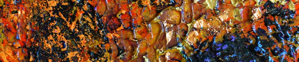
My favorite piece in this exhibit is Rockface, Quiet Bay 2008 by Gregory Hardy. This large work dominates one’s field of vision with a rocky landscape refelcted in a lake. the colors are rather subdued but with a few exciting dabs of orange.
If you happen to be in Edmonton, with an opportunity to visit the AGA before February 20th be sure not to miss this exhibit. It is interesting in its own right but especially so when seen against the 20th Century French paintings and the other current AGA exhibits.
It’s All in the Wrist
I frequently have been achieving “painterly”, abstract effects on my photos through the use of intentional camera motion. By using a neutral density filter I am able to shoot at a 2 to 4 second shutter speed which allows me plenty of time to move the camera about, effectively painting with the available light upon my camera sensor. In general the effect is to soften edges and blur the image but depending on the type of motion, different results can be achieved.
Here was the basic scene (i.e regular shutter speed, no motion) that I used for the following demonstration:

Woods in Winter (normal exposure)
In this next image of the same scene I used a 4-second exposure and moved the camera vertically – more like tipping it forward and back using my wrists. This type of motion tends to preserve the vertical elements of the picture, such as tree trunks.

Woods in Winter (Abstraction I)
In this second image (again a 4 second exposure) I moved the camera rapidly in a horizontal fashion throughout the exposure. The effect is to soften, to blur those vertical edges. If there were a strong horizontal element it would of course have been reinforced. I like this motion for a landscape with a definite horizon line.

Woods in Winter (Abstraction II)
In this final variation I incorporated both vertical and horizontal motion – rapidly moving the camera back and forth horizontally for a couple of seconds, then moving it up and down for the last two seconds. The edges are soft and I like the grid like texture that results

Woods in Winter (Abstraction III)
Another of my standard “tricks”/requirements with these long exposures with camera motion is to increase the contrast and color saturation during post processing. Here, for example is tha last image straight out of the camera:

Woods in Winter (Abstraction III - un processed)
Saturation in the Night
Here in the first week of December, there doesn’t seem to be much color in the landscape but not much doesn’t mean none. Here are a series of images created today – mostly four second hand-held exposures with kicked up color saturation and contrast in the post-processing.

Abstract 342-005

Blue Moon 2

Abstract 342-008

Abstract 342-039

Abstract 342-019


