Emily Carr at the AGA
Last week I had the pleasure of visiting “Nature and Spirit: Emily Carr’s Coastal Landscapes” at the Art Gallery of Alberta in Edmonton. Anyone that knows me well, will know that I count Emily Carr among my most favorite and influential painters.
I never miss an opportunity to see Carr’s work in person. A few years ago I took in a great show in Ottawa at the National Gallery. Any time I get to Vancouver I make a point of visiting the Vancouver Art Gallery with probably the greatest permanent collection of this west coast Canadian painter. Fortunately this AGA exhibition was organized by the Vancouver Art Gallery and features many of their key, and my favorite works. Among the great works that caused by slow trip past the works to come to a complete stand still were Scorned as Timber, Beloved of the Sky and some luscious views of the interior of the west coast rainforests (specific titles escape me at the moment).
Like the national exhibition a few years ago this exhibit of paintings is complemented by Haida Art: Mapping an Ancient Language, an equally large display of west coast native art and artifacts. The indigenous west coast peoples and cultures were a huge influence and inspiration for Carr so this pairing is ideal.
This exhibition (of 35 Carr paintings) began 2011 March 5 and runs through to June 5. If you are in the Edmonton area this is a must see exhibition. I’ll be back, a few more times – guaranteed!

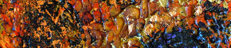
Bending to the Sky by Randall Talbot (influenced by Emily Carr)
Hueless City
There are some days when black and white just seems right. On a day like today (March 24th) when fresh snow covers the City of Edmonton, its one of those days. Here are some of my favorite photos du jour:

Komatsu

Lots of Parking

Downtown Alley

Glass Blocks

Teatime
Diving Into Water(color)
I paint with oils and acrylics and have used many other media. I have however never really tried one of the most common and popular media – watercolor. Today that changed. I did up five sketches in watercolor. I wasn’t using the common forms of watercolor – in pans or tubes. What I worked with are water color sticks (from Daniel Smith).
These are the results of today’s efforts (keep in mind that I’m new to the media and these are quick sketches, not finished works)

Sketch #1
I experimented with a few different techniques. In the first sketch I started with an ink drawing before adding the color. From the second sketch on I did basic drawing with a pencil, even shading with the pencil to establish a bit of value toning.

Sketch #2
I also tried different ways of applying the watercolor: drawing with a dry stick and later brushing with water, drawing with a wet stick and pulling color off the stick with a wet brush and then painting on to paper in a traditional fashion.

Sketch #3
These first three sketches were done in a standard sketch book, probably about 80lb paper. The size of each image was around 5×7 inches (13 by 18 cm) . My last two sketches were a little larger and done on130 lb paper (more suitable for water media).

Sketch #4
The landscapes I used for these sketches are from a series of photos I took last July while on a drive along the coast, north of San Francisco. I plan to develop a series of paintings from these landscapes but the point of this exercise was primarily to get familiar with the media rather than work out compositions and color schemes.

Sketch #5
I don’t expect watercolor to become a dominant media for me (but never say never). What I like about these watercolor sticks is their portability. If I can develop an ability to handle them to create the way I want to, they will be ideal to take with me while traveling. I’m thinking they would be great to pack along while cycle touring.
Night Studio – a book review

NIGHT STUDIO , A Memoir of Philip Guston by Musa Mayer
After reading (and greatly enjoying) de Koonig, an American Master the biography of Abstract Expressionist painter Willem de Koonig, I was keen to learn more about the movement and other key players. Searching around for other books, one which seemed highly recommended was NIGHT STUDIO, A memoir of Philip Guston by Musa Meyer. I ordered a copy and started reading.
The first thing I discovered was that the author Meyer is Guston’s daughter. Her relation to the painter gave a fascinating layer to this work. Not only do we learn about Guston the painter but we get to know what life was like for his family – his wife and daughter.
At first, the fact that the author was the painter’s daughter and the book was not just a non-subjective biography turned me off. I was expecting to hear just about this great artist: his life, how he thought, his creative process. In retrospect I realize I was hoping for a continuation of the style of the de Kooning biography. An example of what I wasn’t expecting were passages such as this (in chapter 3):
“My daily life was dull by comparison. Third and fourth grades, I went to the West Hurley Elementary School, a white frame schoolhouse about two miles from the Maverick Road. First through fourth grades were in one classroom, fifth through eighth grades in the other. My entire fourth-grade class was left handed– all four of us.”
As I say this wasn’t what I expected to read and my loss of enthusiasm slowed down my progress through the book. I did however persevere and was very glad I did. All these bits of observation and the feelings of the daughter certainly helped paint a true picture of the successful and driven painter.
The book certainly does the job as a biography. We learn that Philip Guston was born Phillip Goldstein, in Montreal in 1913. The family moved to Los Angeles six years later where he grew up. We learn about his upbringing, art education and his decision to change his name. As one of Abstract Expressionist’s, Guston counted as his friend others of the movement such as Pollock, de Kooning and Rothko, so these names and anecdotes about them do appear in this book. Another prime character in this story is Guston’s wife, Musa McKim (a writer and one time painter herself) and Meyer relates a fair bit about the sacrifices that McKim made for her husband’s art career.
The book includes 81 black and white photos plus a drawing at the start of each chapter. The photos include a lot of pictures of Guston and his family and some of his art. The book was written in 1988, 8 years after the painters death so it also describes the interesting challenges of managing the painter’s estate and body of work.
Again the daughter’s perspective in the telling of this story provided a unique and often touching perspective – such as this passage near the end:
“My mother knelt and, after a long time, set my father’s ashes inside the deep hole. With them we put brushes and paint, tubes of cadmium red, mars black, titanium white. His colors. I knelt beside my mother and we refilled the grave together”
Night Studio is a very good book – I do not hesitate to recommend it.
Seeing Things Differently
I want to share some recent photo experiments. I have been exploring the effects that can be achieved using the Capture NX2 software (and I assume similar to other image processing software). I use Capture NX2 because it works with the Nikon RAW format. There are a number of controls in this software and I have previously used it primarily for straightening and cropping images as well as adjusting the exposure, contrast and color balance. Through these software manipulations I see images in very different ways from what I originally saw and was inspired by. It is like exploring strange and new worlds.

Abstract 110318-192
What I have done this week is play around more with an input- output curve that can be adjusted simply by clicking on the curve and pulling a point up or down. The curve in the relationship between the value of the original image and the value of final image. What would normally be a straight diagonal line from bottom left to top right can be twisted around to an s-curve with an inverse slope. This effectively turns the brightest pats of the original image into the darkest portion in the final image. The colors also can get changed in the process resulting in some interesting effects

Night Magic
(Prints and cards of the Night Magic image are available for purchase on RedBubble)

Stained Glass Sidewalk Ice

Melting

Blue Marbling
As you can see there are some very interesting effects possible. I like this exploration both for creating photos and for giving me ideas for paintings
Color Play Abstractions
Today I was playing with the color on some new photos, using the Capture NX2 software. For the most part these effects were created by inverting the “quick fix” curve – essentially creating a digital color “negative”. On the right I’ve included the original unaltered images for comparison

Magpie 2

Magpie original

Copper Snow

Copper Snow original

Abstract 110314-11

110314-11 original

Abstract 110314-004

110314-004 original

Abstract 110314-21

110314-21 original
The Continuing Beauty of Winter
It is the first week of March and still very much winter in Edmonton, as evidenced by a deep blanket of snow everywhere. On one hand you could think that would make for boring photography but I take it as a challenge – and that is the fun. You can see from these 7 photos, all taken in one day, that there is lots to be seen, lots to be captured and different ways of presenting the final image.

White on Blue

Not Coral

Three Twigs

Grass Arc

Nest

Melting Dirty Ice

Shadows of a Picket Fence
Mystery Solved!
I have this painting hanging over my bed:

"mystery painting" - acrylic on canvas, 30 by 40 in (76 x 101 cm)
I’ve always liked it for it’s bold, expressionistic use of color and brushstrokes, but it’s been a bit of a mystery.
I know who painted it – I did.
I knew that I painted it back in the late 80’s, probably while I was at a painting course at Red Deer College.
I also recalled that it was inspired by a historical painting, one that I found in a book – probably on a day when the weather was unsuitable for working outside. For many years I have not known what the inspiring painting was or even who had painted the original. Over the years I have asked people familiar with art history if they had a clue – but no luck.
Today I stumbled across an old sketch book of mine and while flipping through it I saw a little sketch that was similar to my mystery painting.

Randall's sketch (5x8 in)
On the page facing this sketch was written “Corot”. That rang a bell. I went to the web searched for images for Corot and promptly found this one:

Mornex, Haute-Savoie by Jean-Baptiste Camille Corot
Mystery solved! You can see I obviously didn’t emulate Corot’s style but the elements of the landscape are the same.
More Snow
More snow, in black and white:

Path

Ridge and Textures

Three Twigs

Snow Break

Edge in the Light
Just Snow
With snow dominating the Edmonton landscape in early March 2011, I’ve decided to feature nothing but snow and ice in this set of photos:

Drift's Edge

The Wedge

Tracks

Balanced

Crashing Surf (dreaming of)
Winter Barks (part 2)
Continuing on from Part 1, here are some more photos, featuring the wonders to be seen on the bark of trees (even in the middle of winter):

Cracked and Yellowed

A Touch of Orange

A Knot

Sun-bleached Bark

Tracks


