Auvergne (Painting Series) – part 1
The creation of my first painting series (a group of works based on a common theme and style), was an important point for my artistic development. In August of 1984 I attended a “Painting in France” course put on by Paul Deggan (in conjunction with Capilano College in Vancouver). I and three other students stayed at Deggan’s home / art studio in the small, medieval village of Montaigut-le-Blanc in central France (the Auvergne region). For three weeks (after a week in Paris) we explored and painted this picturesque village (with it’s old chateau, a church and village walls) and surrounding rural areas.
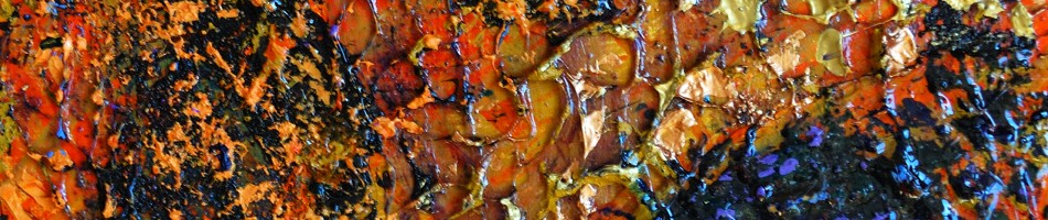
The paintings in Part 1 of this series blog post are works that were painted “en plein air”, right there looking directly at the scene.

“Countryside View from Chateau” Oil on canvas board 45 x 56 cm

“L’Eglise”, oil on canvas board 33 x 41 cm

“In the Field”, oil on canvas board, 28 x 41 cm
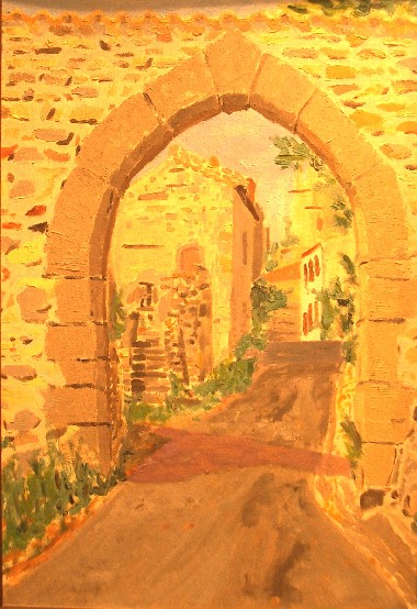
“Arch in Montaigut-le-Blanc” – oil on canvas board, 38 x 56 cm
A number of other paintings were created as part of this series but they were done after the trip, back in the studio, from sketches and reference photos. These other paintings are featured in part 2 of this blog.
Killing the Plein Air Mood
It was a beautiful sunny morning after a couple of cooler days. It was also my last opportunity to gather some plein air images for printing. What type of landscape I wanted to capture, I wasn’t sure, but I was confident I’d know it when I saw it.
Perhaps a receding fenceline? Or a grassy field backed by the forest:
  Maybe a bending path:
  Or a little creek
  There’s a tree with some character worth capturing:
  Maybe some wild flowers?
  A path through the shaded woods?
  Ah finally, this is it:
  A colorful edge of a field with some attractive curving lines. I walked up and down the bit of trail overlooking this scene. There was no great place to sit so I chose a spot in the grass at the side of the trail. I got out my watercolor paint sticks and yupo sheet and sat down. But,
  What’s that … an ant? No not AN ant, hundreds of them. The ground was swarming with them. They were soon all over the supplies that I had set down on the ground and before I knew it they were also crawling over me! I picked up my stuff and frantically started brushing off the ants as I got the heck out of there. My initial thought was to move along and find a nearby place to try again – but I was spooked! I ended up deciding to just collect some photos for future reference and head back to the (safety and comfort of the) studio.
Artistic Retreat
For the second year, the first week of July has been an opportunity to escape the city and normal responsibilities for the serenity of the countryside and the inspiration of being around like-minded artists.

My makeshift outdoor studio
A group of 12 painters gathered at the Lazy M Lodge in rural central Alberta for five days of rest, relaxation and rejuvenation.

Alberta countryside near the Lazy M

The North Raven River beside the Lazy M
My main goal for the week was to focus on painting but I knew my eye would be drawn to many more sights than I could attempt to paint. Therefore my camera would be close at hand and be put to good use capturing references for current and future landscape paintings as well as for some things that are just more suited to photographic images than paint.
My goals for the week were pretty loose but I did want to focus on landscape painting and I did want to work larger and looser with acrylic than I had done the previous year. So I did away with the backpack and pochade box and working on by 9 by 12 inch boards. This year I wouldn’t be packing my gear – I brought some medium size (22 by 28 inch; 56 by 71 cm) stretched canvases, a portable easel and a (5 foot long) folding table. I pre-mixed my acrylic paints half-and-half with a heavy gel to help hold the texture and to extend the working time. I also would use a couple of stay-wet, sealable palettes for color mixing. I used a split-primary color palette and would do mos of my painting thick and with a palette knife)

Paint for the week

Lazy M Driveway
Of course, my eye was looking not only for landscapes that I could paint quasi-en-plein-air but also for inspirations for future studio abstract paintings. I re-visisted my long-exposure with camera-motion technique to generate some of these ideas:

Green Between Pink
A project that the group of 12 painters undertook during the week was to produce this composite canvas (4 feet square) to be left at the Lazy M Lodge:

Lazy M Group Project
It wasn’t a highly productive week in terms of completed canvases. In fact I completed only 2 (and one is not a keeper). I got a good start on another couple of canvases forming a landscape diptych. Nonetheless, it was a very beneficial week – the rest and rejuvenation benefits can not be understated.
For more photos visit my Lazy M 2014 Flickr album.
ASA 2012 New Members Exhibition

Paintings by Randall Talbot in the ASA’s 2012 New Members Show: (L-R) Storm Approaches, Dark Treeline, Spirals
2013 March 8 – the Alberta Society of Artists (ASA) New Members Show Opening
It started about a year earlier when I submitted images of my recent paintings to the ASA in application for full member status. In April 2012 I received word that I had been juried-in as a full member.

One of the things the ASA does to welcome new members is to give them an opportunity to participate in an exclusive New Member’s show. This year it was at the Artpoint Gallery and Studio Society in Calgary, Alberta, Canada.
I had brought my three paintings for the show, from my home in Edmonton to Calgary a few weeks before the show, when I had drove to Calgary for a meeting. I came back down to Calgary for the Opening but this time chose to travel by bus.
I walked from downtown to the Artpoint Gallery for the opening – a pleasant 25 minute stroll in the late afternoon sun of a springlike day. I arrived at the gallery a bit before six for the Opening which ran from 5 to 9. The gallery was pretty quiet at that time, but the crowds built as the evening progressed and the room was pretty full by 7 when the artists each spoke a bit about their work (or in the case of Shona Rae, did a fascinating story-telling performance).

The Artpoint Gallery for the Opening of the ASA’s 2012 New Members Show

ASA Opening at the Artpoint
I was one of 8 new ASA members showing in this exhibition. The others were:
When my turn came to speak, I spoke briefly about my background – a lifelong Albertan with a longtime interest in the visual arts including painting, photography and sculpting. I then said a few words about each of my three paintings in the show (all were painted in 2012 but representing different approaches):

Storm Approaches
acrylic on hardboard
61 by 91 cm (24×36 inches)
This work is an example of by approach of working plein air. This work was developed in the studio based on a small sketch that I had done on-site. The particular location of this was near the central Alberta community of Markerville but it depicts a fairly generic and common prairie/parkland scene on a summer afternoon, when the dark clouds roll in from the west.

Dark Treeline
acrylic on canvas
61 by 91 cm (24×36 inches)
This painting is an example of an increasingly common technique in my work, of using my own abstracted photographs as the inspiration and reference for abstracted landscapes. I use a technique of multiple second exposures while I move the camera to create the abstraction/simplification of the scene.

Spirals
oil on canvas
46 by 46 cm (18x 18 inches)
This non-representational (abstract) work was one of a small series of exploration I began in October of 2012. The key feature of this series is the technique of drawing into the wet oil paint, using a variety of tools, to leave marks and reveal the underpainting.
All in all, it was a great evening – a chance for me to meet some artists and art lovers I had not known and see some interesting work. It was an opening to a good exhibition that I am proud to be part of.
The show runs until March 30th (2013) in Calgary.

The Exterior of the Artpoint Gallery at the end of the Evening
Workshop’s End – Day 5

Ganges Harbour on a Sunny Morning
The fifth and final day of the 2012 Federation of Canadian Artists (FCA) plein air workshop on Salt Spring Island was on Sunday September 16th. The format of the day was different but that was okay. Instead of heading of as one of four groups to a different location on the island and being instructed by one of the experts, this day we hung around Ganges and painted.

Painting from the Dockside Gazebo
Well it wasn’t quite that simple. We started of with a group critique, an opportunity to get back with the instructor whom we started with on Day 1. The group was able to take a look at what they had accomplished over the week and to get some useful feedback.
After that it was time to get down to painting. With some one hundred workshop attendees there were lots of plein air painters to be seen around Ganges and particularly along the waterfront.
For my first painting of the day I chose a water scene and worked quickly to capture the impression on it. I found the instruction of Stephen Quiller (who our group had studied with the previous day) to be most on my mind. As a result, I was experimenting with thin acrylic washes to start with, building up values and rich colors. The final strokes were to apply thicker, more opaque acrylic.

My painting of the Ganges Harbor
After this water scene, I wanted to paint a forest scene, so I packed up my gear and walked to Mouat Park on the edge of Ganges. Although very dry at this time of year, this are was still lush and green, dark and refreshing.

Mouat Park, Salt Spring Island

My Idyllic setting in Mouat Park
I finished one plein air sketch there in the park and did a couple of thumbnails sketches for another one.
I also wanted to consider another water or town scene so I hiked back through Ganges looking for an inspiring scene. For some reason I didn’t find anything that caught my fancy so in the end I was back near Art Spring.

Setting for my final painting
I set up my pochade box on a big stone table and proceeded to work from my thumbnail sketch. I was in a bit of a hurry as I worked here. At 3 o’clcok we were to begin set up for the “Wet Paint show and sale” at Art Spring. The widely publicized even ran from 4 until 6 giving those so inclined and opportunity to sell works which they had completed during the week. I chose not to put any of my works up for sale but I did set some pieces to show along with some of my business cards.

The Wet Paint Sale”
Another unique aspect to this final workshop day was an opportunity for a one-on-one critique with the legendary Robert Genn. I did not take advantage of this but many people did and if there is a next time, I will.
The final event of the week was an evening banquet at the Harbor House Hotel. This was a very nice event with just a little bit of formal talking, lots of opportunity to chat with fellow workshop participants and an exceptional meal.
The week went by very quickly but it was good and I will certainly consider doing it again. Next year’s equivalent event will be held in September at Whistler, BC.
FCA Salt Spring Workshop – Day 4

Stephen Quiller Demonstrating for the Class (and any chickens that cared to watch)
On the fourth day of the 2012 Federation of Canadian Artists (FCA) workshop on Salt Spring Island, our group was with Stephen Quiller [see my introductory post about this workshop]. Our location was at a private farm, on the coast, a couple of kilometers south of Ganges [see map]. This was another location that offered some subject matter to suit everyone’s tastes – there was the farm, with trees, chickens, road and fences and nearby, ocean-side fields and beaches.

Quiller & his Color Wheel
Stephen Quiller is a water-media artist, not making a big distinction between water color , acrylic and gouache media. He is very comfortable with and knowledgeable about all. Quiller is noted for his work with color and has a number of products and books relating to his Quiller color wheel. In fact, having studied his books, was how his name popped out for me, amongst the four workshop instructors. One of the key lessons from Quiller related to his efforts in identifying color complement pairs amongst the many hues of colors available today. By mixing these pairs one is able to obtain some very nice clear greys, or neutral tones. Interestingly as he was unable to find a perfect complement to cadmium yellow light, he had his own created – Quiller Violet.
As in the days that we spent with the other workshop instructors, the format was to have a demo/talk first thing in the morning and then the participants would disperse over the area to work on their own and then we would gather again just after lunch for another demo. On this day we also got together for a group critique at the end of the day.
The demonstration started off with a description of Quiller’s color theory and then he got into working on a piece – an abstracted depiction of the landscape in front of him (using acrylics). Quiller\s approach was to start with thin, transparent washes and work his way to applications of opaque paint. Before starting the actual painting Quiller asked that any questions be saved until the end so as not to disrupt his process. I expected him to be in the “zone” and therefore completely silent during his painting process but while he was clearly in the zone, there was one side of him that was still giving a very useful running commentary of what he was doing and thinking.

A Fence Line – one option to paint

A Beach Scene – another option

A scene similar to the one I chose to paint
Having so many possibilities for paintings around this location, it was difficult to choose. I hiked down the shaded path from the farm area to a large grassy spit which featured a greeny bay at low tide on one side and the open water and a rocky beach on the other. On the land was a large grassy field bordered by some trees sporting dramatic autumn colors.
The field/tree scene won out for me so I set up my pochade box in the shade looking out over this scene and got to work. I was experimenting with my process again on this day – still trying to find the best way to use acrylics for this plein air work. I learned on the previous days that my paints were just drying out too quickly on the palette – even when I used the Sta-Wet palette with a wet sponge underneath.

My plein air palette
This day I tried pre-mixing my tube colors with heavy gloss gel to slow the drying time and also to give me a thicker paint, which I prefer for the impasto style. I stored these premixed colors in little plastic cups with lids, which were great for ensuring that the left over paint could be saved for my next session. I still used the Sta-Wet palette as my surface for mixing (and saving) other colors.
It was a good day with Stephen Quiller. the information on his color theories was good but largely review. there were a couple of things that he said that while not new or revolutionary, really stuck with me during that day and I’m still thinking about them.
- “See the stroke – put it down” is what he said. These are simple words, a simple concept but oh so important so as not to muck about in one’s painting and thereby destroy the freshness and expressiveness of the image.
- “Always finish your paintings”. There is a tendency to give up on hopeless cases, canvases that you just know can’t be saved. Quiller said that the last 15% of a painting can be very hard – but very beneficial. Keep working on the problems and you will learn something and probably something that will help prevent you from making the same mistake again!

The road out of the farm at the end of the day
Go back to my Workshop Day 3 (with Carla O’Conner) blog post.
FCA 2012 Workshop Day 3
On the third day (2012/9/14) of the Federation of Canadian Artists 2012 painting workshop on Salt Spring Island (British Columbia, Canada), our group had the pleasure of being instructed by Carla O’ Conner.

Carla O’Conner addressing the group
Carla is a watermedia artist whose “designated” media at the workshop was gouache. As it turned out, most of her group instruction was generic and could be applied to to any media. She started out her morning session talking about Design and how there are 7 elements of design (shape, size, line, texture, direction, color and value) AND 7 principles of design (balance, harmony, gradation, variation, contrast, dominance and unity). Since each element applies to each principle there are 49 things to consider! Carla went on to talk about composition and some of the most common classifications of composition.

Old Farm Road
Our location for the day was Ruckle Provincial Park on the south east corner of the island. The land for the park was donated by the Ruckle family so part of the park continues as the working family farm (complete with cattle, sheep and turkeys – not to mention the wild deer that wandered through later in the day).
This location offered a great variety of subject matter for painting: the wide open valley, the animals, farm buildings, fences, coastal forests and, just a 5 minute walk away, the coast, with a lovely, quiet little beach.

Turkeys by an Old Farm Building
I was attracted down to the beach – a lovely little cove with shore rocks, a rocky little island, birds, driftwood and a shell and pebble beach.There were even a couple of people kayaking.

A Secluded Beach at Ruckle Park
I took off my boots, pulled out my sketch book and proceeded to sketch some scenes. It was so nice (and I so needed the seeing/sketching practice) that I never did break out my painting materials that day. As I sketched I was concentrating on elements of the previous two days’ lessons – namely to simplify in terms of shapes and values and to use values to define sections of the painting. I found my grey scale markers very handy for these sketches, allowing me to quickly establish my 3 greys (as well as black and white).

Ruckle Park Coastal Sketch
In early afternoon we had gathered up by the big barn again and Carla gave a useful little demonstration of how to incorporate figures into the landscape. To be believable the figures do not need to be highly detailed – what is key is to get the general body shape and proportions correct. After this demo I went back down to the beach to sketch. At the end of the day I caught back up with Carla and got some useful feedback on my day’s work.
After the workshop was over we went down to another part of this large park to take some reference photos of the forest and coast.

Sea through the Forest
To see more photos of Salt Spring Island (many taken during this workshop) please visit my Flickr photostream.
If you missed my “Day 2” blog post, find it here. {Click here to read about Day 4]
Three Regions, Three Values

John Salminen
On the second day (Sept. 13) of the Federation of Canadian Artists (FCA) 2012 workshop on Salt Spring Island, our group had the very entertaining and knowledgeable John Salminen as our instructor.
John’s forte is painting urban scenes with watercolor. Our painting location for this day was the Garry Oaks Winery. This place wasn’t an urban location but John found a suitable building on the premises to use as the subject for his demonstration piece. Not being particularly drawn to buildings myself I found this site with many opportunities for landscape paintings. I’m particularly fond of the parallel lines of the rows of the vineyard.

Part of the vineyard at Garry Oaks Winery
Shortly after our arrival at 9 AM, the group gathered together and John began his demonstration. Unlike many instructors who do not like to actually demonstrate by creating a full work from start to finish, John did. He did do a few things in preparation before the group arrived and also did a bit of work while we were scattered in the fields. Nonetheless, through the two demo sessions that he did we got a good idea of how he approached his work. John works in watercolor so many of the tips and techniques (e.g. masking off sections of the painting and use a mouth-blown sprayer) of that he shared won’t have direct applicability to my current style but I have carefully tucked away his approaches for future use.

John Salmimen’s Demonstration Piece
One thing that John talked about which is fully applicable to any media, concerned values and planning your composition. He said to consider that your scene has three regions: a foreground, a middle ground and a background. Also consider that there are three value families: Light (say values 1 to 3, on a nine point scale), middle (values 4 to 6) and darks (values 7 to 9 ). John suggested doing thumbnail sketches of the composition using all of the combinations of value families with the three regions. For example you could do the foreground in your darkest values, your mid-ground with your middle values and the background in your lightest values – or you could flip that around making your foreground lightest and background darkest. Or maybe you make your middle ground darkest
There are 6 combinations of the value families that you can assign to the three different sections of your painting and each can impart a different mood on the scene. Also worth remembering is that you don’t need to be a slave to reality – just because nature is presenting you with a scene where the background (e.g. distant hills and sky) are very light, your painting does not have to be the same (it could be – but that your choice!).
This lesson stuck with me, it was with me through that day as I tried to apply the idea, but it was also there in the back of my mind throughout the rest of the week. A good principle, a good lesson!

Plein Air Painting at Garry Oaks Winery
After the morning demonstration, I wandered up and down the road beside the vineyard looking for just the right scene to capture my attention. I ended up finding a nice spot in the shade under a massive old oak tree, looking out over a section of the vineyard with curving rows. I would spend the rest of the day in that spot and although the painting, didn’t turn out to my satisfaction. I kept repeating my mantra from Day 1 ” I don’t have to produce a finished painting, I am just here to learn”!
During the course of the day, John made the rounds to visit the students scattered around the property, offering individual suggestions. He got to me quite late in the day and suggested that I add a figure as a focal point. I don’t often include figures in my landscapes (although I often thought I should). Anyway, I did put in a suggestion of a figure and have to agree that it does add a focal point to an otherwise ungrounded painting. What do you think?

“Finished” Plein Air Sketch
So that was day 2 – another day of solid learning, another day of not so successful painting – and all in a very beautiful locale. [click here to read about Day 3]

Pastureland

Across the Valley

Lavender and Gold


