Mountains (a Series – Part 2)
In this part 2, I share more mountain paintings, a few more from the Banff region with a couple more based on reference photos from when I cycled the “Golden Triangle” in May of 2010.

“Sun Play II”, oil on hardboard, 41 by 30 cm, 2009

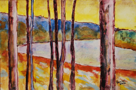
“Mountains Over Vermilion River”, oil on hardboard, 30 by 41 cm, 2010

“Mountain’s Edge”, oil on hardboard, 51 by 61 cm, 2009

“On the Ridge”, oil on canvas, 46 by 46 cm, 2010

“Rocky Mountain Serene” oil on canvas, 23 x 30 cm, 2009

untitled, oil on hardboard, 20 by 30 cm, 2009
Mountains (a Series – Part 1)
Living in the Canadian province of Alberta, the Rocky mountains have always been nearby and not an infrequent subject for my art (although not nearly as much as I would like). In this 2-part blog post I will share my take on mountains as subjects for landscape paintings.
All of the works in this “Part 1” were painted in August 2009 when I spent a week at the Banff Centre.

“Twisted Stone”, Oil on hardboard, 30 by 41 cm, 2009

“Mountain Mystery”, oil on canvas, 61 by 41 cm, 2009

“Long Shadows on Tunnel Mountain”, oil on hardboard, 30 by 41 cm, 2009

“Bow Valley from Tunnel Mountain”, oil on hardboard, 41 by 30 cm, 2009

“Sun Play (Banff)”, oil on hardboard, 61 by 51 cm, 2009

“Banff Evening Solitude”, oil on canvas, 51 by 76 cm, 2009
Lines (an Abstract Painting Series)
This small series from the autumn of 2012 was an exploration of mark making into the wet surface of an oil-painted canvas:

“Marks”, oil on hardboard, 30 by 30 cm, 2012

“Fall”, Oil on canvas, 46 by 46 cm, 2012

“Lines in a Field”, oil on hardboard, 30 by 30 cm, 2012

“Spirals”, Oil on canvas, 46 by 46 cm, 2012

“Maxwell”, Oil on hardboard, 61 by 61 cm, 2012
Night Train (a Series)
This painting series was a bit unique for me. It had a common theme in terms of the subject matter – all of the images were drawn from what I saw (and captured with photos) during the night while on a train between Edmonton and Vancouver in November of 2007. What was unique for me was the use of oil pastel on a number of the works, and oil paint on a couple of larger ones.

“Rolling Through the Night”, oil on canvas, 41 by 51 cm, Nov 2008

“November Rockies Dusk”, oil pastel on paper, 23 x 30 cm, 2009

“Passing in the Night”, oil pastel on paper, 23 x 30 cm, 2008

“Night Siding”, oil pastel on paper, 23 x 30 cm, 2009

“Dawn Arrival”, oil pastel on paper, 23 x 30 cm, 2009

“Supporting the Dawn”, oil pastel on paper, 30 x 23 cm, 2008

“Morning Train into Vancouver “, oil on hardboard, 61 x 71 cm, 2008
Alberta Landscapes (Painting Series, Before and After 2010)
In my previous blog post I shared my Alberta landscape paintings from the particularly busy year of 2010. In this post, I share my landscape works from a couple years before and after that year.

“Red Deer Field and Trees (study)”, oil on hardboard, 20 x 25 cm, 2007

“Canola Fields I”, oil on canvas, 51 x 76 cm, 2008

“Canola Fields II”, oil on canvas, 76 x 51 cm, 2008
(See the previous blog post for Alberta landscape paintings from the year 2010)

“North Saskatchewan River”, oil on canvas, 61 x 91 cm, 2011

“Storm Approaches” acrylic on hardboard, 61 x 91 cm, 2012

“Dark Treeline”, acrylic on canvas, 61 x 91 cm, 2012
“Bend in the North Saskatchewan River”, water color on paper, 10 x 15 cm, 2012
Alberta Landscapes – 2010 (a Painting Series)
Although landscapes are a theme I have always painted, there are periods when they become a particular focus. In around 2010, I developed a new series of landscapes from my home province of Alberta. Most of these again depict the prairies and parkland that dominates the central region of the province. I was painting primarily with oils during this period and this series was painted in the studio.

“Vanishing Prairie”, oil on hardboard, 31 x 41 cm, 2010

“Beside the Highway”, oil on canvas, 23 x 30 cm, 2010

“August Prairie and Sky”, oil on canvas, 76 x 51 cm, 2010

“Flat Prairie Horizon”, oil on canvas, 41 x 51 cm, 2010

“Prairie and Forest”, oil on canvas, 45 x 61 cm, 2010

Prairie Exit”, oil on canvas, 51 x 41 cm, 2010

Prairie Gold”, oil on canvas, 46 x 61 cm, 2010

“Prairie Hay”, oil on hardboard, 30 x 41 cm, 2010

“Prairie’s Edge”, oil on hardboard, 30 x 41 cm, 2010

“Sheltered Prairie”, oil on canvas, 41 x 51 cm, 2010

“Through the Trees”, oil on canvas, 41 x 51 cm, 2010
The North (Painting Series)
In 2009, I painted a series inspired by a train trip from Toronto to Edmonton in December of 2008. The first day and a half of the trip covered southern and northern (northwest) Ontario (actually not very far north in terms of Canada’s geography but feeling very far removed compared to the Toronto region). I took many photos of the rugged terrain of the Canadian Shield to use as reference images for paintings. As a series this is one of my personal favorites. Here are the key works:

“Evening from the Canadian”, oil on canvas, 61 by 122 cm (24×48″), 2009

“Leaning”, oil on canvas, 41 by 41 cm (16×16″), 2009

“Northern Survivor”, oil on canvas, 51 by 76 cm (20 x 30″), 2009

“Winter Sunrise on the Rails”, oil on canvas, 61 by 61 cm (24 x 24″), 2009

“December Sunset (Northern Ontario)”, oil on canvas, 61 by 61 cm (24×24″), 2009

“Leaning II”, oil on canvas, 61 by 61 cm (24×24″), 2009

“Northern Sunset Over Unknown Lake”, oil on canvas, 61 by 91 cm (24×36″), 2009
A Studio to Call your Own – Reminiscing
A year ago I was packing up the studio that I’d called “my space” for 16 months. It was hard. I came to the reluctant decision that I had to move out of lovely studio space.
It was May of 2014 when I noticed a sign on the outside of a historic (over a century old) building in downtown Edmonton, a comfortable half hour walk from my home.

Studios were located on the 3rd and 4th floors, in a variety of sizes. I was able to get a very generous space of over 400 square feet. That amount of space was very beneficial to me. Of course it meant that I didn’t have to clean up after every creative session, packing away wet materials and works in progress. It meant that I could set up separate work spaces for my two main painting medias: oil and acrylic.

First into the studio space – my oils
The space gave me room to get, and keep, organized. A set of shelves, behind my work table and next to an easel were dedicated to my acrylic paints and media.

Acrylics Shelf
A similar set-up of shelves, table and easel on the other side of the room was dedicated to oils:

Studio Divided
The space allowed me to work larger than I had been. Canvases of 3 by 4 feet (90 by 120 cm) became my standard and I assembled some even larger stretchers (but never did get around to putting canvas on them).

Big Stretchers
Even with the two work spaces, I still had lots of floor space to use when I needed to paint on the floor, to build stretchers or for varnishing.

Paintings on the floor for varnishing
In the end it was time to retreat to a much smaller home studio, disassembling shelves and stretchers and hauling out many carloads of supplies and many mostly-completed paintings

Packed up and Ready to go
And in the end that highly creative space reverts to just a space.

The Final View – Empty Studio (like in the beginning)
A year later I can see ever so clearer how important that space was. Although I do have some space at home that I am re-converting into a working studio, progress has been very slow. I didn’t paint at all for half a year. Finally I cleared out a little space and created 3 works. Now I am back into re-organizing mode that will hopefully give me room for a couple of easels and two distinct little work areas (one for acrylics and one for oils, with a third, a small table for pastel work).
The other important function of that studio space was storage. I had lots of space for materials – for stretcher bars and canvas rolls, for primed canvases and boards, for paintings in various states of progress, completed works awaiting varnish and framing and exhibition-ready pieces. Now I have all these things stored around my house in different rooms, paintings stacked up, eight deep, against walls and bookshelves. My ultimate goal is to make my studio space just a working space – the storage issue is a whole other problem that I will have to address. I suppose someday it will all come together …
ASA 2012 New Members Exhibition

Paintings by Randall Talbot in the ASA’s 2012 New Members Show: (L-R) Storm Approaches, Dark Treeline, Spirals
2013 March 8 – the Alberta Society of Artists (ASA) New Members Show Opening
It started about a year earlier when I submitted images of my recent paintings to the ASA in application for full member status. In April 2012 I received word that I had been juried-in as a full member.

One of the things the ASA does to welcome new members is to give them an opportunity to participate in an exclusive New Member’s show. This year it was at the Artpoint Gallery and Studio Society in Calgary, Alberta, Canada.
I had brought my three paintings for the show, from my home in Edmonton to Calgary a few weeks before the show, when I had drove to Calgary for a meeting. I came back down to Calgary for the Opening but this time chose to travel by bus.
I walked from downtown to the Artpoint Gallery for the opening – a pleasant 25 minute stroll in the late afternoon sun of a springlike day. I arrived at the gallery a bit before six for the Opening which ran from 5 to 9. The gallery was pretty quiet at that time, but the crowds built as the evening progressed and the room was pretty full by 7 when the artists each spoke a bit about their work (or in the case of Shona Rae, did a fascinating story-telling performance).

The Artpoint Gallery for the Opening of the ASA’s 2012 New Members Show

ASA Opening at the Artpoint
I was one of 8 new ASA members showing in this exhibition. The others were:
When my turn came to speak, I spoke briefly about my background – a lifelong Albertan with a longtime interest in the visual arts including painting, photography and sculpting. I then said a few words about each of my three paintings in the show (all were painted in 2012 but representing different approaches):

Storm Approaches
acrylic on hardboard
61 by 91 cm (24×36 inches)
This work is an example of by approach of working plein air. This work was developed in the studio based on a small sketch that I had done on-site. The particular location of this was near the central Alberta community of Markerville but it depicts a fairly generic and common prairie/parkland scene on a summer afternoon, when the dark clouds roll in from the west.

Dark Treeline
acrylic on canvas
61 by 91 cm (24×36 inches)
This painting is an example of an increasingly common technique in my work, of using my own abstracted photographs as the inspiration and reference for abstracted landscapes. I use a technique of multiple second exposures while I move the camera to create the abstraction/simplification of the scene.

Spirals
oil on canvas
46 by 46 cm (18x 18 inches)
This non-representational (abstract) work was one of a small series of exploration I began in October of 2012. The key feature of this series is the technique of drawing into the wet oil paint, using a variety of tools, to leave marks and reveal the underpainting.
All in all, it was a great evening – a chance for me to meet some artists and art lovers I had not known and see some interesting work. It was an opening to a good exhibition that I am proud to be part of.
The show runs until March 30th (2013) in Calgary.

The Exterior of the Artpoint Gallery at the end of the Evening
Simplify! – A Workshop Lesson
Simplify – that is the message I took from Elizabeth Wiltzen, our group’s first-day instructor at the 2012 FCA workshop, on Salt Spring Island. (for an intro to this workshop, see my first post in the series). Liz is a very accomplished oil painter of landscapes, from Canmore (Alberta, Canada) who had worked in watercolors for years. Interestingly, she is also a life coach and an avalanche rescue (with dog) volunteer.

Liz Wiltzen painting a demo
I liked the way Liz started off the workshop: encouraging, no demanding, that we drop any pressures (self imposed or imagined) to have to complete paintings during the week. We were there to learn, to experiment, to try and fail, but ultimately to grow. She joked that the “wet paint sale”, scheduled for the last day, was not happening. It was of course, but we were to act as if it wasn’t and not feel under any pressure to produce. I though this set a very good tone, not only for this day but for the entire workshop. I know I adopted that mindset and while I would get frustrated with a lack of quality output, I kept telling myself that I was there to learn and if I didn’t end up with even a single finished painting, that was okay – that thought settled me down on more than one occasion.
On this day, our group was on a beautiful private property, right on the south coast of the island, between Ruckle Park and Fulford Harbour. The views looking towards the water were particularly stunning. The views looking inland weren’t bad either, with fields, buildings, trees and rocks.

Land and Sea – Salt Spring Island
Liz started off with a good talk about her plein air painting equipment as she set it up for her first demonstration – of the exercise she wanted us to take on that morning. During that day we were given 2 exercises. That first one was to simply a scene to a few (5 to 10) large shapes and assign each shape one of just 5 values – and then paint it like that!  This sort of exercise is nothing new but it was nonetheless very valuable. It is so easy to get overwhelmed by a scene, all the details and color. What this exercise demonstrated is the value of getting down good solid “bones”, an infrastructure for the painting! When you’ve got a believable value composition down, you are half way there!
On the right is my small painting resulting from that morning’s exercise – again the goal being to simplify shapes and values (and of course it is not as easy as it looks)!
The format of this first day of the workshop was typical of each day. We would get on site by 9 AM unload our gear and gather as a group (of about 25). Our instructor for the day would then give us a talk and demonstration (for maybe half an hour) and then we would scatter around the site to get down to painting. When done for the morning we would typically eat the lunch that we had brought and then gather as a group for the afternoon demonstration.

The Afternoon Demo
At our afternoon gathering, Liz demonstrated the exercise that she wanted us to try that afternoon. Still on the theme of simplifying. the challenge was to do a painting using just 50 strokes of the paintbrush. Well this was interesting – she made it look easy but of course it was not. A good starting point was to follow the lesson from the morning by establishing your composition with a limited number of large shapes. When it came to the painting, one trick (especially in the early stages), was to load up a paintbrush and without lifting it from the surface, sweep it all about to fill in the large shapes. Later strokes would be shorter and useful for adding highlights and providing definition to the painting. One of the unexpected challenges of this exercise is keeping track of the 50 strokes – once you get into the painting zone it is so easy to lose track of a simple thing like counting. Before I started painting I took a couple of pine cones and pulled off 50 scales, put the 50 markers in a pile.. Then after each painting stroke, I simply tossed away one of the scales – when they were all gone, my painting was “done” (“remember, it’s just an exercise”)!

A Small Beach (crying out to be painted)
It was a good first day with the exceptionally beautiful landscapes that I was expecting, great weather, a chance to meet a few of the people in my group and of course a couple of lessons in simplification that stuck with me through the week (and beyond).

Simplify – The First Step to Getting Your Plein Air Ducks in a Row
Misericordia Show
Yesterday, 2012 July 7, I had the pleasure of setting up a major show of 43 of my paintings at the Misericordia Hospital in Edmonton.

Paintings laid out in the main hallway prior to hanging
The show includes paintings spanning my painting career of some 25 years. The first paintings encountered as one travels the hallway north of the main lobby is a group of seven paintings depicting the Canadian landscape. This group was inspired was inspired by a train trip I took a few years ago from Toronto to Edmonton, and particularly the rugged Canadian Shield in Northern Ontario.

Four paintings in the northern Canadian Landscape group
After passing through this group of paintings, a turn to the left takes one into the hallway that contains 36 of my paintings – landscapes, abstracts and some in between. First, on the right, are 3 landscape paintings going back to the 1980’s. There is a landscape of the the Auvergne region of France and couple of Alberta landscapes (done in very different styles).

“Woods in Spring” and “Auvergne Landscape”
Next on the right are a group of five paintings of the Alberta prairies from the last 4 years.

“Prairie Gold” and “Canola Fields I”
The Prairies give way to the mountains with a eight paintings (some quite abstracted) from 2009/10 depicting scenes of, from and in the Canadian Rockies.

“Banff Evening Solitude” and “Mountains Over Vermillion River” from the Mountains group
At the end of the long hallway, one turns around and returns, seeing a few more of the mountain group and then a selection of ten paintings from my Earth Light Tapestries series. This series of 24 highly textured acrylic paintings was created on 2006/7 and 14 of them were exhibited at Edmonton’s Milner Library gallery in the fall of 2009. Seeing 10 of these 24 by 24 inch (61×61 cm) works in a row is quite impressive.

“Earth Light Tapestry XIX” and “Earth Light Tapestry XV “
Next are 5 paintings of an abstract nature including 1 that was inspired by an early morning train arrival into Vancouver and two from a scene on Beddis Beach on Salt Spring Island on a foggy November morning in 2007.

“Always Waiting” and “Park Nocturne I”
Back at the start of the long hallway the show ends with a few of my most recent canvases.

“Dark Treeline ” and “Path 2011”
This show runs through to August 17th on the main floor (look for the Day Ward hallway) at the Misericordia Hospital in west Edmonton [map]. The works are for sale during the show – contact the Misericordia Volunteer office (780-735-2754) for more information.
Plein Air en Velo
I’ve always felt that plein air painting is the ultimate but I’ve never done enough of it to really feel comfortable. Hopefully that will change now that I’ve outfitted myself with equipment that allows me to take-off on my mountain bike with my painting gear. While riding around the river valley here in Edmonton I’ve often noticed views that cried out to be painted. Until know I have had to be satisfied with taking a quick reference photo and then working up a painting in the studio.
The first piece in the puzzle was the pochade, a self contained studio-in-a box. I have long heard of the Guerrilla Painter line of plein air boxes and after much deliberation decided to go with their 9 x 12 inch pochade. I wanted something as big as possible but it had to be small enough to carry on my bike. That meant I had to face the limitation of the bike bag (pannier) that I would use. At first I did not think I’d be able to find a bag to accommodate the 9×12 box and so had been thinking I’d have to go with the 6×8 box. But I did find a pannier at Mountain Equipment Co-op (MEC) that I thought would work – but it didn’t. Even though the dimensions of the bad were adequate the opening at the top was just a tad too small – the bag wouldn’t stretch and the wooden box can’t compress to fit through the opening. I returned that bag and picked up another one (the Urban Shopping Tote) which had a large top opening and ample room inside (not only for the pochade box but also for my collapsible stool).

Guerrilla 9×12 Painting Box

Stool, Pochade and Pannier

Pannier on rack with Pochade and stool inside
It looks like the bike may be side-heavy with the bag/box on just the one side but I noticed nothing unusual in the bike handling as I was riding. I set off down the bike paths and then dirt trail within Edmonton’s river valley arriving at a place about 10K from home that I had long wanted to paint. It is a little pond set on a flat section, half way down the river bank.

my painting scene
Having picked my scene, I got set up to paint. The pochade and stool came out of my bike bag easily and set up quickly.

- Bike and painting gear on location

I had decided, for this first test run, not to use a tripod to support the pochade box since I’d prefer to travel light and not to have to carry a tripod. One thing I quickly discovered was that I couldn’t just support the pochade on my lap. I ended up sitting on my stool with one leg crossed up over the other to give me a more stable platform. This worked reasonably well but was not the most comfortable position and it did not allow me to easily back away from the painting to get the big picture of how it was coming along.

The scene sketched in
At one point I did put the pochade upon my stool so I could back-up and take a look. Another lesson was learned at that point. The stool is not the most stable thing.

A moment to admire
As I got a few paces back, I saw not only my painting and the inspirational scene but in slow motion, I watched as the stool collapsed and my pochade box fell and dumped its contents at the edge of the pond.

Oops!
Fortunately there was no damage – the canvas stayed in the lid and none of my paints or other equipment actually hit water. I picked everything up and put the finishing touches on my painting.

the “finished” sketch (9×12″, oil on canvas)
I am already looking forward to my next plein air excursion on the bike. I will take along a tripod to hold the pochade box and also will experiment with different clothing, that might be a bit better for both cycling and painting.
Heather Horton – Painter and Explorer
I would like to draw your attention to one of my favorite contemporary Canadian painters. Her name is Heather Horton and she paints compelling (and mainly) figurative works, in a realistic and emotional style . Her rendering of faces and fabrics is truly breathtaking.
Not only do I admire her painting talent but I am also envious of how she lives life, her travels and adventures. As she describes it:
“I have traveled a lot over the past two years. A LOT. I believe travel is the best education certainly, yet there is a time and place for it. As a painter, I need a quiet studio, without frenetic energy, in which to create.”
That quiet studio is at her home base in Burlington, Ontario. She is not exaggerating about a lot of travel – just from what I can recall, in the last year she has traveled to Turkey, southern France and Paris, a few points across the central U.S., New Orleans, Alaska, and the Yukon (and I’ve probably missed a few).
On top of all this travel in the last year, Heather has been very involved in a major project on the life and travels of Christopher McCandless. – a fascinating and tragic story that you can find out about in the Wikipedia synopsis of Into the Wild, the Sean Penn-directed film from 2007. This project involves a series of paintings that Horton has produced. Paintings from the McCandless project will be exhibited June 3-18 (2011) at the Abbozzo gallery in Oakville.
A great talent with great and inspiring energy. If you are not following her already please do by visiting her website, subscribing to her blog , liking her on Facebook or following her on Twitter @Heather_Horton. On Twitter, she often shares inspiring photos from here travels or some of the great quotes that she has collected. Here is one inspiring recent example:
“Tell me, what is it you plan to do with your one wild and precious life?”~Mary Oliver
Original works by Horton are available from the Abbozzo gallery and prints of a number of her works are available on-line from DeviantArt. ( from where I purchased a small framed print of one of my favorite Horton paintings: “The Red Toque” )
William Wray – Urban Landscape Painter
With this, I am starting a new series of blog posts to point my readers to artists I know and respect. Many of the artist’s I currently follow are part of the twitter community and may well be known to each other and to you. There are a few artists that I came to know from before twitter (yes there was a time) – particularly from the WetCanvas on-line community and this artist is one of those.
The artist to introduce you to is California painter William Wray. He often paints what I would describe as gritty, urban landscapes. It is not uncommon to see industrial factories, gas stations or downtown canyons. He has also made compelling works with car, trains and shopping carts as the subjects. Wray’s unique style is also applied to some still life and figure painting.
His subject matter often makes his work distinctive but so is masterful use of color, light and shadow. Words can’t really do justice so please visit his website and his blog to see his works and to learn more about him.
Be sure to also look for the links to a couple of books he has of his paintings.
Broken but Standing
In an earlier post I described the steps I took in going from a photo to a painting. I saw things in that first “study” that I wanted to improve and this is the result of a second attempt:

Broken but Standing, oil on canvas, 41 by 51 cm (16"x20") by Randall Talbot
My original intent was to do at least a couple of these smaller studies before painting a larger final version. I still may do that but first I want to study this one for awhile to decide what I like and what I would want to improve.
Incidentally, for those who might be interested, this is what my palette looked like by the time I finished this painting:

the palette
My palette is a sheet of glass under which I’ve placed a sheet of neutral gray paper and on the right I’ve placed a 9-point value scale as a reference.
Steps in Developing a Painting
Some people may wonder how I go about creating a painting. In this post I will share my steps in the development of a recent canvas.
This painting started off from a photo. The photo was one I took while out for a walk with our dog in Edmonton’s river valley. When walking I am usually carrying my Nikon D80 equipped with either a 18-55 or 55-200 lens. I took over 100 photos over the course of a couple of hours. This is the photo that inspired me for the painting:

original photograph
The broken tree trunk was the obvious central object that attracted me but I also liked the snow, some of the other tree forms and also the sky with the contrast between sky and clouds. I don’t like my paintings to be too much like a photo, especially with respect to color. Therefore I will often convert my color reference photo to black and white. I will want to get the values right but not be a slave to the natural colors. In the process of converting to black and white I will also take the opportunity to apply color filters and adjust the contrast/brightness. I use Nikon’s Capture NX2 software for the processing. This is my black and white reference photo:

enhanced black and white photo
I really liked the way the “red” filter turned the sky dark. What I didn’t like about the photo was how busy the mid-ground looked with all of the brush. Here I was able to apply my artistic license to clear out the million little lines and emphasize a few key tree elements. I may have done a few small thumbnail sketches to test out my idea , then I transferred my design to the canvas (12 by 16 inches/30×41 cm), drawing it in with charcoal:

charcoal sketch on canvas
You can see how much I have simplified the scene, taking liberties with the sky and the trees. From there it was time to start applying color. I did not refer to the color photo for the “real” colors. At this point I went with my gut to realize the colors that I somehow envisioned. In this case, I started by painting in the sky. You can see even at this stage I made some alterations to the design as I had drawn in with charcoal:

half-painted
The painting continued as I moved to the tree and foreground. Especially for these key elements I choose to apply the paint think and juicy.

"finished" painting
I call this work “finished” (in quotes) because it may not be. I see a number of things that I wonder if I could improve upon. I could continue to rework this painting but I generally I do not like to re-work, especially after the paint has started to dry. Instead I would prefer to live with this painting for awhile, thinking about what I like and noting what I think can be improved – and then I will paint another version. In fact with this one, I am thinking of a couple of small studies and then I will paint a larger version.
Link to more of my abstracted landscape paintings (often developed in similar fashion from photos)
Snow Paintings
Living in a northern climate with a healthy dose of winter (usually with snow on the ground for 4 or 5 months, each year), I have to ask myself why I have so few landscape paintings with snow. I do like to take photos of snowy landscapes, often with the good intent of using them for painting references but so far there are not a lot of paintings.
Last night I was reading Deviant Spirits by Ross King and ran across this passage (on page 166) that got me thinking:
Although Quebec painters such as Gagnon, Cullen and Suzor-Coté had tackled snow and ice before, landscapists in English Canada generally steered clear. They recognized , as one critic observed, that to paint a Canadian landscape under snow was “unpatriotic, untactful and unwise.” Canada’s cold climate and deep snow had been a sore point at least since Voltaire mocked the country as “a few acres of snow.” As Jefferys put it “Our climate, winter especially, was regarded as sort of a family skeleton.”
So that’s the story I’ll stick with for now – to paint snow would be to perpetuate an embarrassing Canadian stereotype. Seriously though, I love snowy landscapes and have spent some time studying the more successful ones. Particularly, I have paid attention to the value range of successful paintings – how the values of snow in shadows compares to that in sunlight. I will no doubt be tackling the Canadian landscape in snow in the months and years to come.
One of my few successful snowy landscapes to date was my 2009 oil painting Winter Sunrise on the Rails . This painting was inspired by a photo I took in December of 2008 as I traveled by train from Toronto, home to Edmonton. The scene was from the back of The Canadian somewhere around the Ontario-Manitoba border, probably about an our east of Winnipeg. The sun was just breaking over the horizon and glimmering along the rails behind us.

Winter Sunrise on the Rails, oil painting by Randall Talbot, 2009
I recently had a print of this painting made at RedBubble and I’m pretty thrilled by the way it looks framed up with a black mat.

Prints of this image, Winter Sunrise on the Rails are available for purchase at RedBubble as cards and prints of various sizes, matted or framed, if desired. The original painting is also still available for purchase.
Here is one of my earlier winter landscapes done back in 1993. This scene depicts the Moose River in Northern Ontario

Bank of the Moose River, acrylic painting by Randall Talbot, 1993
There is a bit of a story behind this painting, but I’ll leave that for another day.
A Salt Spring Painting Excursion (Day 4) – Close to Perfect
November 13th (2007) – this very well may have been the best day of my trip. The morning was magical and the day was one of joyful discovery. I awoke around 6, just as it started to get light outside. As there was no storm this morning I decided to head down to the beach to catch the sunrise. I was out the door by 7 and at the beach 10 or 15 minutes later. The beach is, not surprisingly, deserted and it is much wider (perhaps 5 meters now) than when I visited the day before. I watch the eastern horizon glow and brighten for about 15 minutes before the intense sunlight slides above the distant mountains and clouds. The scene is beautiful and peaceful and I just close my yes and let the sun bathe me – ahhh.

Sunrise from Beddis Beach, Salt Spring Island (7:20 AM November 13, 2007)

Still considerable run-off from the storm crossing Beddis Beach

Calm waters at Beddis Beach
With the sun shining on me I am warm – so warm that I take off my boots and wade into the water – just to say I did (the water was indeed breathtakingly cold).

My sensible boots wait for my return
I could have stayed there on the beach much longer but I had things I wanted to do, so just after 8, I headed back up to the Villa and had some breakfast (croissants with butter and strawberry jam and some hot chocolate).

Steps up through the garden to Fridas Villa (yes, Nov. 13th)
As pleasant as my morning was, that was just the start. Tracy and Carl (owners of Fridas Villa) had mentioned that there was a nice rain forest not far away and paying a visit was my plan for the rest of the morning. Access to the Cusheon Creek rain forest is gained by following Beddis Road south to where it intersects with Creekside Drive. a little way along on the left (south) side of the road is an access trail.When planning out this trip I was aware of a little beach near by but had no knowledge of this little gem of a lush green wilderness area just a 15 minute walk away.
I started down the little trail from the road and was soon blown away by the beauty – lush green trees, moss and ferns and a vibrant orange carpet of fallen leaves; a charming little creek and wooden bridges crossing it. I started snapping photos and kept going until I had completely exhausted my camera batteries – over 200 photos in an hour and a half!


A Bridge over Cusheon Creek

- Ferns of the rain forest


- Spirirt Guardian of the Rain Forest

I had taken a number of decent photos and with many that could be used for painting references but for now I was done and headed back home for a bite to eat before my next adventure.
It was finally time to get to the whole point of this excursion – PAINTING! I loaded my plein air gear into my backpack and returned to Beddis Beach. I set up at the south end of the beach looking north at a scene that included beach, ocean distant land. I was working on an 8 by 10 inch (20×25 cm) panel using oil paints and a fairly natural palette of colors.

painting sketch, north from Beddis Beach (SSI)
It was a nice sunny afternoon but I was disappointed that I was unable to capture that in my painting – it seemed very flat, in terms of values. Partly discouraged, I did not start another painting that afternoon – besides, I had another mission to complete before darkness.
The day before, on my walk to Ganges I had noticed a cheese farm just a short way up Beddis Road. After dropping off my paintings supplies I walked up to Moonstruck Cheese Farm where I bought a Camembert and a chunk of Tomme d’Or. I grated some of the Tomme d’Or on the pasta that I made for dinner and enjoyed the cheeses though the week.
In the evening, I did a bit of thinking about my painting, what worked and especially what didn’t. I thought a lot about value scales and the limitation of recreating the full scale of nature with paint pigments. I reminded myself that the absolute values on my painting will necessarily be different form the value of something exposed to direct sunlight. I also spent some time thinking about my use of white paint in my paintings – for a long time I had shunned it but now it was back in my palette (for better or worse?).
I had started my day catching the sunrise on Beddis Beach and dipping my feet in the ocean. Now, I ended off the day taking advantage of another of the great amenities at Fridas Villa – a hot tub in the back yard. A luxurious half hour soak under a wonderfully starry sky was a perfect ending to a great day!
Rolling Through the Night
This is a painting I produced in November of 2008, inspired by a journey that I took a year before that:

Rolling Through The Night, 41x51 cm (16x20") oil on canvas
This painting is one of a number of paintings in a series I call my Night Train series. Seven works in the series have been completed to date – in oil and oil pastels. Click on this link to see the other works in this series on my website.
The series was inspired by a VIA Rail train trip that I took in November 2007 from Edmonton to Vancouver (this was the first leg of the journey that took me to Salt Spring Island for a week of exploring, photography and painting – but that is another story for another time). The VIA Canadian traveled across the province of British Columbia through the long night, arriving in Vancouver at dawn. I spent a lot of time through the evening and night staring out the window, often taking some long exposure, hand-held photos which served as the inspiration for the paintings.
This series was a bit of a departure for me both in the degree to which I abstracted the landscape and also the darkness of the color palette. Overall I was very pleased with the outcome.
This painting was donated to (and sold at) a fund raising auction for the Visual Arts Alberta Association (VAAA) in November of 2009. I find the idea of capturing the mysterious self-abstracting night landscape as seen from a train, very compelling. I fully expect to return to this theme and series again in the future.
*This painting was reproduced on my latest art card and I would be happy to mail one of these postcards to anyone requesting one (while supplies last).
Long Shadows on Tunnel Mountain
I am really liking the new background image on my iPhone – this one:

"Long Shadows on Tunnel Mountain", oil on hardboard, 30x41 cm
This is a painting I did about a year ago, in August 2009, while at a painting retreat an The Banff Centre. The event, organized by the University of Alberta’s Faculty of Extension was an exciting week of thinking about painting and the landscape. It was of course also a very productive week of painting thanks to the conducive setting, facilities and like-minded artists.
The Banff Centre is located on the side of Tunnel Mountain, overlooking the town of Banff. Right next to the campus is abundant natural terrain which served as inspiration for a number of paintings. I loved the way the afternoon sun shone through the trees on the slope providing wonderfully contrasting shadow patterns.
More of my paintings from that retreat (and other mountain scenes) can be seen starting at this page on my website.
Prairie Exit, a landscape painting
In the first part of 2010 I painted a series of landscapes inspired by the Alberta Prairies. Here is one of this group:

"Prairie Exit" by Randall Talbot, 2010 (oil on canvas, 51 x 41 cm)
To see more paintings from this series, please visit my web site: www.randalltalbot.com


