Autumn Pastels (part 1)
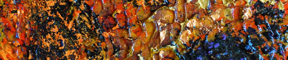
I love the media of pastel – for the rich color and soft shapes that can be depicted. Autumn is a great time to be inspired by the natural landscape, to find images particularly suited to pastels:


Those people familiar with my work probably correctly guessed that the images above are not pastel works but rather are abstract photos that I took and created, with the intent of using them as reference images for future pastel paintings.
Night Train (a Series)
This painting series was a bit unique for me. It had a common theme in terms of the subject matter – all of the images were drawn from what I saw (and captured with photos) during the night while on a train between Edmonton and Vancouver in November of 2007. What was unique for me was the use of oil pastel on a number of the works, and oil paint on a couple of larger ones.

“Rolling Through the Night”, oil on canvas, 41 by 51 cm, Nov 2008

“November Rockies Dusk”, oil pastel on paper, 23 x 30 cm, 2009

“Passing in the Night”, oil pastel on paper, 23 x 30 cm, 2008

“Night Siding”, oil pastel on paper, 23 x 30 cm, 2009

“Dawn Arrival”, oil pastel on paper, 23 x 30 cm, 2009

“Supporting the Dawn”, oil pastel on paper, 30 x 23 cm, 2008

“Morning Train into Vancouver “, oil on hardboard, 61 x 71 cm, 2008
Progress Report – a Street Scene in pastel
On August 14th I got back to work on my recent large pastel piece. By the end of the session this is how it looked:

At this stage I used some pan pastel on the red regions. I liked the intensity and warmth of the Permanent Red. It was my first time trying these pan pastels and I like them but it was a little different using the sponge applicator to apply the pigment. It will take awhile before I am comfortable with working with these but I saw no reason that I won’t be able to use them and various stick pastels together on one piece.

a variety of pastels used in creating this piece
I was torn (as I often seem to be on my work), with how abstract to make the piece. I initially was inspired to do this piece by a photo I had created that eliminated most of the detail and left just a pattern of color regions. However as I worked on this piece on Saturday I found myself adding little bits of detail to make things more recognizable. So, although I had signed this piece and called it done, upon further reflection I’ve decided that I want to do a bit more work on it (still undecided on which way on the abstraction continuum I will go).

detail - of Street Scene, pastel work-in-progress
On the 14th, I also got most of the design laid out on a larger canvas for an oil painting. I have chosen to use a fairly large canvas (24 by 30 inches ; 61×81 cm). I had covered the canvas with a light orangy-red tone and then sketched in my design with charcoal. I also shade in regions of the canvas to get a rudimentary value map.

roughed in sketch on canvas for next oil painting
Pastel Work-In-Progress (part 2)
My second session on this street scene in pastel has involved blending in the previously applied pastel to hide all of the white spots in my panel. I have done this using by fingertips which has been okay on the relatively smooth surface of these panels. On a sanded paper, such as Wallis, my fingers would be raw. This part of the process was fun, like finger painting (but not too messy).

The blending process has dulled the colors and softened all of the edges. My next step will be to take a second look at the colors and make adjustments in value and temperature. My final step will be to go back in and re-establish any harder edges and highlights that I want.

Pastel Street Scene Work-in-progress after 2nd session
Pastel Work-in-Progress (Street Scene
Today I’ve started a large (24×28 in, 61 x71 cm) pastel painting of a street scene in my neighborhood. I was inspired by an iPhone photo I had taken and pushed the color saturation. I am very excited by the start. My challenge will be to maintain the freshness as I continue working in it.

iPhoneography Inspired Abstract Paintings (Exploration – part 3)
Here is the third piece that I worked through to explore the process of using my abstracted iPhone images as references for pastel paintings.

original iPhone photograph

iPhone photo after processing

final abstract pastel painting
I considered this exploration, proof of concept to be successful enough that I am going to proceed to develop a series based on this theme and approach. I do hope and expect that my pastel technique will improve as I do more of these pieces.
I see now that the pastel pieces in these posts look considerably more washed out than they are in real life. I would say they are in fact closer to the enhanced photos than they are to the original photos.
I would certainly appreciate any feedback you have on these pieces
iPhoneography Inspired Abstract Paintings (Exploration – part 2)
Here is another example, where I take an iPhone photo, abstract it and then use it as the basis for an abstract pastel painting:

original photograph (seagulls sitting on a roof)

photo after enhancing/abstracting

final pastel painting (30 x 30 cm)
iPhoneography Inspired Abstract Paintings (Exploration – part 1)
Today (2010 August 2) I am starting a new series of abstract pastel paintings based on images I created with my iPhone. By taking photos of some very simple subjects and then using the apps (particularly Photo Shop Mobile) to adjust the exposure, contrast, saturation as well as some cropping and rotating I have come up with some images that really appealed to me. I wanted to take these larger but I just don’t think the resolution of the camera would allow for an enlargement of reasonable quality. I therefore have begun to explore the idea of using the photos as starting points for some colorful abstract paintings and I’m thinking pastels will give me the color saturation most similar to what appeals to me in the processed photos.
I’m sharing here my first experiments. I have taken three photos and created little (30 by 30 cm, or 1 foot square) works on hardboard prepared with gesso and Golden Acrylic Ground for Pastels. My vision is to produce the series at a size of 60 by 60 cm and maybe even try a few at double those dimensions.
For each of these works I will show the original unprocessed iPhone photo, then the processed photo and finally the pastel work. My intent is not to make an exact copy of the photo image but to capture the essence of it

original iPhone photograph

photo after processing with iPhone apps

final pastel painting (30 x 30 cm)
As it has been a while since I’ve worked with pastels I am not feeling as comfortable with the media as I would like to be but I’m sure I will improve as I work on this series.


