Bending Space and Light to See the Unimaginable
I was doing some experimentation with transforming an image. In this case, I found a simple photo of light shining through some blinds onto my kitchen floor to be interesting – but not that interesting. However I thought that there might be something there, so I played around with the image on my phone, primarily manipulating it in various ways using the Tiny Planet app. I came up with a variety of compositions that I think are quite intriguing.

And visual variations after different digital manipulations:


I like the way these camera apps can let me see differently, to envision compositions that I couldn’t have imagined and which could be quite successful as references or inspiration for paintings.
Old But Not That Old
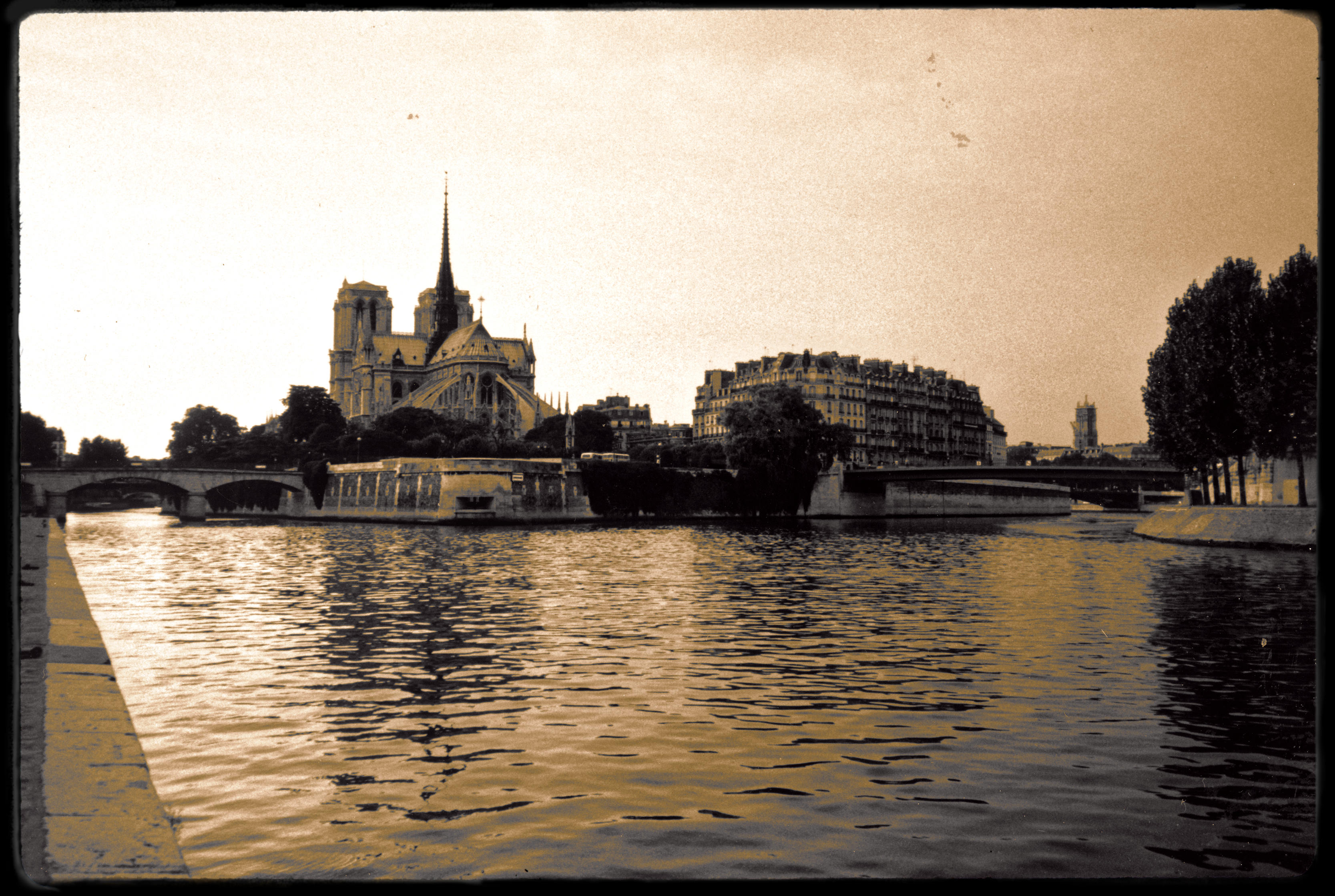
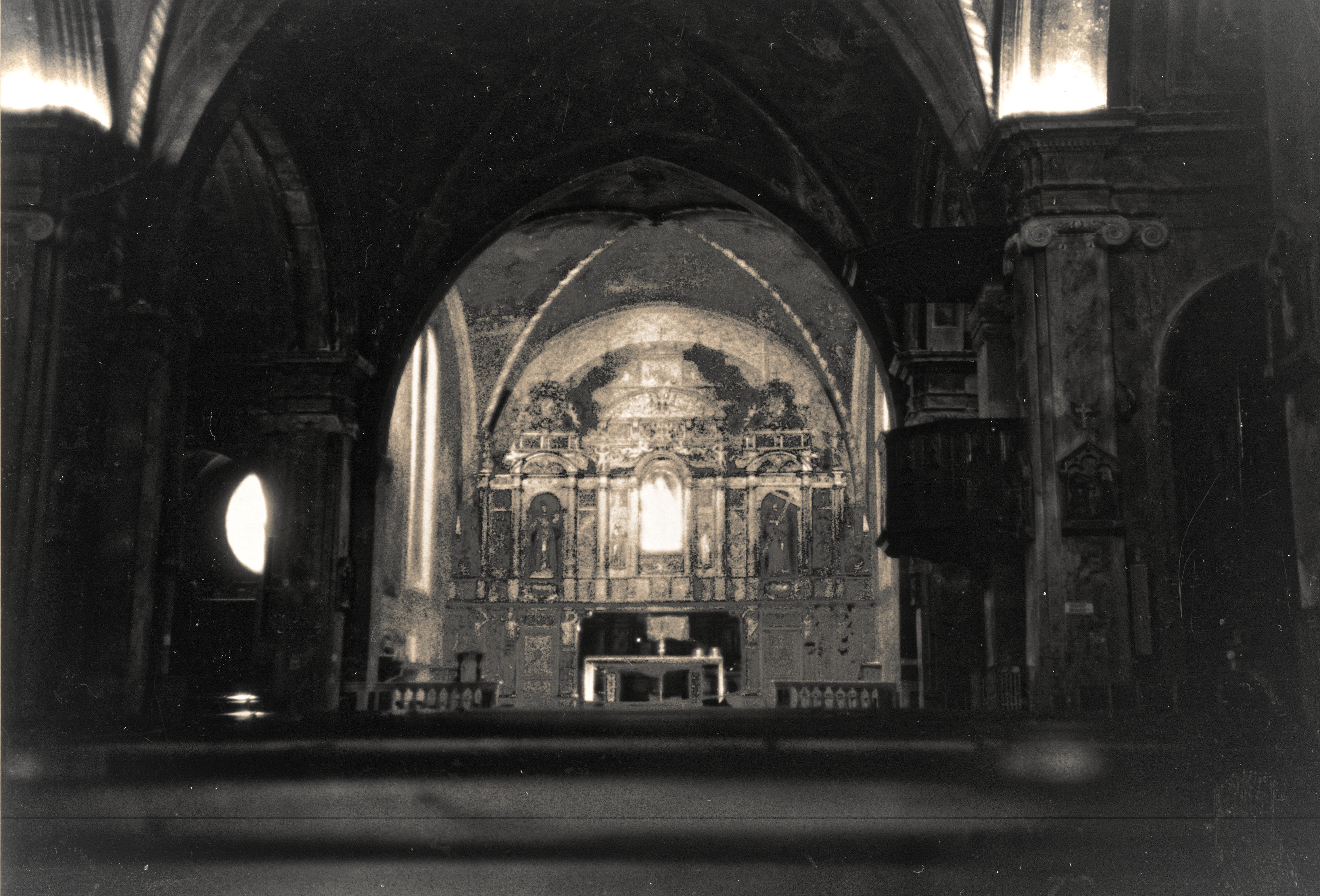
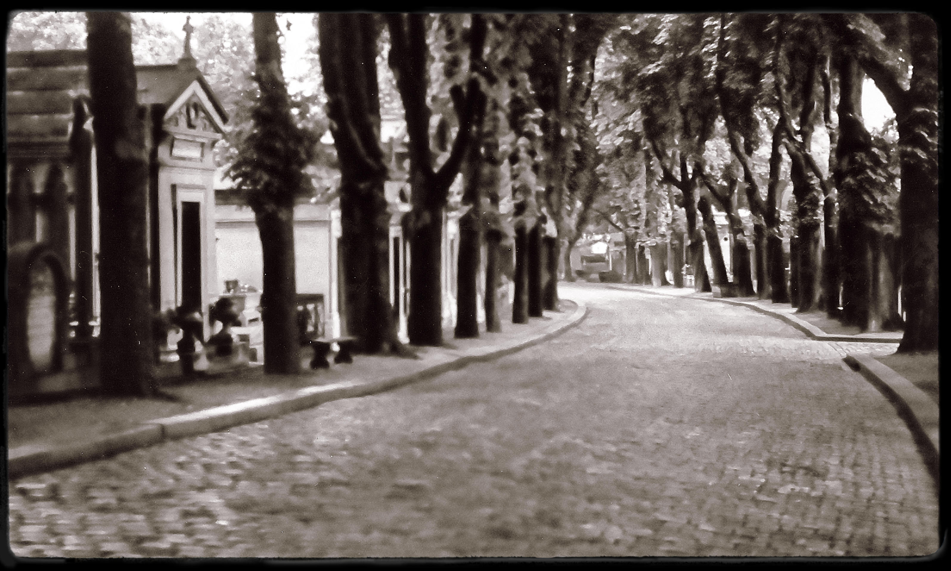
I’ve recently been experimenting with software that simulates the look of photos created through the history of photography. The software that I am using is DxO’s FilmPack 6 (FP6). Among the historical looks that appeal to me and that I have been applying to some of my photos, are the style of the early 1900’s and especially that of Eugene Atget, a French photographer.
I thought that some of my photos, taken in the 80’s, in Paris, might be particularly suited to the historical treatment. My photos from that time were obviously taken on film and I subsequently scanned and digitized them, so they lost some of the detail in the process but given the limits of film and processing from a hundred years ago I think that only adds to the authenticity of the look. Here are two of my photos software-adjusted to simulate the look of photos from around the year 1900:

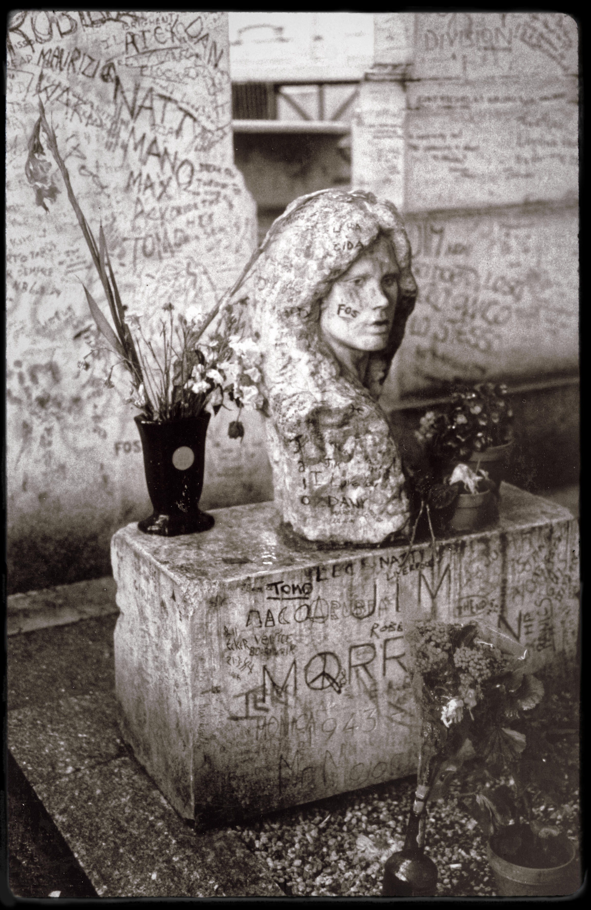
Here are photos that I took in 1984 at Paris’s Père-Lachaise Cemetery. These are intended to look like something Atget may have captured in the first couple of decades of the 1900’s:


One of my reasons to visit that cemetery was to see the final resting place of Jim Morrison:


So what do I think of software manipulation of photos to give them an antique or historical look? Well it is kind of fun and I’ll probably play around with it a bit more, particularly on old, low quality images. I’m not trying to fool anyone but if the look of the photo contributes to the mood conveyed by the image and that helps tell the story then I think the historical treatment is valid.
Creativity in a Small Package – Favorites from 2018
One more look back at 2018 and some of my favorite images. In this post I will focus on photos taken with a “small package” – my camera phone (a Samsung Galaxy S5) and the processed with the apps thereon. Snapseed was probably used on every photo and a few might have also been processed by some digital filtering app (e.g. TinyPlanet and Cameringo).
January:

February:

March:

April:

May:

June:

July:

August:

September:

October:

November:

December:

Most of the better photos that I have taken with my phone/camera (and therefore all of the ones included in this post) are shared on my Instagram account: randytalbot
Autumn Pastels (part 1)
I love the media of pastel – for the rich color and soft shapes that can be depicted. Autumn is a great time to be inspired by the natural landscape, to find images particularly suited to pastels:


Those people familiar with my work probably correctly guessed that the images above are not pastel works but rather are abstract photos that I took and created, with the intent of using them as reference images for future pastel paintings.
A Kick in Your Creative Pants
Do you ever find yourself wanting to ( perhaps even needing to) do something different with your painting – but are feeling blocked, just unable to get started? One solution may be as near as your smartphone.
Specifically I am suggesting that you use some common photo apps with built-in transformative filters. Take a standard image and then apply a filter or six to see what happens. I’m not suggesting just painting the transformed photo but you might start off that way and once you creative juices are flowing, use that first painting as a jumping off point for a second.
These are some variations I came up with using the Cameraringo app on my Android device:


To me each of these variations suggests a different approach/media/color palette that I could use, and once applied to one image I’d likely carry the idea across to a little series.
Incidentally, here is the original image that spawned the five variations shown above:

Moving This Way and That
I have often used camera motion during a long exposure to create an abstract photo. I recently took some of these photos one evening in downtown Edmonton and discovered after the fact that I have used a good variety of camera motions for different effects.

Dance in the Distance
Cycles of Light

Towers of Dripping Light

Side Step

Scratchy
February 17 Abstracts (Part 2)
In my previous post I shared 5 abstract photos from a 2014 February 17 photoshoot. Here are another 5 from that particularly creative and productive batch.

The Corner of My Eye

Blues Three

Brick and Blue Alley

Swimming in Blue

Urban Abstract 8636
As with most of my previous abstract photos, my basic technique is to use a long exposure (made possible by a neutral density filter) and then move the camera in a particular direction during the exposure. Post processing to emphasize color and contrast is usually also required.
Someday, I am looking forward to using some of these photographic images as inspiration, starting points for large paintings.
Three Regions, Three Values

John Salminen
On the second day (Sept. 13) of the Federation of Canadian Artists (FCA) 2012 workshop on Salt Spring Island, our group had the very entertaining and knowledgeable John Salminen as our instructor.
John’s forte is painting urban scenes with watercolor. Our painting location for this day was the Garry Oaks Winery. This place wasn’t an urban location but John found a suitable building on the premises to use as the subject for his demonstration piece. Not being particularly drawn to buildings myself I found this site with many opportunities for landscape paintings. I’m particularly fond of the parallel lines of the rows of the vineyard.

Part of the vineyard at Garry Oaks Winery
Shortly after our arrival at 9 AM, the group gathered together and John began his demonstration. Unlike many instructors who do not like to actually demonstrate by creating a full work from start to finish, John did. He did do a few things in preparation before the group arrived and also did a bit of work while we were scattered in the fields. Nonetheless, through the two demo sessions that he did we got a good idea of how he approached his work. John works in watercolor so many of the tips and techniques (e.g. masking off sections of the painting and use a mouth-blown sprayer) of that he shared won’t have direct applicability to my current style but I have carefully tucked away his approaches for future use.

John Salmimen’s Demonstration Piece
One thing that John talked about which is fully applicable to any media, concerned values and planning your composition. He said to consider that your scene has three regions: a foreground, a middle ground and a background. Also consider that there are three value families: Light (say values 1 to 3, on a nine point scale), middle (values 4 to 6) and darks (values 7 to 9 ). John suggested doing thumbnail sketches of the composition using all of the combinations of value families with the three regions. For example you could do the foreground in your darkest values, your mid-ground with your middle values and the background in your lightest values – or you could flip that around making your foreground lightest and background darkest. Or maybe you make your middle ground darkest
There are 6 combinations of the value families that you can assign to the three different sections of your painting and each can impart a different mood on the scene. Also worth remembering is that you don’t need to be a slave to reality – just because nature is presenting you with a scene where the background (e.g. distant hills and sky) are very light, your painting does not have to be the same (it could be – but that your choice!).
This lesson stuck with me, it was with me through that day as I tried to apply the idea, but it was also there in the back of my mind throughout the rest of the week. A good principle, a good lesson!

Plein Air Painting at Garry Oaks Winery
After the morning demonstration, I wandered up and down the road beside the vineyard looking for just the right scene to capture my attention. I ended up finding a nice spot in the shade under a massive old oak tree, looking out over a section of the vineyard with curving rows. I would spend the rest of the day in that spot and although the painting, didn’t turn out to my satisfaction. I kept repeating my mantra from Day 1 ” I don’t have to produce a finished painting, I am just here to learn”!
During the course of the day, John made the rounds to visit the students scattered around the property, offering individual suggestions. He got to me quite late in the day and suggested that I add a figure as a focal point. I don’t often include figures in my landscapes (although I often thought I should). Anyway, I did put in a suggestion of a figure and have to agree that it does add a focal point to an otherwise ungrounded painting. What do you think?

“Finished” Plein Air Sketch
So that was day 2 – another day of solid learning, another day of not so successful painting – and all in a very beautiful locale. [click here to read about Day 3]

Pastureland

Across the Valley

Lavender and Gold
Abstract Photography on a Painting Trip
When I made the trip from Edmonton to Salt Spring Island for the Federation of Canadian Artists (FCA) 2012 workshop, the primary purpose was the workshop, which was focused on plein air painting. My personal goal for the trip was a bit broader than just painting. For me, this was an opportunity to indulge my other artistic passion – photography. On this trip I carried three cameras with me: a Nikon DSLR with three lenses and accessories (all of the photos in this blog post came out of the Nikon), a Panasonic point-and-shoot camera and my Samsung Galaxy S III . Between these cameras I collected some 2500 images over the 10 days!
Within the realm of photography I had three distinct goals:
1. The first was to capture reference photos of the varied coastal and inland landscapes for use in landscape paintings.
2. My second goal was to take some good, clear quality photos that can stand on their own.
3. The third goal was to capture abstract photo images that might serve as references for abstract paintings.
With these abstract photos I do not look for details or necessarily recognizable elements. I am more interested in capturing colors and patterns and flowing lines. My basic technique for abstracting an image is through motion between the camera and subject, during the exposure. This often requires a slow shutter speed which may necessitate using a neutral density filter. I usually will move the camera (in one or more directions) but on this trip I was also traveling by train so I also made use of the train’s motion relative to the landscape outside. In this blog post I share a few of the abstract images I generated on this trip.

Abstract Landscape 451-045 (from a speeding train)
That first image was shot from the train on the way to Vancouver. When I got to Salt Spring Island I spent my first day (the day before the painting workshop began) hiking with my camera gear. I set off for a favorite place from my visit to the island 5 years earlier – the rain forest in the valley of Cusheon Creek . With the heavy, lush tree cover, it was not very bright (except for where the sun broke through the canopy). These conditions were however quite suitable for the long exposure shots that I was taking.

Abstract Landscape 451-465 (Cusheon Creek)

Abstract Landscape 451-408

Abstract 451-625
As beautiful and quiet as the Cusheon Creek area was, it was a bit unnerving – just as I entered the area I noticed a sign warning that a cougar had been spotted in the area! Fortunately I did not run into one (but it was always in the back of my mind).
After this day of photography, it was 5 days of painting (with a bit, okay quite a bit, of reference photography) before another free day to wander about with the cameras and then a couple of travel days. I returned to Edmonton from Vancouver via the train, so once again had an opportunity to see what type of abstractions I could capture while in motion.

Abstract 453-437
Losing the Landscape
In this post I share some recent abstract landscape photos. I’ve called this losing the landscape because I have pushed the abstraction to the point that the images may not read as originating from the landscape – but they all did.

Abstract 419-076

As I have done to create abstracted photos in the past, these were made using a 2 to 4 second exposure (with neutral density filters to allow that exposure). During the exposure I move the camera about in a linear or rotational fashion, or just with a gentle random shaking.
This next image may be the most suggestive of a landscape, with the green and blue

Abstract 419-102

Abstract 419-129

Abstract 419-138
Abstractions of the February Landscape

Color on the Trunk
This is another series of abstracted photographs. As I have shared previously, the technique I use is to employ a neutral density filter that allow me to use shutter speed in the 2 to 4 second range. During this long exposure I will move the camera – normally in a direction parallel to the lines I wan to emphasize. In the previous and next image I would have followed the line of the vertical trunk. Generally I don’t want too great a range of movement and might go back and forth over a short displacement during the exposure.

Morning Light
“Morning Light” was the result of a bit of a happy accident. I neglected to stop down my neutral density filter sufficiently to get a “proper” exposure. The image was over-exposed but still one I could work with in post-processing. I liked the over blown background exposure that resulted.

Abstract Landscape 381-104

Yellow at the Base
The yellow at the base of the tree (that you may be able to make out in the previous image was from the lichen that I typically find on the trees around the Edmonton region. Especially in the winter this color seems intense. However, straight out of the camera, these long exposure images typically do not have much color, so I usually will bump up the color saturation significantly to get an image that feels to me like what I was actually seeing/feeling.

The Edge of a Hill
Abstracts in Blue
Not much to say about this group of photos, other than that they were all taken using long (4 seconds) hand-held exposures with deliberate camera motion. The early morning time of day is responsible the dominating blue cast to these images.

Blue Fenceline

Abstract 356-033

Abstract Landscape 356-038 (River in December)

Abstract 356-034

Abstract 356-039
It’s All in the Wrist
I frequently have been achieving “painterly”, abstract effects on my photos through the use of intentional camera motion. By using a neutral density filter I am able to shoot at a 2 to 4 second shutter speed which allows me plenty of time to move the camera about, effectively painting with the available light upon my camera sensor. In general the effect is to soften edges and blur the image but depending on the type of motion, different results can be achieved.
Here was the basic scene (i.e regular shutter speed, no motion) that I used for the following demonstration:

Woods in Winter (normal exposure)
In this next image of the same scene I used a 4-second exposure and moved the camera vertically – more like tipping it forward and back using my wrists. This type of motion tends to preserve the vertical elements of the picture, such as tree trunks.

Woods in Winter (Abstraction I)
In this second image (again a 4 second exposure) I moved the camera rapidly in a horizontal fashion throughout the exposure. The effect is to soften, to blur those vertical edges. If there were a strong horizontal element it would of course have been reinforced. I like this motion for a landscape with a definite horizon line.

Woods in Winter (Abstraction II)
In this final variation I incorporated both vertical and horizontal motion – rapidly moving the camera back and forth horizontally for a couple of seconds, then moving it up and down for the last two seconds. The edges are soft and I like the grid like texture that results

Woods in Winter (Abstraction III)
Another of my standard “tricks”/requirements with these long exposures with camera motion is to increase the contrast and color saturation during post processing. Here, for example is tha last image straight out of the camera:

Woods in Winter (Abstraction III - un processed)
Saturation in the Night
Here in the first week of December, there doesn’t seem to be much color in the landscape but not much doesn’t mean none. Here are a series of images created today – mostly four second hand-held exposures with kicked up color saturation and contrast in the post-processing.

Abstract 342-005

Blue Moon 2

Abstract 342-008

Abstract 342-039

Abstract 342-019
First Snow – Abstracted Landscape Photos
Today (2011 November 12) Edmonton had its first (and unusually late) snow of the season. While there are many thing about the snow I am not a fan of, I have been looking forward to applying the camera-motion abstraction technique that I’ve been playing with in recent months, to the snowy landscape. Here are some of my first results:

Abstract Landscape 326-379

Abstract Landscape 325-383

Abstract Landscape 326-390

Abstract Landscape 326-397

Abstract Landscape 326-410
As with my previous photos in this style, the original intent was to give me reference images for paintings. However, so far I have not been able to create a painting that I like as much as or better than the photo (which is okay – for now).
My basic technique in this style is to use a neutral density filter to allow me to get a 2 second exposure. During the exposure I move/shake/vibrate the camera around vigorously. Post processing usually is required to increase contrast and color saturation.
Mystery in the Darkness – 5 Abstract Autumn Photos
As the days of autumn get shorter and more of my waking time is spent in dim light my photography has changed. Perhaps not surprisingly but it s also getting darker – not just physically but also subject wise. I’m finding my favorite images have a mysterious, dreamlike to them quality. One is not sure what one is looking at and that can lead to a feeling of cautiousness, apprehension.

Abstract 218-423

Abstract Landscape 319-519

Abstract 321-787

Stairs to Where?

Tunnel Entrance
So how have I created the dark, ominous feeling in these photos? By keeping the edges soft the viewer is not able to focus in what is seeing and that gets the mind racing, bringing the viewers imagination into play. I frequently achieve those soft edges by using a long exposure (like 2 seconds) and I deliberately move the camera around. I will walk into the scene during the exposure and frequently also be shaking the camera as I do so. I also let the darks dominate in the image, sometimes with strategic highlights and increased contrasts and sometimes with an overall low contrast. Finally I find that black and white can really add to the mystery but as you can see I have also let a dark but saturated blue dominate in this last image, but still managed to convey that mystery that I was looking for.
What to you think makes these images work (in mysterious ways). Do you have any techniques or approaches for achieving similar moods?
Just a Couple of Seconds
The title of this post is “A Couple of Seconds”, as in two-second exposures. For all of the images that follow, I kept the shutter open for a full two seconds. I had recently been experimenting with “long” exposure of 1/4 to 1/2 of a second, during which I panned the camera. I was growing bored with that technique and once I acquired a variable neutral density filter for my wide angle lens I was able to slow down the exposure considerably more!
I was obviously not after nice, sharp images so these photos are also all handheld. Not only was I not worried about keeping the camera steady, I in fact moved the camera in a variety of ways during the exposure! One technique that I discovered worked quite well was to walk during the exposure. I believe that is what I did for this photo:

Abstract Landscape 305-309
No digital filter were used on that last and the next image. All I did was increase the contrast, exposure and color saturation a bit.

Abstract Landscape 305-308
On this next one, I incorporate a twist of the zoom lens during the exposure:

Abstract 305-316
This next one was a horizontal pan of the camera. With a 2-second exposure one must be careful not to move the camera to fast!

Beside the River (305-353)
This next one was produced by a rotational movement during the exposure

Abstract Landscape 305-372
Next a skyline sunset with a diagonal camera movement (still with the 2-second exposure)

Abstract 305-386
A final experiment, where I took the long exposure photo and applied a color infrared film filter from Color Efex 2.0, to further abstract the image.

Abstract Landscape 305-376
Landscape Abstracts for Late Summer
As September 2011 arrived in Edmonton the landscape began a slow color transformation towards autumn hues. As I walked through the river valley with my camera, I captured some of these colors. In this series I have used camera motion to blur the distracting details and emphasize the colors as well as general forms and directions of structure or motion.

Abstract Landscape 283-222-2

Abstract Landscape 283-247
 Abstract 283-242

Abstract Landscape 283-252-3

Abstract Landscape 283-234
The Mid-August Blurs
Five photographic experiments from today (2011 August 18).As I have been playing around with recently, the name of the game is motion-abstraction (i.e. using a slow shutter speed and moving the camera during the exposure. For something different I also combined zooming the telephoto lens while sweeping the camera on some of these shots:

Indigo Blur
With Indigo Blur I took advantage of some colorful deep blue flowers that I came across in a neighborhood flower bed. I use a straight horizontal pan of the camera to create the abstraction.

Abstract 110818-067

Abstract 110818-056
Motion and zoom to abstract that last one with some sunflowers, as with these next two which were taken downtown:

Abstract 110818-094

Abstract 110818-090
5 Favorite Photos From the Last Week of July
If you follow me on Flickr you may have already seen some of these photos but here are some favorites from the last week ( 1 from each day that I took photos).
This first one is a photo of a sunflower growing next to a garage and fence in a back alley in my neighborhood. I was struck by the bright yellow of the sun flower and also the background color. I used a slow shutter speed and camera movement to blur the image and emphasize the color over the details.

Abstract 245-566
Again in this next one, color is the thing and motion blurring is the technique:

Abstract 246-058
Soft Evening Sky I was taken with a telephoto lens looking at the distant edge of the river valley in Edmonton, as the last rays of evening sun kissed the tree tops and provided a red glow.

Soft Evening Sky I
This next photo was purely an experiment in atmosphere. There was no subject, to speak of. I manually focussed as near as I could, just to capture the atmosphere generated by the background plants, a meter or two away, with their blue/green shades:

Abstract 248-131
Finally another motion-abstracted image – this of the Capilano Bridge in Edmonton. I used a telephoto lens and a shutter speed of probably 1/5 second. I panned the camera parallel to the bridge to keep the white and red edges on the bridge sharp and intense.

Capilano Bridge
I have received the comment that these photos look like paintings – I agree. Lately many of my photos that I like best have that quality. It is my intent to actually use these photos as reference or inspiration for paintings, but I am happy with the images as they are as photos. What do you think?
Photos in the Rain
You might think that rain and photography don’t mix – I did. First there is just the hassle of trying to keep your camera dry or your lens unspectled. Today I decided I was going out with my camera (Nikon D80) and just tucked it under my rain jacket, pulling it out only for a quick shot. I also mad a point of keeping the lens pointed down when not in use to minimize the possibility of raindrops striking it.
Perhaps a bigger deterrent to taking the camera out is the fear that there will not be anything to take a picture of. The environment looks very devoid of color – just grey and green everywhere. Also it is relatively dark so one is forced to resort to higher ISO and/or lower f-stops for handheld shots. Or….one couldchange their approach.
Today, that is what I did. I decided I would deliberately go with slow shutter speeds – like around 1/4 second! I wasn’t going to worry about holding the camera steady. In fact I was planning to deliberately move it during the exposure ( a technique I have been playing with recently). I thought this approach was quite successful. I captured a number of images that I was quite happy with. In fact, I think the camera motion added signifcantly to reinforcing the feeling of rain – the directionality and blurring.

Rainy Street

Stairs in the Rain

Forest in the Rain

Fence Posts in the Rain

Dawson Park in the Rain
A Series Experience – Color in the Landscape (part 2)
This is my account of Day 2 (Tuesday July 12) of the Colour in the Landscape course offered by Red Deer College as part of their 2011 Series program.

My Studio Setup
I arrived early to the classroom on this day and immediately went to the room next door where we were set up with studio easels. My plan was to work in the studio from my field sketches – painting in acrylics. The first step was to lay out my acrylics, palette and other paintng supplies. I didn’t have time to start painting that morning but I was ready to get down to work later in the day
Again we started the day with a quick critique of the previous day’s paintings (but I hadn’t gotten further than a few pen and marker sketches). We then had a slide presentation by instructor from instructor Dave More and a few words about the types of contrast. By tenish we got the maps for the daytrip and headed out. This day we went to historic Markerville, a 25 minute drive southwest of Red Deer.

Sign Outside the Creamery Museum
Markerville [map] is a tiny hamlet that historically was the site of a significant settlement for Icelandic settlers. It also featured a regional creamery and was the regional supply center. Today it is a quaint, little community , with a creamery museum and cafe, set on a small river with picturesque surrounding fields and landscapes. Of course we were there for the landscapes (and ice cream).
Upon arrival, our group soon spread out, some choosing village buildings or gardens to paint, others picking scenes with the river, fields or barns. I chose to spend the first hour or so just walking around with my camera, scouting out scenes to sketch later and capturing some reference photos.

Markerville's old one-lane, wood-surfaced bridge

Markerville Creamery Museum (and cafe)

A popular painting subject at Markerville

Painting in a field

Painting in-town (Markerville)

Painting at the edge of town

My colored Conte set
After having a huge and delicious double ice cream cone, I settled in on a bench, offering me a view of the river and fields to the southeast of Markerville.
One of my goals for the days was to try out different sketching media. I first dug out my watercolor sticks and after drawing in the scene in ink, I rubbed in the watercolor stick both dry and set. I also used a watercolor brush to blend in the colors and to apply some details. The result wasn’t great but I was satisfied to give it a try. Next, I changed my viewpoint a bit and dug out my colored Conte sticks. Again I started with an ink drawing but then used the Conte for color and value. Once the basic colors were laid-in I used water and brush for blending.

- Markerville Sketch 2

After these sketches I drove back to the College. I intended to get down to painting in the studio that evening but by the time I got there I found the door locked. Fortunately though that freed me up to take-in a professional development seminar put on by Sharon Moore-Foster of the VAAA ( and who was also a figurative sculpting instructor that week).
See Part 1 in my blog for the story of the first day and for links to related information.
Landscape Photos Abstracted
While at Red Deer College in the Series “Color in the Landscape” painting course, I always had a camera with me to capture reference photos for the landscapes I would be painting (in a mostly representational manner). However, I could not avoid also capturing interesting photos purely for their abstract appeal. I particularly like to put the camera in motion to capture some atmospheric images. I find that the initial image is only half way to the finished abstract image. the post-processing on the computer is equally important for me to realize a satisfying final work. I typically use Capture NX2 to adjust contrast, saturation and to crop the image.

Abstract 238-032
Occasionally I will use a digital “filter” from Color Efex Pro to coax out a unique effect.

Abstract 238-034
A full moon, slow exposure and panning the camera provided the basis for this Rothkoesque image:

Abstract 238-057
In this next image I applied an infrared treatment with Color Efex to get the strong yellow/pink color scheme to an image which I already had achieved the motion blur by a horizonatal sweep of the camera during exposure:

Abstract 238-031
Hillside is one of my favorites of this group and is at the top of my list to turn into a painting. The colors, composition and motion all appeal to me in this image:

Abstract 238-067 (Hillside)
Color and Movement (Part 2)
This is a continuation of my previous post where I shared some motion-abstracted photographs. Here are a few more from that shoot on a windy, cool evening in July after a rainy day.

Abstract 110708-527
For most of these photos I used a shutter speed of between 1/4 and 1/10 of a second with a shutter priority setting. I like to sweep the camera horizonatlly for a general landscape image. The speed of the camera movement as it relates to the shutter speed is something I am continuing to experiment with.

Abstract 110708-520
The vertical structure of tree trunks invites vertical movement of the camera, such as in this image:

Abstract 110708-483
One aspect that I quite like about these motion-abstractions is how the movement blurs out the elements of the urban environment. These images were all taken in the city but you dould easily think they were from a rural environment.

Abstract 110708-518
The wet streets also create some great reflections and invite vertical camera motion

Abstract 110708-489
There is lots of fun to be had in exploring this unconventional idea of deliberately moving the camera and blurring the image. I love the effect and will continue to explore. Have any readers explored this technique?


