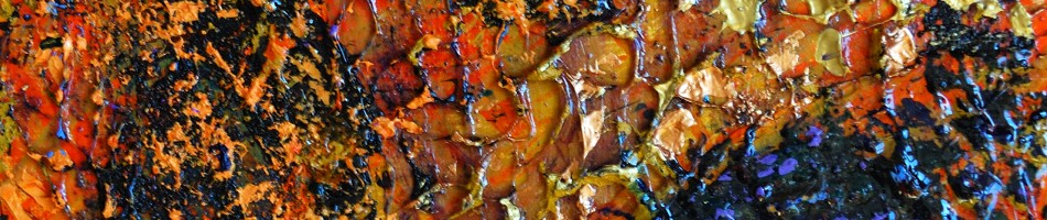
Back in the Paint
I’ve been in a bit of a painting slump for many months (dare I say years?), but recently I’ve been inspired to finish off a few abstracts that I had begun quite a while back, These are all non-representational works using acrylic paints and media, on 30 by 30 cm (12×12″) canvas.


I am expecting/hoping to exhibit these works as part of a group show in September 2022.
Mountains (a Series – Part 2)
In this part 2, I share more mountain paintings, a few more from the Banff region with a couple more based on reference photos from when I cycled the “Golden Triangle” in May of 2010.

“Sun Play II”, oil on hardboard, 41 by 30 cm, 2009

“Mountains Over Vermilion River”, oil on hardboard, 30 by 41 cm, 2010

“Mountain’s Edge”, oil on hardboard, 51 by 61 cm, 2009

“On the Ridge”, oil on canvas, 46 by 46 cm, 2010

“Rocky Mountain Serene” oil on canvas, 23 x 30 cm, 2009

untitled, oil on hardboard, 20 by 30 cm, 2009
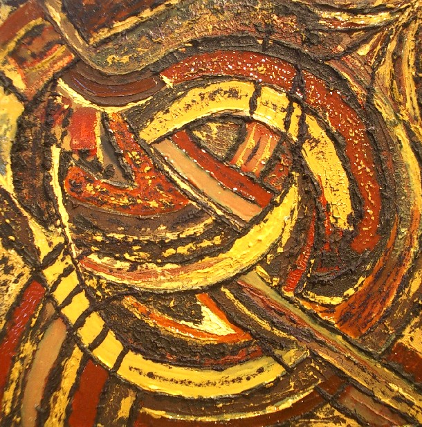
Lines (an Abstract Painting Series)
This small series from the autumn of 2012 was an exploration of mark making into the wet surface of an oil-painted canvas:

“Marks”, oil on hardboard, 30 by 30 cm, 2012

“Fall”, Oil on canvas, 46 by 46 cm, 2012

“Lines in a Field”, oil on hardboard, 30 by 30 cm, 2012

“Spirals”, Oil on canvas, 46 by 46 cm, 2012

“Maxwell”, Oil on hardboard, 61 by 61 cm, 2012
Night Train (a Series)
This painting series was a bit unique for me. It had a common theme in terms of the subject matter – all of the images were drawn from what I saw (and captured with photos) during the night while on a train between Edmonton and Vancouver in November of 2007. What was unique for me was the use of oil pastel on a number of the works, and oil paint on a couple of larger ones.

“Rolling Through the Night”, oil on canvas, 41 by 51 cm, Nov 2008

“November Rockies Dusk”, oil pastel on paper, 23 x 30 cm, 2009

“Passing in the Night”, oil pastel on paper, 23 x 30 cm, 2008

“Night Siding”, oil pastel on paper, 23 x 30 cm, 2009

“Dawn Arrival”, oil pastel on paper, 23 x 30 cm, 2009

“Supporting the Dawn”, oil pastel on paper, 30 x 23 cm, 2008

“Morning Train into Vancouver “, oil on hardboard, 61 x 71 cm, 2008
Earth Light Tapestries Series (part 3)
This blog post shares the last eight works of my 24-piece Earth Light Tapestries series of paintings. The first 16 pieces were shared in Parts 1 and 2 of this blog post.

“Earth Light Tapestry XVII”, acrylic on hardboard, 24 by 24 inches (61 x 61 cm)
“Earth Light Tapestry XVIII”, acrylic on hardboard, 24 by 24 inches (61 x 61 cm)

“Earth Light Tapestry XIX”, acrylic on hardboard, 24 by 24 inches (61 x 61 cm)

“Earth Light Tapestry XX”, acrylic on hardboard, 24 by 24 inches (61 x 61 cm)

“Earth Light Tapestry XXI”, acrylic on hardboard, 24 by 24 inches (61 x 61 cm)

“Earth Light Tapestry XXII”, acrylic on hardboard, 24 by 24 inches (61 x 61 cm)

“Earth Light Tapestry XXIII”, acrylic on hardboard, 24 by 24 inches (61 x 61 cm)
The 24th (final) piece in this series was completed in July 2007, about 8 months after the start. About half of the series formed a solo exhibition at the Gallery at Milner (Library in Edmonton) in November of 2009.

“Earth Light Tapestry XXIV”, acrylic on hardboard, 24 by 24 inches (61 x 61 cm)
Earth Light Tapestries Series (part 2)
In this blog post, I present the middle third (pieces 9 – 16) of my 2006/7 Earth Light Tapestries series of abstract paintings. (The first 8 pieces are shown in Part 1 of this blog post)

“Earth Light Tapestry IX”, acrylic on hardboard, 24 by 24 inches (61 x 61 cm)

“Earth Light Tapestry X”, acrylic on hardboard, 24 by 24 inches (61 x 61 cm)

“Earth Light Tapestry XI”, acrylic on hardboard, 24 by 24 inches (61 x 61 cm)

“Earth Light Tapestry XII”, acrylic on hardboard, 24 by 24 inches (61 x 61 cm)

“Earth Light Tapestry XIII”, acrylic on hardboard, 24 by 24 inches (61 x 61 cm)

“Earth Light Tapestry XIV (The Sun King)”, acrylic on hardboard, 24 by 24 inches (61 x 61 cm)

“Earth Light Tapestry XV”, acrylic on hardboard, 24 by 24 inches (61 x 61 cm)

“Earth Light Tapestry XVI”, acrylic on hardboard, 24 by 24 inches (61 x 61 cm)
The final group of paintings from this series can be seen in part 3 of this blog post.
The Earth Light Tapestries Series (Part 1)
The non-representational (abstract) painting series which I called “Earth Light Tapestries was my largest and most deliberate series. I began the series in late 2006 and finished in early 2007. A dozen pieces from this series were exhibited in a solo show at the Milner Library in Edmonton in November of 2009.
From the start, I set out with the goal to paint 24 pieces, each which would be 24 by 24 inches (61 x 61 cm) in size. I used acrylic paints with the intent to be experimental with textures and additives. The “earth” in the series title refers to the “earth” pigments (ochres, umbers, sienna, etc.) that dominated the colors through this series.
The pieces were just given numerical titles (in roman numerals) corresponding to the order in which they were created.

“Earth Light Tapestry I”, acrylic on hardboard, 24 by 24 inches (61 x 61 cm)

“Earth Light Tapestry II”, acrylic on hardboard, 24 by 24 inches (61 x 61 cm)

“Earth Light Tapestry III”, acrylic on hardboard, 24 by 24 inches (61 x 61 cm)

“Earth Light Tapestry IV (Windy City Sand Storm)”, acrylic on hardboard, 24 by 24 inches (61 x 61 cm)
The “sand” reference in “IV” comes from the texture which was created by the mixing a fine sand into the paint and gel media.

“Earth Light Tapestry V”, acrylic on hardboard, 24 by 24 inches (61 x 61 cm)

“Earth Light Tapestry VI”, acrylic on hardboard, 24 by 24 inches (61 x 61 cm)

“Earth Light Tapestry VII”, acrylic on hardboard, 24 by 24 inches (61 x 61 cm)

“Earth Light Tapestry VIII”, acrylic on hardboard, 24 by 24 inches (61 x 61 cm)
The rest of the pieces in this painting series are presented in Parts 2 and 3 of this blog post series.
Whales Atrium (a Painting Series)
One of my weirdest (and by weird I mean quirky and fun) painting series was the abstract group of paintings that I did in 2010 and which I called “Whales Atrium”*. In this series I played around with various acrylic media and additive in a very exploratory and undirected way. Other than the lack of any direction other than to experiment, the common element to the 12 paintings in this series is the size – all works are on 30 by 30 cm (12 inch) hardboard panels.

“Eggman”

“English Garden”

“Ga Joob”

“I am He”

“If the Sun Don’t Shine”

“I’m Crying”

“Penguin Singing”

“See How They Fly”

“See How They Run”

“Sitting on a Cornflake”

“Smile Like Pigs”

“The Joker Laughs”
Don’t try to read too much into the titles of these works, they were largely an afterthought.
* I am still waiting for someone to “get” the significance of this series title. Let me know if you think you do.
Twitter Art Exhibit 2016
I am participating again in the Twitter Art Exhibit. I mailed my postcard-sized painting today. It should comfortably get to New York by the March 11 deadline.
Here’s an image of my piece, entitled “Restless”:

This, the sixth, Twitter Art Exhibit runs March 31 to April 21 (2016) at the Trygve Lie Gallery in New York City.
Like all of the preceding Twitter art exhibitions, the works are donated by artists from around the world and sold, with proceeds going to charity. There is no theme for the exhibit (the only thread connecting the exhibit is that all of the artists are on Twitter), so the range of works is mind boggling. To get a feel for the diversity, look inside the book featuring the works from the 2014 Twitter Art Exhibit that was held in Orlando.
The first Twitter Art Exhibit was held in 2010 in Moss, Norway, the hometown of founder David Sandum (@DavidSandumArt), after he called upon his many international artist friends on Twitter. The rest as they say is history.
My Twitter handle is: @RandallTT
Photographic References for Abstract Painting?
It has become quite common (an pretty much acceptable) for artists to paint from photographic references rather than from a model in the studio or from a landscape “en plein air”. But do photographs have any value to an “abstract” painter? Well, for me they certainly do. One of my favorite forms of photography is abstractions, especially those that push to the edge of non-representational-ism. Through the use of camera-motion and long exposures, with a bit of post-processing to enhance colors and contrast (and some cropping), I regularly come of with images that I will use to inspire my paintings. Here are some recent examples (all are photographs) that I can’t help thinking would make dramatic largish paintings on canvases/boards/paper in acrylic, oil or pastel.

Surreal Manuscript

Light on Blue

Cubist Portrait

Base

Sweep
My painting are yet to come out of any of these images and I’m not sure how related the final work might appear in comparison to these references but some day I shall tackle them.
Jock Macdonald at the Vancouver Art Gallery
While recently in Vancouver I did what I try to do every time that I make it to that city – visit the Vancouver Art Gallery and very specifically to visit their collection of Emily Carr paintings. The Vancouver Art Gallery occupies a wonderful old building in downtown Vancouver with the top floor gallery devoted to Emily Carr. There are however 3 other floors, exhibiting other shows and what ever I can see there is just a bonus for me. See my previous post about what I saw on the Emily Carr floor on this visit.
Perhaps the highlight for me on this visit was the exhibition “Jock Macdonald: Evolving Forms“. I must admit that before I got there, I’d heard there was an exhibit of work by the Canadian painter J. MacDonald and I just assumed it was J.E.H MacDonald, one of my favorite painters from the Group of Seven.
But wrong I was. It was a different Macdonald and while I guess I’d heard the of Jock Macdonald but never really seen his work – I got a good education!
Jock (more formally James William Galloway) Macdonald was a leading Canadian modernist painter of the 20th Century. He was born (1897) and raised in Scotland before coming to Canada in the 1920’s. He first settled in Vancouver but would live in a number of places in Canada before passing away in 1960 in Toronto after over a decade there.
His early training was as a designer and some of his early work bears the influence of commercial design. In Canada he worked with Fred Varley of the Group of Seven and produced some fine landscape canvases that fit right in with the work of the Group.
But most significantly (and enlightening for me) was his development as a leading modernist abstract painter. In fact he was an important member of the Canadian Painters Eleven group.
 Accompanying the exhibit is a fine catalog (printed by black dog publishing), that I just had to bring home with me as a reminder and reference, after seeing the exhibition.
Jock Macdonald: Evolving Forms runs at the Vancouver Art Gallery until 2015 January 4th.
[link to Jock Macdonald at the National Gallery of Canada website]
Credit to a Curator
It might be said that a curator (of an art exhibition) is doing their job when they aren’t even noticed or thought about by the visitor to an exhibit. Most of the time, I never give any thought to who the curator was or how well they did their job. The exhibit either works and I enjoy it (the art work presented) or it doesn’t really make an impression on me so I just move on.
Last week though, while visiting the Vancouver Art Gallery, I found myself thinking “This shouldn’t be working but it does – Who curated this?”
The exhibit I refer to is “Emily Carr and Landon Mackenzie: Wood Chopper and the Monkey“, described in the exhibition guide:
Engaging in a dialogue with the work of eminent British Columbia artist Emily Carr, Vancouver-based painter Landon Mackenzie presents three thematically arranged galleries with more than 50 artworks that collectively span over 100 years of landscape paintings by these two artists.
Why I was skeptical about this exhibition working is because I hold Emily Carr in such high esteem. I couldn’t imagine presenting her work with anyone but, say Tom Thomson or the Group of Seven members. Landon Mackenzie is a contemporary artist, born in 1954, whose work while including some landscape elements also extends to large abstract paintings that at first glance would seem to have no way of being connected to Carr’s work. Somehow though, the juxtaposition of the work of these two artists works and delivers and pleasing and meaningful experience.

images of paintings by Mackenzie and Carr (from the Exhibition catalog)
This exhibit runs at the Vancouver Art Gallery from 2014 September 20 to 2015 April 6. Incidentally this exhibit is the fourth in a series of exhibitions pairing Carr’s work with that of contemporary artists from the region. It was the first one that I’ve seen (or was even aware of) but my interest is piqued.
Oh, yes, the curator? Grant Arnold, Audain Curator of British Columbia Art – BRAVO!
ASA 2012 New Members Exhibition

Paintings by Randall Talbot in the ASA’s 2012 New Members Show: (L-R) Storm Approaches, Dark Treeline, Spirals
2013 March 8 – the Alberta Society of Artists (ASA) New Members Show Opening
It started about a year earlier when I submitted images of my recent paintings to the ASA in application for full member status. In April 2012 I received word that I had been juried-in as a full member.

One of the things the ASA does to welcome new members is to give them an opportunity to participate in an exclusive New Member’s show. This year it was at the Artpoint Gallery and Studio Society in Calgary, Alberta, Canada.
I had brought my three paintings for the show, from my home in Edmonton to Calgary a few weeks before the show, when I had drove to Calgary for a meeting. I came back down to Calgary for the Opening but this time chose to travel by bus.
I walked from downtown to the Artpoint Gallery for the opening – a pleasant 25 minute stroll in the late afternoon sun of a springlike day. I arrived at the gallery a bit before six for the Opening which ran from 5 to 9. The gallery was pretty quiet at that time, but the crowds built as the evening progressed and the room was pretty full by 7 when the artists each spoke a bit about their work (or in the case of Shona Rae, did a fascinating story-telling performance).

The Artpoint Gallery for the Opening of the ASA’s 2012 New Members Show

ASA Opening at the Artpoint
I was one of 8 new ASA members showing in this exhibition. The others were:
When my turn came to speak, I spoke briefly about my background – a lifelong Albertan with a longtime interest in the visual arts including painting, photography and sculpting. I then said a few words about each of my three paintings in the show (all were painted in 2012 but representing different approaches):

Storm Approaches
acrylic on hardboard
61 by 91 cm (24×36 inches)
This work is an example of by approach of working plein air. This work was developed in the studio based on a small sketch that I had done on-site. The particular location of this was near the central Alberta community of Markerville but it depicts a fairly generic and common prairie/parkland scene on a summer afternoon, when the dark clouds roll in from the west.

Dark Treeline
acrylic on canvas
61 by 91 cm (24×36 inches)
This painting is an example of an increasingly common technique in my work, of using my own abstracted photographs as the inspiration and reference for abstracted landscapes. I use a technique of multiple second exposures while I move the camera to create the abstraction/simplification of the scene.

Spirals
oil on canvas
46 by 46 cm (18x 18 inches)
This non-representational (abstract) work was one of a small series of exploration I began in October of 2012. The key feature of this series is the technique of drawing into the wet oil paint, using a variety of tools, to leave marks and reveal the underpainting.
All in all, it was a great evening – a chance for me to meet some artists and art lovers I had not known and see some interesting work. It was an opening to a good exhibition that I am proud to be part of.
The show runs until March 30th (2013) in Calgary.

The Exterior of the Artpoint Gallery at the end of the Evening
Misericordia Show
Yesterday, 2012 July 7, I had the pleasure of setting up a major show of 43 of my paintings at the Misericordia Hospital in Edmonton.

Paintings laid out in the main hallway prior to hanging
The show includes paintings spanning my painting career of some 25 years. The first paintings encountered as one travels the hallway north of the main lobby is a group of seven paintings depicting the Canadian landscape. This group was inspired was inspired by a train trip I took a few years ago from Toronto to Edmonton, and particularly the rugged Canadian Shield in Northern Ontario.

Four paintings in the northern Canadian Landscape group
After passing through this group of paintings, a turn to the left takes one into the hallway that contains 36 of my paintings – landscapes, abstracts and some in between. First, on the right, are 3 landscape paintings going back to the 1980’s. There is a landscape of the the Auvergne region of France and couple of Alberta landscapes (done in very different styles).

“Woods in Spring” and “Auvergne Landscape”
Next on the right are a group of five paintings of the Alberta prairies from the last 4 years.

“Prairie Gold” and “Canola Fields I”
The Prairies give way to the mountains with a eight paintings (some quite abstracted) from 2009/10 depicting scenes of, from and in the Canadian Rockies.

“Banff Evening Solitude” and “Mountains Over Vermillion River” from the Mountains group
At the end of the long hallway, one turns around and returns, seeing a few more of the mountain group and then a selection of ten paintings from my Earth Light Tapestries series. This series of 24 highly textured acrylic paintings was created on 2006/7 and 14 of them were exhibited at Edmonton’s Milner Library gallery in the fall of 2009. Seeing 10 of these 24 by 24 inch (61×61 cm) works in a row is quite impressive.

“Earth Light Tapestry XIX” and “Earth Light Tapestry XV “
Next are 5 paintings of an abstract nature including 1 that was inspired by an early morning train arrival into Vancouver and two from a scene on Beddis Beach on Salt Spring Island on a foggy November morning in 2007.

“Always Waiting” and “Park Nocturne I”
Back at the start of the long hallway the show ends with a few of my most recent canvases.

“Dark Treeline ” and “Path 2011”
This show runs through to August 17th on the main floor (look for the Day Ward hallway) at the Misericordia Hospital in west Edmonton [map]. The works are for sale during the show – contact the Misericordia Volunteer office (780-735-2754) for more information.
Gerhard Richter, A Life in Painting – a book review
 I recently finished reading Gerhard Richter, A Life in Painting by Dietmar Elger (English translation by Elizabeth M. Solaro). I thoroughly enjoyed the book and the insights it provided into the life and works of Richter. I must confess that before reading this book I knew very little about this iconic German painter. The book describes his life growing up in Dresden, first under Nazi rule and then as part of communist East Germany. He became a painter under the soviet society but escaped to the West in 1961, shortly before the infamous Berlin wall was built.
The book describes Richter’s life in West Germany – his friends and associates, the galleries where he showed his work. At the time Richter was noted for his paintings that looked like black and white (and later color) photographs. He often used newspaper photographs as the reference source for these paintings. In the late sixties he was inspired to do something different and that was to paint elaborate “color charts”. At another phase of his career he painted landscapes in a most serene, classical sense. Richter continued to change and explore different forms of expression including what might be called pure abstract paintings, “photo” paintings of politically charged images from the terrorist activities in Germany in the 1980’s, some interesting works with glass and mirrors and some huge commissions including a stained glass window for the Cologne Cathedral and a huge installation in the Reichstag in Berlin. The book is illustrated with lots of examples (78 plates) of Richter’s work through the years so one gets a good feel for each of these phases in his career.
If you know nothing about Gerhard Richter, this book would be a good place to start and if you want to retain a reference of his life and work this would be a good one to have in your library. The book was written in 2002 and translated in 2009. An excerpt from the book may be read here.
The Triumph of American Painting – a book review
A few month’s back, in my quest to learn more about the Abstract Expressionist movement, I purchased a recent book by Irving Sandler. The description of that book intrigued me in that Sandler would be taking a second look at the movement – having written a definitive account of the history of the Abstract Expressionists, back in 1970. I thought it would be best to first read his first account before learning how his interpretation might have changed with 4o years of thought and observation. As luck would have it, that latest book sat on my “to read” pile and in the meantime I found a copy of his first book at a library.
So having now read that first book, The Triumph of American Painting, A History of Abstract Expressionism, I will tell you what I found. 
I enjoyed this book. It was generally accessible and definitely educational. I have read a few biographies of key Abstract Expressionists and have become familiar with the painting style of maybe half a dozen of these artists but I never felt that I had the big picture. I had questions like: where and why did this movement come into being?, what were the influences (from without and within)? and what was the common thread that brought a number of artists with quite diverse approaches to their art, to be lumped into this movement called abstract expressionism? Having read The Triumph of American Painting, I feel that I got answers to those questions.
The 300 page book is divided into 20 chapters and includes a comprehensive bibliography and a section with short biographies of fifteen of the painters. Just over half of the chapters are devoted to individual artists, while the remaining chapters are of a more general nature, with titles such as The Great Depression, The Gesture Painters, The Color Field Painters, The Abstract Expressionist Scene, 1950-52: Success and Dissolution. The artists to whom individual chapters are devoted are:
- Arshile Gorky
- William Baziotes
- Jackson Pollock
- Willem de Kooning
- Hans Hoffmann
- Clyfford Still
- Mark Rothko
- Barnett Newman
- Adolph Gottlieb
- Robert Motherwell, and
- Ad Reinhardt
The book contains many images, photos of paintings, but unfortunately they are all in black and white. It would have been nice to see these works in full color but surprisingly, these monotone images do still convey a strong sense of the energy and style of the paintings. The only little gripe I had with this book and specifically the images, is a lack of indication of the size of each work – especially given how important this element was to a number of the abstract expressionists.
Through the course of the book Sandler describes the origins of the movement from the politics and philosophies of the time, through the drive to create art that would be distinct from the European traditions and particularly the influence of Paris. I learned how abstract expressionism grew out of cubism and surrealism and strove to be something distinct from these movements and how abstract expressionism could be broken down into two main branches: gesture and color field. The final part of the book describes the eventual recognition of the movement in the 1950’s, after a long struggle for acceptance.
 As mentioned the author, Sandler revisited the movement in his 2009 book, Abstract Expressionism and the American Experience: a Reevaluation. I am looking forward to reading that book and when I do, I will pass along my thoughts.
Tonalism – a Book Preview
Yesterday, I received an art book that I an quite excited about. It will take me a good while to work through this tome, so this is just a quick preview about the book and the subject.

A History of American Tonalism: 1880-1920
The book is A History of American Tonalism: 1880-1920 by David A Cleveland. It is a very large and heavy book (610 pages, 22.5 x 30 cm) – substantial physically and in content and meaning.
Because I am not an art historian, nor a formal student, the term “tonalism” is one of the “-isms” I had not really heard of, although I could imagine what it was about. Here is part of the Amazon product description that caught my attention:
“The first definitive overview of the Tonalist movement-the crucial but long-misunderstood missing link in the evolution of American art … details the development and importance of Tonalism, starting with La Farge, Whistler, and Inness in the late 1800s, through its influence on the development of modernism in the Stieglitz Circle, on to Milton Avery, the Abstract Expressionism of Rothko, Gottlieb and Newman, and finally, postmodern Tonalists like Wolf Kahn … this tome argues Tonalism is the driving force in the development of a distinctly American vision, reflecting abstract and spiritual impulses that remain a force in American art today…” [my addition of bold font]
This aspect of a missing link between of nineteenth century landscape painting which I’ve had an interest in, with “modern” art which I have a growing fascination with, immediately caught my interest. I have been learning a lot about the abstract expressionist movement and am a major fan of Wolf Kahn’s work. That these could all be connected, was a concept I just have to explore – to help me understand the common thread in what inspires my work. As you would get from the title, the focus of the book is on the 40-year period between the 19th and 20th centuries but I like that it does reach forward to other artists and movements in the 1900’s.
So at first glance, this book looks good, but it will not be an easy read. There are lots of photos of paintings although few are full page images. This is not a picture book; it is a book with lots of text – reading and thinking will be required. I am looking forward to spending a good part of my upcoming summer doing just that. Once I have done so, I will follow up with a proper book review
Abstract Harris and Carr
Today I got back to the Art Gallery of Alberta. My first motivation was to re-visit the Emily Carr exhibit. My second reason was a visit to the new exhibition of abstract paintings by Lawren Harris, renowned landscape painter with the Canadian Group of Seven.
Lawren Harris was a founding member of the Canadian landscape school but even in some of his later landscape paintings the move to abstraction was very apparent. This exhibit, simply and appropriately called Lawren Harris Abstractions, focuses solely on the abstract works later in Harris’ career. The core of this relatively small exhibit are six paintings from the Art Gallery of Alberta’s own collection. Supplementing those works are sixteen from the National Gallery of Canada. Probably half of the works are large (a meter or two) paintings and very interestingly there are a number of abstract sketches, some apparently preparatory sketches for the works on canvas. There is a certain spirituality to Harris abstracts relating to Harris’s following of Theosophy.
I really enjoyed these Harris works and spent some time studying the curves, colors, shapes, volumes and composition. They are interesting from across the room and intriguing up close. The Harris exhibit runs through to September 11, 2011.
For more about Harris and his abstracts check out this CBC story from 1961.
The other exhibit I had an opportunity to visit today was Nature and Spirit: Emily Carr’s Coastal Landscapes. I had seen this exhibit a few weeks ago and at the time vowed to visit again. It was just as impressive this time as it was the first time. I focused just on Carr’s paintings today foregoing the companion exhibit of Canadian west coast native art and artifacts. For more on my first visit see my earlier blog post.
The Carr exhibit runs until 2011 June 5 and I will get back, at least one more time.
William Wray – Urban Landscape Painter
With this, I am starting a new series of blog posts to point my readers to artists I know and respect. Many of the artist’s I currently follow are part of the twitter community and may well be known to each other and to you. There are a few artists that I came to know from before twitter (yes there was a time) – particularly from the WetCanvas on-line community and this artist is one of those.
The artist to introduce you to is California painter William Wray. He often paints what I would describe as gritty, urban landscapes. It is not uncommon to see industrial factories, gas stations or downtown canyons. He has also made compelling works with car, trains and shopping carts as the subjects. Wray’s unique style is also applied to some still life and figure painting.
His subject matter often makes his work distinctive but so is masterful use of color, light and shadow. Words can’t really do justice so please visit his website and his blog to see his works and to learn more about him.
Be sure to also look for the links to a couple of books he has of his paintings.
Disconnected
Here is an non-representational painting I completed in January 2010:

- Disconnected, acrylic on hardboard, 71 by 61 cm (28″ x 24″)
I created this on a black-gessoed hardboard panel. It involved the application of numerous layers of acrylic paints applied with a palette knife. I also used a squeegee to apply and spread the paint. To give a rough texture and hazy effect I added fine sand to clear gel and spread it over sections.
Diebenkorn in New Mexico – a Book Review
I fell in love with the art of Richard Diebenkorn first when I saw some of his pieces in San Francisco at the Museum of Modern Art, then when I read “The Art of Richard Diebenkorn” by Jane Livingston (See my earlier blog post). I was hungry to learn more about him and to see more of his work.

This book, Richard Diebenkorn in New Mexico, satisfied my hunger. It focuses on Diebenkorn’s time in Albuquerque while he was doing a Masters degree at the University of New Mexico. He was there from 1950 to 1952 and produced some 200 works (paintings mainly but also some prints and sculpture). I like how the paintings occasionally hint at the colors and forms of the New Mexico landscape.
Richard Diebenkorn in New Mexico, the 2007 book was published in conjunction with an exhibition of the same name. It features 83 full page color plates and many other photos of his work amongst the text. The text is made up of an introduction by Charles M. Lovell and 3 essays – by Charles Strong and Gerald Nordland and Mark Lavatelli. These three takes on Diebenkorn’s time in the region have some overlap but are nonetheless each interesting.
Charles Strong is a curator and artist who studied with Diebenkorn for a short time in San Francisco. Strong’s two page “The Sky is the Ocean” serves as an overview to Diebenkorn’s life and work.
Gerald Nordland is the author of the book Richard Diebenkorn: Revised and Expanded and a recognized authority on Diebenkorn. His substantial section of this book entitled “Richard Diebenkorn: Routes to New Mexico” sets the stage for the Albuquerque period describing Diebenkorn’s life from his childhood to his life as a student in New Mexico (and a little beyond)
The Mark Lavatelli short, 5 page essay, “Diebenkorn’s Albuquerque Years” focuses on just that. He talks about the paintings from that time as well as the influences and how the period shaped Diebenkorn’s style. Lavatelli too know the work of Diebenkorn well, having done his MFA on Diebenkorn’s paintings from the New Mexico period.
All in all, this is a good book. I’d loved to have seen the exhibition which this volume accompanied but since I didn’t, this book will have to do. I know I will be coming back to the images in this book regularly in the future, as I enjoy and try to understand, the works of this wonderful painter: Richard Diebenkorn.
For more, read the New York Times review of the book.
Rolling Through the Night
This is a painting I produced in November of 2008, inspired by a journey that I took a year before that:

Rolling Through The Night, 41x51 cm (16x20") oil on canvas
This painting is one of a number of paintings in a series I call my Night Train series. Seven works in the series have been completed to date – in oil and oil pastels. Click on this link to see the other works in this series on my website.
The series was inspired by a VIA Rail train trip that I took in November 2007 from Edmonton to Vancouver (this was the first leg of the journey that took me to Salt Spring Island for a week of exploring, photography and painting – but that is another story for another time). The VIA Canadian traveled across the province of British Columbia through the long night, arriving in Vancouver at dawn. I spent a lot of time through the evening and night staring out the window, often taking some long exposure, hand-held photos which served as the inspiration for the paintings.
This series was a bit of a departure for me both in the degree to which I abstracted the landscape and also the darkness of the color palette. Overall I was very pleased with the outcome.
This painting was donated to (and sold at) a fund raising auction for the Visual Arts Alberta Association (VAAA) in November of 2009. I find the idea of capturing the mysterious self-abstracting night landscape as seen from a train, very compelling. I fully expect to return to this theme and series again in the future.
*This painting was reproduced on my latest art card and I would be happy to mail one of these postcards to anyone requesting one (while supplies last).
Discovering Diebenkorn
It’s always exciting to discover a “new” artist – not new as in the sense of young and undiscovered, just in terms of an artist that you haven’t yet gotten to know or appreciate. If I had a proper, formal art education there would be nothing new about the artist in this story but I didn’t, so let me take you on my voyage of discovery.
In July of 2010 I visited San Francisco for the first time. Among the many sites on my list to see was the San Francisco Museum of Modern Art (SFMOMA). I previously shared some photos and impressions of the museum itself in this blog entry so I will jump straight to my discovery:

"Cityscape I" by Richard Diebenkorn at the SFMOMA
Cityscape I took my breath away. It made a connection with me before I even knew whose work I was looking at. I had to read the title to know it was Richard Diebenkorn, a name I’d heard of but knew nothing about, other than his association with the 20th Century American Abstract Expressionist movement. In this work I liked the way Diebenkorn has taken an obvious landscape subject and flattened the space to abstract the scene
Fortunately with Diebenkorn having lived in the San Francicso area, the SFMOMA has a bit of a collection of his work and there were at least a couple I was able to see on my visit. This was another one that had me nodding by head, “Yes, I really, really like this!” :
 enhanced")
Richard Diebenkorn at the SFMOMA
There is so much I like about this painting. I like how it combines a figure with a landscape. I like the full value range and the demonstration that a lot of detail is not necessary.
After this initial exposure to Diebenkorn’s work I had to know more and see more. When I got home I quickly searched for books of his work and life and ordered The Life of Richard Diebenkorn by Jane Livingston

"The Art of Richard Diebenkorn" by Jane Livingston
This was a very good book. It gave me a biography of the artist and a good selection of images of his works. It is a book I read through and have gone back to browse in a number of times since.
The paintings of Diebenkorn appeal to me and teach me a number of things. As previously mentioned, the fact that his subject matter covers the spectrum from landscapes and figures, to highly abstracted non-representational is something I find gives me license, or confidence to similarly explore a range of subjects.
I also made some discoveries through viewing, reading-about and contemplating Diebenkorn’s work. My eyes were opened to how the landscape can be abstracted by flattening of space (providing an aerial perspective). Diebenkorn demonstrates the value of leaving marks of the painting process to give a richness to the work. I also became aware of how he uses inside and outside scenes in a single painting – I love that! These are all things that I fully intend to explore and test in my own work and I am excited about that.
I may have been late to the show but having now discovered Richard Diebenkorn, I look forward to what more I can learn and I certainly won’t hesitate to recommend others to fully discover this inspirational artist.
Guilded Show at Profiles
Last Thursday (September 2, 2010) evening, I attended the opening of the “Guilded” show at the Profiles Public Art Gallery in St. Albert. The exhibition features the work of nine artists in the St. Albert arts guilds. Most of the works are paintings but there is a nice variety of styles of work, including a lovely textile work and a series of striking Raku torsos. Although I enjoyed all of the works, my favorites were the abstract paintings of Rick Rogers and the impressive, expressive landscapes of Mike Dendy.
Rick’s painting Attachments is one not to miss. This painting is done with acrylics on hardware cloth and has a delightful translucent quality to it. It looks good on a wall and not doubt would look even more magical if it were positioned to allow light to shine through it.
If you happen to be in downtown St. Albert before the show closes on October 2nd, it is certainly worth stopping in to have a look.


