Back in the Paint
I’ve been in a bit of a painting slump for many months (dare I say years?), but recently I’ve been inspired to finish off a few abstracts that I had begun quite a while back, These are all non-representational works using acrylic paints and media, on 30 by 30 cm (12×12″) canvas.


I am expecting/hoping to exhibit these works as part of a group show in September 2022.
The “2012-08” Series
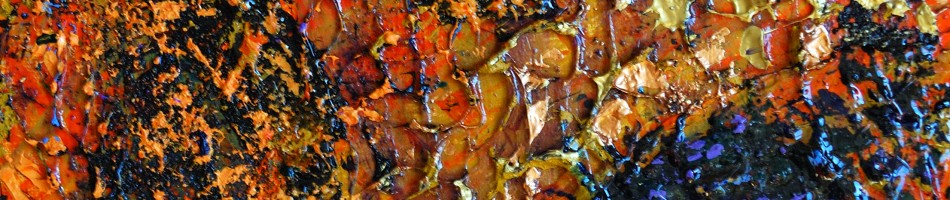
In August of 2012 I started a small series of large canvases. This series of abstract paintings were all done on 91 by 121 cm (3 x 4 feet) canvasses. I used generous amounts of gel with the acrylic paints for think, juicy textures. The color palette was restricted to the primaries, plus black and white.

“2012-08-01” acrylic on canvas, 91 by 121 cm, 2012

“2012-08-02” acrylic on canvas, 91 by 121 cm, 2012

“2012-08-03” acrylic on canvas, 91 by 121 cm, 2012

“2012-08-04” acrylic on canvas, 91 by 121 cm, 2012

“2012-08-05” acrylic on canvas, 91 by 121 cm, 2012

“2012-08-06” acrylic on canvas, 91 by 121 cm, 2012
West Coast Trees (Painting Series)
In my previous blog post I shared a series of my landscape paintings of scenes from Canada’s west coast. Again, these were painted around 1992, in fact these paintings were intermingled with the more open coastal scenes done during the same period.

“Candles in the Rain”, acrylic on hardboard, 51 by 61 cm, 1992

“Red Trees”, acrylic on hardboard, 36 by 38 cm, 1992

“Red Path and Trees (study)”, acrylic on hardboard, 51 by 61 cm, 1992

“In the Darkness Grows”, acrylic on hardboard, 36 by 38 cm, 1992

“Together”, acrylic on canvas, 51 by 61 cm, 1992
West Coast (a Painting Series)
In around 1992 after visits to Canada’s west coast (particularly the Gulf Islands), I produced, perhaps my favorite series of paintings. This collection featured trees(and/or driftwood), shorelines and often active skies. My works at this time may show signs of influence from the paintings of Emily Carr.

“Bending to the Sky”, acrylic on hardboard, 61 by 61 cm, 1992

“Windswept”, acrylic on hardboard, 51 by 61 cm, 1992

“Red Leaning”, acrylic on hardboard, 12 by 15 cm, 1992

“Waiting on Island View Beach”, acrylic on canvas, 61 by 76 cm, 1992

“Turning Sky”, acrylic on canvas, 61 by 61 cm, 1992
Earth Light Tapestries Series (part 3)
This blog post shares the last eight works of my 24-piece Earth Light Tapestries series of paintings. The first 16 pieces were shared in Parts 1 and 2 of this blog post.

“Earth Light Tapestry XVII”, acrylic on hardboard, 24 by 24 inches (61 x 61 cm)
“Earth Light Tapestry XVIII”, acrylic on hardboard, 24 by 24 inches (61 x 61 cm)

“Earth Light Tapestry XIX”, acrylic on hardboard, 24 by 24 inches (61 x 61 cm)

“Earth Light Tapestry XX”, acrylic on hardboard, 24 by 24 inches (61 x 61 cm)

“Earth Light Tapestry XXI”, acrylic on hardboard, 24 by 24 inches (61 x 61 cm)

“Earth Light Tapestry XXII”, acrylic on hardboard, 24 by 24 inches (61 x 61 cm)

“Earth Light Tapestry XXIII”, acrylic on hardboard, 24 by 24 inches (61 x 61 cm)
The 24th (final) piece in this series was completed in July 2007, about 8 months after the start. About half of the series formed a solo exhibition at the Gallery at Milner (Library in Edmonton) in November of 2009.

“Earth Light Tapestry XXIV”, acrylic on hardboard, 24 by 24 inches (61 x 61 cm)
Earth Light Tapestries Series (part 2)
In this blog post, I present the middle third (pieces 9 – 16) of my 2006/7 Earth Light Tapestries series of abstract paintings. (The first 8 pieces are shown in Part 1 of this blog post)

“Earth Light Tapestry IX”, acrylic on hardboard, 24 by 24 inches (61 x 61 cm)

“Earth Light Tapestry X”, acrylic on hardboard, 24 by 24 inches (61 x 61 cm)

“Earth Light Tapestry XI”, acrylic on hardboard, 24 by 24 inches (61 x 61 cm)

“Earth Light Tapestry XII”, acrylic on hardboard, 24 by 24 inches (61 x 61 cm)

“Earth Light Tapestry XIII”, acrylic on hardboard, 24 by 24 inches (61 x 61 cm)

“Earth Light Tapestry XIV (The Sun King)”, acrylic on hardboard, 24 by 24 inches (61 x 61 cm)

“Earth Light Tapestry XV”, acrylic on hardboard, 24 by 24 inches (61 x 61 cm)

“Earth Light Tapestry XVI”, acrylic on hardboard, 24 by 24 inches (61 x 61 cm)
The final group of paintings from this series can be seen in part 3 of this blog post.
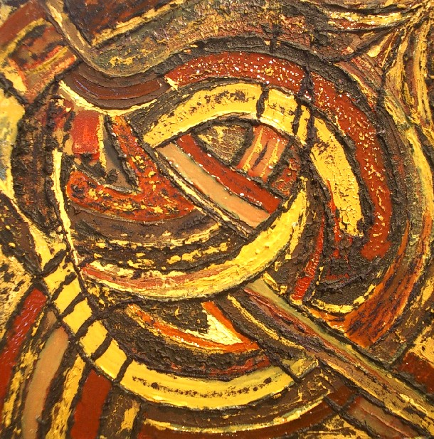
The Earth Light Tapestries Series (Part 1)
The non-representational (abstract) painting series which I called “Earth Light Tapestries was my largest and most deliberate series. I began the series in late 2006 and finished in early 2007. A dozen pieces from this series were exhibited in a solo show at the Milner Library in Edmonton in November of 2009.
From the start, I set out with the goal to paint 24 pieces, each which would be 24 by 24 inches (61 x 61 cm) in size. I used acrylic paints with the intent to be experimental with textures and additives. The “earth” in the series title refers to the “earth” pigments (ochres, umbers, sienna, etc.) that dominated the colors through this series.
The pieces were just given numerical titles (in roman numerals) corresponding to the order in which they were created.

“Earth Light Tapestry I”, acrylic on hardboard, 24 by 24 inches (61 x 61 cm)

“Earth Light Tapestry II”, acrylic on hardboard, 24 by 24 inches (61 x 61 cm)

“Earth Light Tapestry III”, acrylic on hardboard, 24 by 24 inches (61 x 61 cm)

“Earth Light Tapestry IV (Windy City Sand Storm)”, acrylic on hardboard, 24 by 24 inches (61 x 61 cm)
The “sand” reference in “IV” comes from the texture which was created by the mixing a fine sand into the paint and gel media.

“Earth Light Tapestry V”, acrylic on hardboard, 24 by 24 inches (61 x 61 cm)

“Earth Light Tapestry VI”, acrylic on hardboard, 24 by 24 inches (61 x 61 cm)

“Earth Light Tapestry VII”, acrylic on hardboard, 24 by 24 inches (61 x 61 cm)

“Earth Light Tapestry VIII”, acrylic on hardboard, 24 by 24 inches (61 x 61 cm)
The rest of the pieces in this painting series are presented in Parts 2 and 3 of this blog post series.
Alberta Landscapes (Painting Series, Before and After 2010)
In my previous blog post I shared my Alberta landscape paintings from the particularly busy year of 2010. In this post, I share my landscape works from a couple years before and after that year.

“Red Deer Field and Trees (study)”, oil on hardboard, 20 x 25 cm, 2007

“Canola Fields I”, oil on canvas, 51 x 76 cm, 2008

“Canola Fields II”, oil on canvas, 76 x 51 cm, 2008
(See the previous blog post for Alberta landscape paintings from the year 2010)

“North Saskatchewan River”, oil on canvas, 61 x 91 cm, 2011

“Storm Approaches” acrylic on hardboard, 61 x 91 cm, 2012

“Dark Treeline”, acrylic on canvas, 61 x 91 cm, 2012

“Bend in the North Saskatchewan River”, water color on paper, 10 x 15 cm, 2012
Alberta Landscapes – 1990 (a Painting Series)
In the late 1980’s and early 1990’s the subject matter of my painting was primarily landscapes, and more specifically the prairies, parkland and foothills of central part of Alberta.

“Approaching Prairie Storm”, acrylic on canvas, 61 x 91 cm, c. 1989

“Central Alberta Summer Horizon”, acrylic on hardboard, 61 x 41 cm, c. 1989

“Central Alberta Landscape”, acrylic on hardboard, 46 x 61 cm, 1992

“Red Deer College”, acrylic on canvas, 91 x 121 cm, c. 1989

“Restless Foothills”, acrylic on hardboard, 41 x 61 cm, 1991

“Road to the Rockies”, acrylic on canvas, 61 x 91 cm, 1991

“Rolling Prairie with Fence”, acrylic on canvas, 61 x 91 cm, 1991

“Southern Alberta Foothills”, acrylic on canvas, 51 x 91 cm, 1991

“Thunder Cloud”, acrylic on hardboard, 20 x 25 cm, c. 1990

“Stripey Fields”, acrylic on hardboard, 41 x 61 cm, 1988
Whales Atrium (a Painting Series)
One of my weirdest (and by weird I mean quirky and fun) painting series was the abstract group of paintings that I did in 2010 and which I called “Whales Atrium”*. In this series I played around with various acrylic media and additive in a very exploratory and undirected way. Other than the lack of any direction other than to experiment, the common element to the 12 paintings in this series is the size – all works are on 30 by 30 cm (12 inch) hardboard panels.

“Eggman”

“English Garden”

“Ga Joob”

“I am He”

“If the Sun Don’t Shine”

“I’m Crying”

“Penguin Singing”

“See How They Fly”

“See How They Run”

“Sitting on a Cornflake”

“Smile Like Pigs”

“The Joker Laughs”
Don’t try to read too much into the titles of these works, they were largely an afterthought.
* I am still waiting for someone to “get” the significance of this series title. Let me know if you think you do.
Auvergne (Painting Series) – part 2
In Part 1, I shared some plein air paintings I made during a 3 week stay in a small village in the Auvergne region of central France. I was captivated by the area and it continued to be an influence on my painting for years. Not only did I paint while there but I also sketched and took many photos. These references and my memories inspired these paintings:

“Montaigut” oil on hardboard, 61 x 41 cm, c. 1986

“Steve Painting in Field”, acrylic on hardboard, 46 x 61 cm, c. 1986

“Evening Stroll Back to Montaigut”, acrylic on canvas, 51 x 76 cm, c. 1988

“Auvergne Landscape”, acrylic on hardboard, 46 x 61 cm, 1984 AoM
There are a few other paintings I have done of rural France that I count in this series, although I can’t be sure the scenes are from my 1984 visit to Auvergne or from another of my two trips to France during the eighties.

“Country Road”, acrylic on hardboard, 41 x 30 cm, c. 1985

“Maison dans la Campagne”, acrylic on canvas, 46 x 30 cm, c. 1986

“Red Roof in French Landscape”, acrylic on hardboard, 30 x 46 cm, c. 1988
Twitter Art Exhibit 2016
I am participating again in the Twitter Art Exhibit. I mailed my postcard-sized painting today. It should comfortably get to New York by the March 11 deadline.
Here’s an image of my piece, entitled “Restless”:

This, the sixth, Twitter Art Exhibit runs March 31 to April 21 (2016) at the Trygve Lie Gallery in New York City.
Like all of the preceding Twitter art exhibitions, the works are donated by artists from around the world and sold, with proceeds going to charity. There is no theme for the exhibit (the only thread connecting the exhibit is that all of the artists are on Twitter), so the range of works is mind boggling. To get a feel for the diversity, look inside the book featuring the works from the 2014 Twitter Art Exhibit that was held in Orlando.
The first Twitter Art Exhibit was held in 2010 in Moss, Norway, the hometown of founder David Sandum (@DavidSandumArt), after he called upon his many international artist friends on Twitter. The rest as they say is history.
My Twitter handle is: @RandallTT
A Studio to Call your Own – Reminiscing
A year ago I was packing up the studio that I’d called “my space” for 16 months. It was hard. I came to the reluctant decision that I had to move out of lovely studio space.
It was May of 2014 when I noticed a sign on the outside of a historic (over a century old) building in downtown Edmonton, a comfortable half hour walk from my home.

Studios were located on the 3rd and 4th floors, in a variety of sizes. I was able to get a very generous space of over 400 square feet. That amount of space was very beneficial to me. Of course it meant that I didn’t have to clean up after every creative session, packing away wet materials and works in progress. It meant that I could set up separate work spaces for my two main painting medias: oil and acrylic.

First into the studio space – my oils
The space gave me room to get, and keep, organized. A set of shelves, behind my work table and next to an easel were dedicated to my acrylic paints and media.

Acrylics Shelf
A similar set-up of shelves, table and easel on the other side of the room was dedicated to oils:

Studio Divided
The space allowed me to work larger than I had been. Canvases of 3 by 4 feet (90 by 120 cm) became my standard and I assembled some even larger stretchers (but never did get around to putting canvas on them).

Big Stretchers
Even with the two work spaces, I still had lots of floor space to use when I needed to paint on the floor, to build stretchers or for varnishing.

Paintings on the floor for varnishing
In the end it was time to retreat to a much smaller home studio, disassembling shelves and stretchers and hauling out many carloads of supplies and many mostly-completed paintings

Packed up and Ready to go
And in the end that highly creative space reverts to just a space.

The Final View – Empty Studio (like in the beginning)
A year later I can see ever so clearer how important that space was. Although I do have some space at home that I am re-converting into a working studio, progress has been very slow. I didn’t paint at all for half a year. Finally I cleared out a little space and created 3 works. Now I am back into re-organizing mode that will hopefully give me room for a couple of easels and two distinct little work areas (one for acrylics and one for oils, with a third, a small table for pastel work).
The other important function of that studio space was storage. I had lots of space for materials – for stretcher bars and canvas rolls, for primed canvases and boards, for paintings in various states of progress, completed works awaiting varnish and framing and exhibition-ready pieces. Now I have all these things stored around my house in different rooms, paintings stacked up, eight deep, against walls and bookshelves. My ultimate goal is to make my studio space just a working space – the storage issue is a whole other problem that I will have to address. I suppose someday it will all come together …
ASA 2012 New Members Exhibition

Paintings by Randall Talbot in the ASA’s 2012 New Members Show: (L-R) Storm Approaches, Dark Treeline, Spirals
2013 March 8 – the Alberta Society of Artists (ASA) New Members Show Opening
It started about a year earlier when I submitted images of my recent paintings to the ASA in application for full member status. In April 2012 I received word that I had been juried-in as a full member.

One of the things the ASA does to welcome new members is to give them an opportunity to participate in an exclusive New Member’s show. This year it was at the Artpoint Gallery and Studio Society in Calgary, Alberta, Canada.
I had brought my three paintings for the show, from my home in Edmonton to Calgary a few weeks before the show, when I had drove to Calgary for a meeting. I came back down to Calgary for the Opening but this time chose to travel by bus.
I walked from downtown to the Artpoint Gallery for the opening – a pleasant 25 minute stroll in the late afternoon sun of a springlike day. I arrived at the gallery a bit before six for the Opening which ran from 5 to 9. The gallery was pretty quiet at that time, but the crowds built as the evening progressed and the room was pretty full by 7 when the artists each spoke a bit about their work (or in the case of Shona Rae, did a fascinating story-telling performance).

The Artpoint Gallery for the Opening of the ASA’s 2012 New Members Show

ASA Opening at the Artpoint
I was one of 8 new ASA members showing in this exhibition. The others were:
When my turn came to speak, I spoke briefly about my background – a lifelong Albertan with a longtime interest in the visual arts including painting, photography and sculpting. I then said a few words about each of my three paintings in the show (all were painted in 2012 but representing different approaches):

Storm Approaches
acrylic on hardboard
61 by 91 cm (24×36 inches)
This work is an example of by approach of working plein air. This work was developed in the studio based on a small sketch that I had done on-site. The particular location of this was near the central Alberta community of Markerville but it depicts a fairly generic and common prairie/parkland scene on a summer afternoon, when the dark clouds roll in from the west.

Dark Treeline
acrylic on canvas
61 by 91 cm (24×36 inches)
This painting is an example of an increasingly common technique in my work, of using my own abstracted photographs as the inspiration and reference for abstracted landscapes. I use a technique of multiple second exposures while I move the camera to create the abstraction/simplification of the scene.

Spirals
oil on canvas
46 by 46 cm (18x 18 inches)
This non-representational (abstract) work was one of a small series of exploration I began in October of 2012. The key feature of this series is the technique of drawing into the wet oil paint, using a variety of tools, to leave marks and reveal the underpainting.
All in all, it was a great evening – a chance for me to meet some artists and art lovers I had not known and see some interesting work. It was an opening to a good exhibition that I am proud to be part of.
The show runs until March 30th (2013) in Calgary.

The Exterior of the Artpoint Gallery at the end of the Evening
FCA Salt Spring Workshop – Day 4

Stephen Quiller Demonstrating for the Class (and any chickens that cared to watch)
On the fourth day of the 2012 Federation of Canadian Artists (FCA) workshop on Salt Spring Island, our group was with Stephen Quiller [see my introductory post about this workshop]. Our location was at a private farm, on the coast, a couple of kilometers south of Ganges [see map]. This was another location that offered some subject matter to suit everyone’s tastes – there was the farm, with trees, chickens, road and fences and nearby, ocean-side fields and beaches.

Quiller & his Color Wheel
Stephen Quiller is a water-media artist, not making a big distinction between water color , acrylic and gouache media. He is very comfortable with and knowledgeable about all. Quiller is noted for his work with color and has a number of products and books relating to his Quiller color wheel. In fact, having studied his books, was how his name popped out for me, amongst the four workshop instructors. One of the key lessons from Quiller related to his efforts in identifying color complement pairs amongst the many hues of colors available today. By mixing these pairs one is able to obtain some very nice clear greys, or neutral tones. Interestingly as he was unable to find a perfect complement to cadmium yellow light, he had his own created – Quiller Violet.
As in the days that we spent with the other workshop instructors, the format was to have a demo/talk first thing in the morning and then the participants would disperse over the area to work on their own and then we would gather again just after lunch for another demo. On this day we also got together for a group critique at the end of the day.
The demonstration started off with a description of Quiller’s color theory and then he got into working on a piece – an abstracted depiction of the landscape in front of him (using acrylics). Quiller\s approach was to start with thin, transparent washes and work his way to applications of opaque paint. Before starting the actual painting Quiller asked that any questions be saved until the end so as not to disrupt his process. I expected him to be in the “zone” and therefore completely silent during his painting process but while he was clearly in the zone, there was one side of him that was still giving a very useful running commentary of what he was doing and thinking.

A Fence Line – one option to paint

A Beach Scene – another option

A scene similar to the one I chose to paint
Having so many possibilities for paintings around this location, it was difficult to choose. I hiked down the shaded path from the farm area to a large grassy spit which featured a greeny bay at low tide on one side and the open water and a rocky beach on the other. On the land was a large grassy field bordered by some trees sporting dramatic autumn colors.
The field/tree scene won out for me so I set up my pochade box in the shade looking out over this scene and got to work. I was experimenting with my process again on this day – still trying to find the best way to use acrylics for this plein air work. I learned on the previous days that my paints were just drying out too quickly on the palette – even when I used the Sta-Wet palette with a wet sponge underneath.

My plein air palette
This day I tried pre-mixing my tube colors with heavy gloss gel to slow the drying time and also to give me a thicker paint, which I prefer for the impasto style. I stored these premixed colors in little plastic cups with lids, which were great for ensuring that the left over paint could be saved for my next session. I still used the Sta-Wet palette as my surface for mixing (and saving) other colors.
It was a good day with Stephen Quiller. the information on his color theories was good but largely review. there were a couple of things that he said that while not new or revolutionary, really stuck with me during that day and I’m still thinking about them.
- “See the stroke – put it down” is what he said. These are simple words, a simple concept but oh so important so as not to muck about in one’s painting and thereby destroy the freshness and expressiveness of the image.
- “Always finish your paintings”. There is a tendency to give up on hopeless cases, canvases that you just know can’t be saved. Quiller said that the last 15% of a painting can be very hard – but very beneficial. Keep working on the problems and you will learn something and probably something that will help prevent you from making the same mistake again!

The road out of the farm at the end of the day
Go back to my Workshop Day 3 (with Carla O’Conner) blog post.
Simplify! – A Workshop Lesson
Simplify – that is the message I took from Elizabeth Wiltzen, our group’s first-day instructor at the 2012 FCA workshop, on Salt Spring Island. (for an intro to this workshop, see my first post in the series). Liz is a very accomplished oil painter of landscapes, from Canmore (Alberta, Canada) who had worked in watercolors for years. Interestingly, she is also a life coach and an avalanche rescue (with dog) volunteer.

Liz Wiltzen painting a demo
I liked the way Liz started off the workshop: encouraging, no demanding, that we drop any pressures (self imposed or imagined) to have to complete paintings during the week. We were there to learn, to experiment, to try and fail, but ultimately to grow. She joked that the “wet paint sale”, scheduled for the last day, was not happening. It was of course, but we were to act as if it wasn’t and not feel under any pressure to produce. I though this set a very good tone, not only for this day but for the entire workshop. I know I adopted that mindset and while I would get frustrated with a lack of quality output, I kept telling myself that I was there to learn and if I didn’t end up with even a single finished painting, that was okay – that thought settled me down on more than one occasion.
On this day, our group was on a beautiful private property, right on the south coast of the island, between Ruckle Park and Fulford Harbour. The views looking towards the water were particularly stunning. The views looking inland weren’t bad either, with fields, buildings, trees and rocks.

Land and Sea – Salt Spring Island
Liz started off with a good talk about her plein air painting equipment as she set it up for her first demonstration – of the exercise she wanted us to take on that morning. During that day we were given 2 exercises. That first one was to simply a scene to a few (5 to 10) large shapes and assign each shape one of just 5 values – and then paint it like that!  This sort of exercise is nothing new but it was nonetheless very valuable. It is so easy to get overwhelmed by a scene, all the details and color. What this exercise demonstrated is the value of getting down good solid “bones”, an infrastructure for the painting! When you’ve got a believable value composition down, you are half way there!
On the right is my small painting resulting from that morning’s exercise – again the goal being to simplify shapes and values (and of course it is not as easy as it looks)!
The format of this first day of the workshop was typical of each day. We would get on site by 9 AM unload our gear and gather as a group (of about 25). Our instructor for the day would then give us a talk and demonstration (for maybe half an hour) and then we would scatter around the site to get down to painting. When done for the morning we would typically eat the lunch that we had brought and then gather as a group for the afternoon demonstration.

The Afternoon Demo
At our afternoon gathering, Liz demonstrated the exercise that she wanted us to try that afternoon. Still on the theme of simplifying. the challenge was to do a painting using just 50 strokes of the paintbrush. Well this was interesting – she made it look easy but of course it was not. A good starting point was to follow the lesson from the morning by establishing your composition with a limited number of large shapes. When it came to the painting, one trick (especially in the early stages), was to load up a paintbrush and without lifting it from the surface, sweep it all about to fill in the large shapes. Later strokes would be shorter and useful for adding highlights and providing definition to the painting. One of the unexpected challenges of this exercise is keeping track of the 50 strokes – once you get into the painting zone it is so easy to lose track of a simple thing like counting. Before I started painting I took a couple of pine cones and pulled off 50 scales, put the 50 markers in a pile.. Then after each painting stroke, I simply tossed away one of the scales – when they were all gone, my painting was “done” (“remember, it’s just an exercise”)!

A Small Beach (crying out to be painted)
It was a good first day with the exceptionally beautiful landscapes that I was expecting, great weather, a chance to meet a few of the people in my group and of course a couple of lessons in simplification that stuck with me through the week (and beyond).

Simplify – The First Step to Getting Your Plein Air Ducks in a Row
Misericordia Show
Yesterday, 2012 July 7, I had the pleasure of setting up a major show of 43 of my paintings at the Misericordia Hospital in Edmonton.

Paintings laid out in the main hallway prior to hanging
The show includes paintings spanning my painting career of some 25 years. The first paintings encountered as one travels the hallway north of the main lobby is a group of seven paintings depicting the Canadian landscape. This group was inspired was inspired by a train trip I took a few years ago from Toronto to Edmonton, and particularly the rugged Canadian Shield in Northern Ontario.

Four paintings in the northern Canadian Landscape group
After passing through this group of paintings, a turn to the left takes one into the hallway that contains 36 of my paintings – landscapes, abstracts and some in between. First, on the right, are 3 landscape paintings going back to the 1980’s. There is a landscape of the the Auvergne region of France and couple of Alberta landscapes (done in very different styles).

“Woods in Spring” and “Auvergne Landscape”
Next on the right are a group of five paintings of the Alberta prairies from the last 4 years.

“Prairie Gold” and “Canola Fields I”
The Prairies give way to the mountains with a eight paintings (some quite abstracted) from 2009/10 depicting scenes of, from and in the Canadian Rockies.

“Banff Evening Solitude” and “Mountains Over Vermillion River” from the Mountains group
At the end of the long hallway, one turns around and returns, seeing a few more of the mountain group and then a selection of ten paintings from my Earth Light Tapestries series. This series of 24 highly textured acrylic paintings was created on 2006/7 and 14 of them were exhibited at Edmonton’s Milner Library gallery in the fall of 2009. Seeing 10 of these 24 by 24 inch (61×61 cm) works in a row is quite impressive.

“Earth Light Tapestry XIX” and “Earth Light Tapestry XV “
Next are 5 paintings of an abstract nature including 1 that was inspired by an early morning train arrival into Vancouver and two from a scene on Beddis Beach on Salt Spring Island on a foggy November morning in 2007.

“Always Waiting” and “Park Nocturne I”
Back at the start of the long hallway the show ends with a few of my most recent canvases.

“Dark Treeline ” and “Path 2011”
This show runs through to August 17th on the main floor (look for the Day Ward hallway) at the Misericordia Hospital in west Edmonton [map]. The works are for sale during the show – contact the Misericordia Volunteer office (780-735-2754) for more information.


