The Hallway Gallery
Yesterday (Friday 2010 Aug 27) I finally got to visit the U of A Extension’s Hallway Gallery, where I have three of my paintings included in the current exhibition. The “Gallery” features the work of students of the University of Alberta’s Faculty of Extension. The Banff painting retreat that I participated in August of 2009 was a Faculty of Extension program so that why my works are included. There are probably around 50 works in this hallway outside the teaching studios for the Extension’s fine art programs.

The Hallway Gallery

My "Bow Valley from Tunnel Mountain", oil on hardboard, 16" x 12"

My painting "Twisted Stone" (on the left), oil on hardboard, 12" x 16"

My painting "Long Shadows on Tunnel Mountain" (on the right), oil on hardboard, 12" x 16"
There is a very nice variety of work in this exhibit, from the mountain landscapes (in all sorts of styles) to stunning portraits to still life’s. Two artists who’s work particularly caught my eye were Tony Kostyshen and Sandra Soucy, both of whom I had the pleasure of meeting in Banff last year. Tony’s landscapes are colorful and expressive. Sandra has a couple of stunning portraits done in charcoal. Look for them.
I believe this show will run until December and if you are in the downtown Edmonton area, it is worth a visit. The Hallway Gallery is on the second floor of Enterprise Square (Jasper Avenue between 102 and 103 Streets). You’ll find the hallway by going to the northeast corner and it is just off the passageway that leads to Manulife Place.
Beauty in the Ordinary
Part of my fascination with photography is how it heightens my senses to reveal beauty in what often would often go unnoticed. These 5 photos fall in that category for me – places I’ve walked and drove by many a time but this time with the camera to put a frame around it – voila something to really look at!

Rooftop Arcs

Pink and Blue
")
Mixed Media
")
24 Hours Free Daily
")
Yellow Fire Hydrant
All of these photos were shot with a Nikon D80 and edited with Capture NX2.
Two New Books for My Studio Library
I love books and I am passionate about art so it should be no surprise that I have a weakness for art books. I am excited by the recent arrival of two new books in the mail.
The first book is “Night Studio, A Memoir of Philip Guston” by Musa Mayer. This book was recommended to me by a blog commenter after I expressed my delight in having read the biography of de Kooning.

"Night Studio, A Memoir of Philip Guston" by Musa Mayer
Guston was a painter who lived from 1913-1980, during the golden age of Abstract Expressionism. He counted among his friends de Kooning, Rothko and Pollock. Having read the stories of some of these contemporaries I am looking forward to learning how Guston saw the scene and fits into the puzzle.
The second new arrival is the 2007 book “Marsden Hartley and the West, The Search for American Modernism” by Heather Hole.

"Marsden Hartley and the West" by Heather Hole
I became aware of Marsden through my interest in the Canadian “Group of Seven” painters. I have long wondered about American connections and parallels to this quintessential Canadian painting movement. Somewhere I read the reference to Marsden Hartley and a little Google and Amazon searching lead me to this book. I like what I see in terms of Hartley’s painting style and will be interested to learn if this book makes reference to any Canadian connections. Hartley lived between 1877 and 1943 and this book focuses on his period in New Mexico between 1918 and 1924.
I certainly expect to report more on each of these books once I have had an opportunity to read them.
Experiments in Black and White Photography
This week I have challenged myself to do some black and white photography. I have captured a few black and white (or at least monochrome/tinted) images with the iPhone recently but it has been a while since I’ve tackled B&W with the DSLR.
I prefer to shoot in full color with my Nikon D80 and then do the conversion to black and white later, back at the computer using Capture NX2. Doing the conversion at this stage allows me to experiment with different color “filters” in the conversion process to select the value relationships between different colors.
I have noticed that it does take a different “eye” to capture good black and white images. Obviously the attraction of colors (which generally is a big thing for me) takes a back seat to other elements of the composition – the lines, value relationship and of course the subject matter. In fact one of the big advantages of black and white images is that the importance of the subject, the story, may be really emphazised when the flashiness of the color is stripped away.
Anyway, here are a few images taken on August 20, 2010 around the eastern edge of downtown Edmonton.


Timeland – at the AGA
Yesterday I popped into the Art Gallery of Alberta for a short visit. I only had time to take in one of the half dozen or so ongoing exhibits, and the one I was there to see was Timeland (2010 Alberta Biennial of Contemporary Art).
Located on the top floor of the AGA, this exhibit is diverse, challenging and interesting. Although I had hoped to maybe see a bit of Alberta landscape in paintings, this was not what this show is about. It is contemporary – modern art – the stuff that will challenge and frustrate the traditionalists and delight, amuse and inspire thought in the open-minded. There is some painting, video, sculpture, installations – something for all contemporary tastes.
With 22 diverse artists represented in this exhibit, I will not attempt to talk about each but I will mention a few of my favorites.
Lyndal Osborne has a wonderful assemblage of shells and other natural objects in jars, beakers and flasks. Rubber tubes connecting the containers evoke the feeling of a scientific laboratory workbench.
There was some painting to satisfy me in this exhibit. I liked the works of Paul Bernhardt – some large colorful abstract inspired by non traditional landscape subjects (parking garages, industrial settings).
The next to last piece, as you work through the exhibit, might have been my favorite. Rita McKeough, installation piece is intended to bring thought to explosive urban development that is swallowing the grasslands of the prairie. It was effective, I felt moved as I walked through this space populated with many, many models of structures and construction cranes.
That leaves another 19 artists/works that I have not mentioned. To learn more, I recommend checking out the AGA’s Timeland web page or better yet, see these works in person. This exhibit, curated by Richard Rhodes, is on until August 28 2010 (only another week as I write this). If you are in Edmonton I suggest this show (and the AGA in general) is worth a visit .
Long Shadows on Tunnel Mountain
I am really liking the new background image on my iPhone – this one:

"Long Shadows on Tunnel Mountain", oil on hardboard, 30x41 cm
This is a painting I did about a year ago, in August 2009, while at a painting retreat an The Banff Centre. The event, organized by the University of Alberta’s Faculty of Extension was an exciting week of thinking about painting and the landscape. It was of course also a very productive week of painting thanks to the conducive setting, facilities and like-minded artists.
The Banff Centre is located on the side of Tunnel Mountain, overlooking the town of Banff. Right next to the campus is abundant natural terrain which served as inspiration for a number of paintings. I loved the way the afternoon sun shone through the trees on the slope providing wonderfully contrasting shadow patterns.
More of my paintings from that retreat (and other mountain scenes) can be seen starting at this page on my website.
Black and White Photos (Hipstamatic App)
Here are a few black and white photos I created today (2010 Aug 18) using the Hipstamatic application on an iPhone 3GS. The Hipstamatic app offers a couple of simulated black and white films (BlacKeys B+W and BlacKeys SuperGrain) and that is what I used for these photos:

Wires

Beacon
This “beacon” is simply an indicator light atop a traffic light control box, to indicate when the a pedestrian has pressed the walk button or a bus has remotely requested the light to change.

untitled 1 (Aug 18)
I did a bit of post-processing on these images using Photo shop Mobile – mainly to adjust the exposure and contrast.

Once Upon a Back Stairs
I applied a purple tint to the image above using PS Mobile

Crash Guard

Paint Tracks in the Alley
These paint tracks were a close-up and crop of tire tracks I saw in a back alley after vehicles had obviously driven through a large pool of spilled white paint.
This last “Black and White” photo was a bit of a surprise to me. Like the other in this shoot I used the the Hipstamatic Black and White “films” (this one the BlacKeys B+W). This posted photo has not been altered or enhanced in any way but you can see there is a definite orange color to the barricade and pylons, indicating that this app is not in fact true black and white. It would be easy enough to remove the remaining traces of color using an app like Photo Shop Mobile but I thought it interesting (if not particularly useful) to illustrate this observation:

Orange Barricade (black and white)
My goal for today’s experiment with Black and White was largely to discover if there was any advantage to shooting directly in Black and White with the Hipstamatic App. So far I don’t see any real advantage as i felt I needed to adjust the exposure and contrast after shooting. As lock as I am going to use an app such as PS Mobile or PhotoFX. I may as well remove the color after the fact. Also,with Color FX I have the option of processing with color filters which can alter the relative values of different colors.
Garden Photos (Aug 14)
I had the opportunity yesterday to visit some friends and spend sometime in their garden. In the last year they have created an incredible urban backyard space with a bounty of wonderful flowering plants and some delightfully peaceful spots to sit and relax. Here is a bit of what I saw (and captured using the iPhone Hipstamatic app):


Progress Report – a Street Scene in pastel
On August 14th I got back to work on my recent large pastel piece. By the end of the session this is how it looked:

At this stage I used some pan pastel on the red regions. I liked the intensity and warmth of the Permanent Red. It was my first time trying these pan pastels and I like them but it was a little different using the sponge applicator to apply the pigment. It will take awhile before I am comfortable with working with these but I saw no reason that I won’t be able to use them and various stick pastels together on one piece.

a variety of pastels used in creating this piece
I was torn (as I often seem to be on my work), with how abstract to make the piece. I initially was inspired to do this piece by a photo I had created that eliminated most of the detail and left just a pattern of color regions. However as I worked on this piece on Saturday I found myself adding little bits of detail to make things more recognizable. So, although I had signed this piece and called it done, upon further reflection I’ve decided that I want to do a bit more work on it (still undecided on which way on the abstraction continuum I will go).

detail - of Street Scene, pastel work-in-progress
On the 14th, I also got most of the design laid out on a larger canvas for an oil painting. I have chosen to use a fairly large canvas (24 by 30 inches ; 61×81 cm). I had covered the canvas with a light orangy-red tone and then sketched in my design with charcoal. I also shade in regions of the canvas to get a rudimentary value map.

roughed in sketch on canvas for next oil painting
Friday the 13th iPhoneography
While I am anxious to get back to some oil painting and pastel projects, on August 13, 2010 I got my creative fix again with photography using the iPhone.
Here are my favorites shots of the day:

"Looking in - Looking out"

"No Parking, No Trespassing"

"In the Light on a Dark Afternoon"

"High Tide?"
And this one was my Twitter followers’ favorite:

"Fire Hydrant I"
All of these photos were taken in the downtown Edmonton area on Friday August 13, 2010 using the camera with an iPhone 3Gs. Applications used were Hipstamatic and Photo Shop Mobile
Moody Afternoon Skies
Summer in Edmonton and the afternoons can be pretty stormy. It is pretty typical for huge cumulonimbus clouds to built up and quite likely bring rain and thunder storms. The clouds can make for some dramatic skies – some parts clear blue with some dark clouds and some brilliant white fluff where lit up by the afternoon sun. Add to these conditions some moody effect from an iphone camera app and the results can be quite interesting (if at time a bit ominous and scary):

"Muster Point"

"Storefront with Spilling-over Sunlight"

"Apparel"
These images were captured with an iPhone 3GS using the Hipstamatic camera app and post processed a bit with the Photo Shop Mobile app
iPhoneography – 3 Flowers
Here are three flowers that I’ve walked by in the last couple of days and I was sure glad to have my little camera available to capture these beauties:
 This end result of this photo made me pretty impressed with the quality of the iPhone camera. One can not select the exposure on this camera so the flower in the initial photo looked like one big blob of white. However, I ended up being very pleased that there was still a lot of detail captured. I used the Photo Shop Mobile app on the iPhone to repeatedly reduce the exposure. While the back ground faded to black, a lot of subtle shading became visible in the flower. I added a purple tint to the flower to arrive at this final image.
Today I ran across two sunflowers – one a brilliant traditional yellow and the other with some more interesting colors:

 The blue fence boards behind the flower certainly create a nice background to this unusually colored flower. Both of these sunflower photos were taken with the Hipstamatic application and this one in particular was processed with the PS Mobile app to enhance the colors beyond what was actually captured ( but closer to the colors I perceived.
Today’s (2010/6/9) iPhoneography – black and white
Getting away from my supersaturated colors today, here are three black and white photos taken and processed with my iPhone:

One Seed Head

Clover

Dandelion Seeds
Pastel Work-In-Progress (part 2)
My second session on this street scene in pastel has involved blending in the previously applied pastel to hide all of the white spots in my panel. I have done this using by fingertips which has been okay on the relatively smooth surface of these panels. On a sanded paper, such as Wallis, my fingers would be raw. This part of the process was fun, like finger painting (but not too messy).

The blending process has dulled the colors and softened all of the edges. My next step will be to take a second look at the colors and make adjustments in value and temperature. My final step will be to go back in and re-establish any harder edges and highlights that I want.

Pastel Street Scene Work-in-progress after 2nd session
Pastel Work-in-Progress (Street Scene
Today I’ve started a large (24×28 in, 61 x71 cm) pastel painting of a street scene in my neighborhood. I was inspired by an iPhone photo I had taken and pushed the color saturation. I am very excited by the start. My challenge will be to maintain the freshness as I continue working in it.

Iphoneography of the Day (2010 Aug 5)
My iPhone photo of the day: “Flower vs Background”
Image captured with iPhone 3GS camera and processed with the Photo Shop Mobile app. The “Sharpen” function was used to bring the rather bland background to the exciting explosion of color seen here.
I regularly post more iPhone photos on my Twitter feed – follow @RandallTT
Prairie Exit, a landscape painting
In the first part of 2010 I painted a series of landscapes inspired by the Alberta Prairies. Here is one of this group:

"Prairie Exit" by Randall Talbot, 2010 (oil on canvas, 51 x 41 cm)
To see more paintings from this series, please visit my web site: www.randalltalbot.com
Alpine Figures – video clip
I really like this short BBC video clip about 100 life-size sculptures installed in the Austrian Alps by British sculptor Antony Gormley.
http://www.bbc.co.uk/news/world-europe-10833004
It would be quite an experience to come across them while hiking – especially if you weren’t expecting them.
de Young Museum / Birth of Impressionism Exhibit / Goldsworthy

Particularly fortunate for me was that my visit coincided with the exhibition “Birth of Impressionism: Masterpieces from the Musée d’Orsay. I attribute my birth as an artist to the works of the impressionists and the Musée d’Orsay in Paris, undoubtedly has the greatest collection of works from this era. Fortunately because the Orsay is undergoing renovations there is a very rare opportunity to have a significant collection of their works travel out of France.
Being a big expensive exhibition there was a separate admission charge over the normal one for visiting the de Young. Also given the stature of this show the entry were by reserved times. We did a quick tour of part of the regular de Young exhibits then lined up for the Birth of Impressionism about 15 minutes before the 12 noon time on our tickets. I was happy when just a few minutes before 12 they let us in, well let us head downstairs to where the show is. Unfortunately downstairs we encountered another queue – much larger than the one upstairs – and so we waited…
Now I didn’t mind waiting since (I figured) that meant they were doing a good job of controlling the crowd. Unfortunately once I got in I was very disappointed – It was very crowded. The experience was not one i expect when looking at art and I must say it really detracted from the experience. I was really hoping to study these masterpieces – to look up close at the brushwork then move back, sit down and take in the whole image. Generally this just wasn’t possible. So while there were a number of the very masterpieces that I’d seen in books about Impressionism I wasn’t able to make the connection with them.
So would I recommend this exhibit? Would I have gone knowing what it would be like? Would I go again? Yes, probably. It is one of those almost once in a lifetime experiences that you just have to go to say you did. Perhaps i was just there at a bad time (midday on Sunday) but still I would have thought the point of timing entrance was to minimize this very crowding. *
So what about the rest of the museum? Well unfortunately we only spent about half an hour looking through one quarter of it before taking in the “Birth of Impressionism” and then we left to do other site seeing immediately after. I was however very excited before we even went in the front doors of the de Young, because this is what I saw:

Andy Goldsworthy ( http://www.morning-earth.org/artistnaturalists/an_goldsworthy.html ) in an artist I have admired for a long, long time. Most of his works are of a non-permanent nature ( made of nature in fact: leaves, ice, etc) and appreciated only through photography. Goldsworthy’s piece extended from the front street maybe 30 meters to the front doors of the museum. This is what it looks like:
I had fun explaining to my family that this crack was a work of art and this other crack over “here” is, well, just a crack. Joking aside i truly do admire Goldsworthy work and wish I could create like that.

especially interesting and admirable is when the one crack splits and travels up and over these large blocks of stone:

If you ever find yourself in San Francisco be sure to venture into Golden Gate park and at the absolute very least check out the Goldsworthy at the entrance to the de Young Museum.
*also worth noting is that in the fall of 2010 the de Young will be hosting a companion/follow-up exhibit entitled “Van Gogh, Gauguin, Cézanne and Beyond: Post-Impressionist Masterpieces from the Musée d’Orsay”. I personally would enjoy this one even more and wouldn’t miss it if I happen to be in San Francisco anytime between September 25, 2010 – January 18, 2011 – crowded or not!
San Francisco Museum of Modern Art


More information about the building can be found here:http://www.sfmoma.org/pages/about_building
There is a great collection of modern paintings – so many of the big names of abstract expressionism and other modern movements are there. How wonderful it is to see the actual works of the iconic artists in their natural color and size.I was very pleasantly surprised to be able to take photos of the paintings and sculptures in the SFMOMA. There was one exhibit of photographs that they asked photos not be taken. Here are a few of the photos I took of the works that I admired:


Not only are there many excellent paintings, the SFMOMA has a interesting display of 3-dimensional works such as these:


I came out of this place inspired and absolutely pumped-up, eager to create, to paint, to paint big!
When I get back to SF, I will definitely be revisiting the SFMOMA and I don’t hesitate recommending it to everyone with a taste for modern art.
Book Review: de Kooning, An American Master
On New Year’s Eve 2009 I finally finished reading De Kooning, An American Master by Mark Stevens and Annalyn Swan. I highly recommend this 2004 biography of Willem de Kooning, one of the giants of Abstract Expressionism.
Before reading this book I knew little about de Kooning or abstract expressionism. I recognized some of the names and styles but honestly I didn’t really get it. I still don’t know if I “get” it in totality but I have much more admiration and fascination for the movement. This book gives a good perspective of the entire movement in addition to an in-depth description of the life of de Kooning. I won’t provide details that could spoil the story for those who don’t yet know the details de Kooning’s life, but his story starts with growing up in Holland them emigrating to the U.S. then continues with the development of his art in New York and finally his long, brave decline. He was a complex and often troubled individual but I am left with a very strong admiration of his vision and his lifelong dedication to his art. This book has whetted my appetite to learn more – both about de Kooning’s work but also about that of his contemporaries. Again, I highly recommend reading this book.
Here is a link to another review of this book:
http://contemporarylit.about.com/od/thearts/fr/deKooning.htm
Book Review: “Landscape Painting” by Birge Harrison
") I am intrigued by this book by American landscape painter Birge Harrison. This book was originally published 100 years ago – in 1910 (and re-published as a reproduction by BiblioLife in 2009) . In saying it is a reproduction I believe it looks exactly like the original (except perhaps the cover), as if it has been photocopied page for page- original typeface, original language, original illustrations. Unlike a modern landscape instruction book you will not find colorful illustrations. Except for a few small black and white reproduction of paintings, text is the sole means of conveying the author’s message.
I am intrigued by this book by American landscape painter Birge Harrison. This book was originally published 100 years ago – in 1910 (and re-published as a reproduction by BiblioLife in 2009) . In saying it is a reproduction I believe it looks exactly like the original (except perhaps the cover), as if it has been photocopied page for page- original typeface, original language, original illustrations. Unlike a modern landscape instruction book you will not find colorful illustrations. Except for a few small black and white reproduction of paintings, text is the sole means of conveying the author’s message.
I find it so interesting to hear what direction was given to landscape painters at that time. I expect some timeless, unchanging advice and perhaps some really dated tidbits. I’ll share a bit of what I discovered.

Among the first things of interest was the reference to the French Impressionists as “luminarists”. (not a common term to me). There is an interesting discussion of light – the physics of it and the physiology of human interpretation of light and color.
What do you think about this statement:
“There would seem to be only two rules that can not be broken: first the undertone must be warmer than the overtone, and second it must never be brown…out-of-door nature abhors brown, and never uses it” (p. 42)
Overall, this is a good book and I would recommend it too landscape painters looking to understand a bit of the historical perspective of their subject.
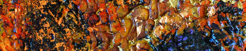
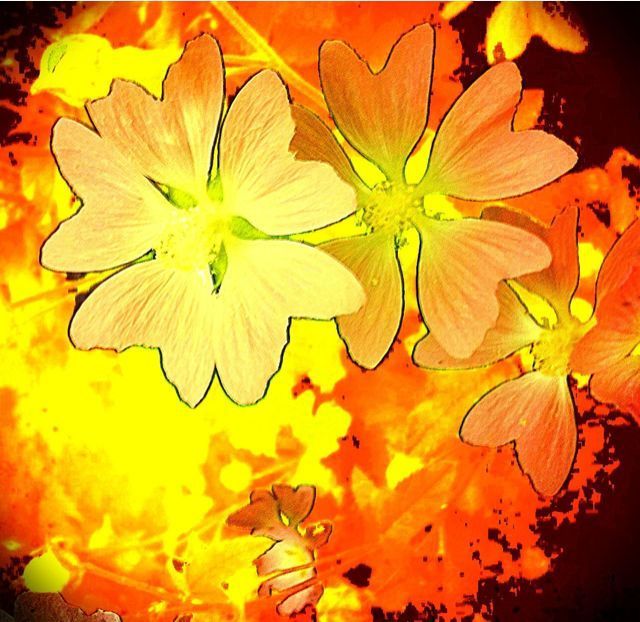
Abstract iPhonegraphy
Sample of Randall’s abstract photographs taken with an iPhone and then manipulated by various apps:


iPhoneography Inspired Abstract Paintings (Exploration – part 3)
Here is the third piece that I worked through to explore the process of using my abstracted iPhone images as references for pastel paintings.

original iPhone photograph

iPhone photo after processing

final abstract pastel painting
I considered this exploration, proof of concept to be successful enough that I am going to proceed to develop a series based on this theme and approach. I do hope and expect that my pastel technique will improve as I do more of these pieces.
I see now that the pastel pieces in these posts look considerably more washed out than they are in real life. I would say they are in fact closer to the enhanced photos than they are to the original photos.
I would certainly appreciate any feedback you have on these pieces


