Landscape Photos Abstracted
While at Red Deer College in the Series “Color in the Landscape” painting course, I always had a camera with me to capture reference photos for the landscapes I would be painting (in a mostly representational manner). However, I could not avoid also capturing interesting photos purely for their abstract appeal. I particularly like to put the camera in motion to capture some atmospheric images. I find that the initial image is only half way to the finished abstract image. the post-processing on the computer is equally important for me to realize a satisfying final work. I typically use Capture NX2 to adjust contrast, saturation and to crop the image.

Abstract 238-032
Occasionally I will use a digital “filter” from Color Efex Pro to coax out a unique effect.

Abstract 238-034
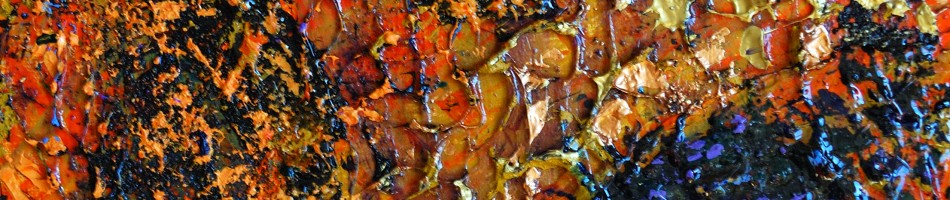
A full moon, slow exposure and panning the camera provided the basis for this Rothkoesque image:

Abstract 238-057
In this next image I applied an infrared treatment with Color Efex to get the strong yellow/pink color scheme to an image which I already had achieved the motion blur by a horizonatal sweep of the camera during exposure:

Abstract 238-031
Hillside is one of my favorites of this group and is at the top of my list to turn into a painting. The colors, composition and motion all appeal to me in this image:

Abstract 238-067 (Hillside)
Walls

Abstract 110610-515
I was walking through an older part of downtown the other day when some interesting architectural details caught my eye. Combine those details, with different points of view for a photo and then different cropping twisting and processing after the shutter press, leads to some interesting images:

Abstract 110607-515(2)
This second image started from the same original photograph. This next one, is not the same photo but is from the same wall, at a different perspective:

Abstract 110610-514(2)
Across the street from this wall, I took this image:

Top of the Wall
This image was processed with the Color Efex infrared film filter through Capture NX2.
Down an alley, and 30 meters away, I found another intriguing exterior wall that I just had to capture:

Old Brick Wall
And finally, another take on this highly textured brick wall:

Bricks and Mortar
Color Efex – Infrared
Since getting my Nikon back from repair I’ve been shooting a lot of photos. At the same time I got the camera back I also purchased Color Efex Pro 3.0 software. This software is a photo processing add-on to the Capture NX2 that I regularly use to work with my Nikon RAW photos (it is also available for PhotoShop and a few other image processing apps). Color Efex provides over 50 (in the pro version) “filters” to apply to the images and I have been exploring what I can do. Here are a few results (just with the infrared film filter) that are interesting and that I am pleased with:

Stairway to ?
That photo uses one of my favorites options with the infrared film filter. There are 4 black and white and 5 color options with this filter (and then 3 slider controls for highlights, brightness and contrast). I like this combination that accentuates the greens and provides that orange sky/background. Here is another photo using that filter:

Street Cleaner 2
Another of the five color options turns the green grass to orange:

Down and to the Left
Or yet another of the options – the green tree becomes pink.

Parking Lot Tree
I like how these color options can be quickly explored and give me ideas for non-conventional color palettes for my paintings.
While Color Efex is primarily about color effects, there are some black and white options. Here is one of the infrared black and white effects:

Snow in June
This shot was taken in early June in Edmonton and while it was a very cool day there was no snow on the ground, as you might think from looking at this photo. This is what the original looked like:

Lumix Experiments
This week I have been continuing to explore my new camera, a Panasonic Lumix DMC-ZS7. Like most point and shoot cameras today, it has an amazing offering of automated, intelligent picture-taking options. However one of the key features that attracted me to this model was the potential for manual control (and good macro capability).

Abstract 110505-452
I used the camera for capturing the initial images and then Capture NX2 software for playing around with the color (contrast, cropping etc.). This next image was, I believe, generated from some natural discoloration on a light pole

Abstract 110505-445
A common theme in this experiment and set of photos was deliberate blur of the images. I slowed down the shutter speed , so that I could move the camera during the exposure to create a directional blur.

Abstract 110505-460
This last photo was primarily about the color play but started from a landscape image where I moved the camera in a vertical direction during the relatively long exposure

Abstract 110505-461
I was pleased by this set of photographic experiments but feel I still have a ways to go until I can use this little camera to it’s full creative possibility. There are some definite limitations with this camera compared to a DSLR but for something I can carry with me most of the time, I will find it very useful.
Ordinary Things – 5 photos
I have been between cameras lately and therefore haven’t had much to share. My Nikon DLSR failed and has been sent for repairs. I grew tired of the limits of my iPhone camera (although really missing the creative possibilities of various apps). I have bought a small point and shoot camera – a Panasonic Lumix DMC-ZS7. The last few days I have been learning how to use the new camera. Here are a few results, shot with the ZS7 and post-processed with Capture NX2.

Abstract 110427-a

Abstract 110427-c

Abstract 110427-d

Seven Blue Cans

Abstract 110427-b
Seeing Things Differently
I want to share some recent photo experiments. I have been exploring the effects that can be achieved using the Capture NX2 software (and I assume similar to other image processing software). I use Capture NX2 because it works with the Nikon RAW format. There are a number of controls in this software and I have previously used it primarily for straightening and cropping images as well as adjusting the exposure, contrast and color balance. Through these software manipulations I see images in very different ways from what I originally saw and was inspired by. It is like exploring strange and new worlds.

Abstract 110318-192
What I have done this week is play around more with an input- output curve that can be adjusted simply by clicking on the curve and pulling a point up or down. The curve in the relationship between the value of the original image and the value of final image. What would normally be a straight diagonal line from bottom left to top right can be twisted around to an s-curve with an inverse slope. This effectively turns the brightest pats of the original image into the darkest portion in the final image. The colors also can get changed in the process resulting in some interesting effects

Night Magic
(Prints and cards of the Night Magic image are available for purchase on RedBubble)

Stained Glass Sidewalk Ice

Melting

Blue Marbling
As you can see there are some very interesting effects possible. I like this exploration both for creating photos and for giving me ideas for paintings
Steps in Developing a Painting
Some people may wonder how I go about creating a painting. In this post I will share my steps in the development of a recent canvas.
This painting started off from a photo. The photo was one I took while out for a walk with our dog in Edmonton’s river valley. When walking I am usually carrying my Nikon D80 equipped with either a 18-55 or 55-200 lens. I took over 100 photos over the course of a couple of hours. This is the photo that inspired me for the painting:

original photograph
The broken tree trunk was the obvious central object that attracted me but I also liked the snow, some of the other tree forms and also the sky with the contrast between sky and clouds. I don’t like my paintings to be too much like a photo, especially with respect to color. Therefore I will often convert my color reference photo to black and white. I will want to get the values right but not be a slave to the natural colors. In the process of converting to black and white I will also take the opportunity to apply color filters and adjust the contrast/brightness. I use Nikon’s Capture NX2 software for the processing. This is my black and white reference photo:

enhanced black and white photo
I really liked the way the “red” filter turned the sky dark. What I didn’t like about the photo was how busy the mid-ground looked with all of the brush. Here I was able to apply my artistic license to clear out the million little lines and emphasize a few key tree elements. I may have done a few small thumbnail sketches to test out my idea , then I transferred my design to the canvas (12 by 16 inches/30×41 cm), drawing it in with charcoal:

charcoal sketch on canvas
You can see how much I have simplified the scene, taking liberties with the sky and the trees. From there it was time to start applying color. I did not refer to the color photo for the “real” colors. At this point I went with my gut to realize the colors that I somehow envisioned. In this case, I started by painting in the sky. You can see even at this stage I made some alterations to the design as I had drawn in with charcoal:

half-painted
The painting continued as I moved to the tree and foreground. Especially for these key elements I choose to apply the paint think and juicy.

"finished" painting
I call this work “finished” (in quotes) because it may not be. I see a number of things that I wonder if I could improve upon. I could continue to rework this painting but I generally I do not like to re-work, especially after the paint has started to dry. Instead I would prefer to live with this painting for awhile, thinking about what I like and noting what I think can be improved – and then I will paint another version. In fact with this one, I am thinking of a couple of small studies and then I will paint a larger version.
Link to more of my abstracted landscape paintings (often developed in similar fashion from photos)


