West Coast (a Painting Series)
In around 1992 after visits to Canada’s west coast (particularly the Gulf Islands), I produced, perhaps my favorite series of paintings. This collection featured trees(and/or driftwood), shorelines and often active skies. My works at this time may show signs of influence from the paintings of Emily Carr.

“Bending to the Sky”, acrylic on hardboard, 61 by 61 cm, 1992

“Windswept”, acrylic on hardboard, 51 by 61 cm, 1992

“Red Leaning”, acrylic on hardboard, 12 by 15 cm, 1992

“Waiting on Island View Beach”, acrylic on canvas, 61 by 76 cm, 1992

“Turning Sky”, acrylic on canvas, 61 by 61 cm, 1992
The North (Painting Series)
In 2009, I painted a series inspired by a train trip from Toronto to Edmonton in December of 2008. The first day and a half of the trip covered southern and northern (northwest) Ontario (actually not very far north in terms of Canada’s geography but feeling very far removed compared to the Toronto region). I took many photos of the rugged terrain of the Canadian Shield to use as reference images for paintings. As a series this is one of my personal favorites. Here are the key works:

“Evening from the Canadian”, oil on canvas, 61 by 122 cm (24×48″), 2009

“Leaning”, oil on canvas, 41 by 41 cm (16×16″), 2009

“Northern Survivor”, oil on canvas, 51 by 76 cm (20 x 30″), 2009

“Winter Sunrise on the Rails”, oil on canvas, 61 by 61 cm (24 x 24″), 2009

“December Sunset (Northern Ontario)”, oil on canvas, 61 by 61 cm (24×24″), 2009

“Leaning II”, oil on canvas, 61 by 61 cm (24×24″), 2009

“Northern Sunset Over Unknown Lake”, oil on canvas, 61 by 91 cm (24×36″), 2009
Autumn Color
It is mid-September here in my part of the world and that means that autumn is arriving in a hurry. There is an exciting burst of color that will soon give way to 7 months of greyness. Fortunately images captured, can be images savored (and perhaps painted), during the long wait til spring.

Splash of Red and Green

Color Grain

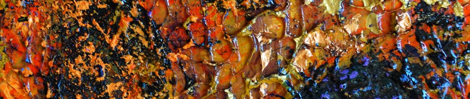
Bending Gold

O Canada

Orangey Shades
Emily Carr at the AGA
Last week I had the pleasure of visiting “Nature and Spirit: Emily Carr’s Coastal Landscapes” at the Art Gallery of Alberta in Edmonton. Anyone that knows me well, will know that I count Emily Carr among my most favorite and influential painters.
I never miss an opportunity to see Carr’s work in person. A few years ago I took in a great show in Ottawa at the National Gallery. Any time I get to Vancouver I make a point of visiting the Vancouver Art Gallery with probably the greatest permanent collection of this west coast Canadian painter. Fortunately this AGA exhibition was organized by the Vancouver Art Gallery and features many of their key, and my favorite works. Among the great works that caused by slow trip past the works to come to a complete stand still were Scorned as Timber, Beloved of the Sky and some luscious views of the interior of the west coast rainforests (specific titles escape me at the moment).
Like the national exhibition a few years ago this exhibit of paintings is complemented by Haida Art: Mapping an Ancient Language, an equally large display of west coast native art and artifacts. The indigenous west coast peoples and cultures were a huge influence and inspiration for Carr so this pairing is ideal.
This exhibition (of 35 Carr paintings) began 2011 March 5 and runs through to June 5. If you are in the Edmonton area this is a must see exhibition. I’ll be back, a few more times – guaranteed!

Bending to the Sky by Randall Talbot (influenced by Emily Carr)
Steps in Developing a Painting
Some people may wonder how I go about creating a painting. In this post I will share my steps in the development of a recent canvas.
This painting started off from a photo. The photo was one I took while out for a walk with our dog in Edmonton’s river valley. When walking I am usually carrying my Nikon D80 equipped with either a 18-55 or 55-200 lens. I took over 100 photos over the course of a couple of hours. This is the photo that inspired me for the painting:

original photograph
The broken tree trunk was the obvious central object that attracted me but I also liked the snow, some of the other tree forms and also the sky with the contrast between sky and clouds. I don’t like my paintings to be too much like a photo, especially with respect to color. Therefore I will often convert my color reference photo to black and white. I will want to get the values right but not be a slave to the natural colors. In the process of converting to black and white I will also take the opportunity to apply color filters and adjust the contrast/brightness. I use Nikon’s Capture NX2 software for the processing. This is my black and white reference photo:

enhanced black and white photo
I really liked the way the “red” filter turned the sky dark. What I didn’t like about the photo was how busy the mid-ground looked with all of the brush. Here I was able to apply my artistic license to clear out the million little lines and emphasize a few key tree elements. I may have done a few small thumbnail sketches to test out my idea , then I transferred my design to the canvas (12 by 16 inches/30×41 cm), drawing it in with charcoal:

charcoal sketch on canvas
You can see how much I have simplified the scene, taking liberties with the sky and the trees. From there it was time to start applying color. I did not refer to the color photo for the “real” colors. At this point I went with my gut to realize the colors that I somehow envisioned. In this case, I started by painting in the sky. You can see even at this stage I made some alterations to the design as I had drawn in with charcoal:

half-painted
The painting continued as I moved to the tree and foreground. Especially for these key elements I choose to apply the paint think and juicy.

"finished" painting
I call this work “finished” (in quotes) because it may not be. I see a number of things that I wonder if I could improve upon. I could continue to rework this painting but I generally I do not like to re-work, especially after the paint has started to dry. Instead I would prefer to live with this painting for awhile, thinking about what I like and noting what I think can be improved – and then I will paint another version. In fact with this one, I am thinking of a couple of small studies and then I will paint a larger version.
Link to more of my abstracted landscape paintings (often developed in similar fashion from photos)
Snow in the Canadian Landscape
In my last post I spoke about how few of my landscape paintings are of snowy scenes. In this post I share what I aspire to – some of my favorite Canadian landscape paintings featuring snow.
Lawren Harris, one of the key members of the Group of Seven had snow in a number of his landscapes. Often this snow would be capping distant mountains but in Snow II it is in the foreground, heavily laden on evergreen boughs. A key observation illustrated by this painting is that snow doesn’t have to be white and certainly not when it is in the shadows. Shacks, a 1919 painting by Harris shows whiter sunlit snow on the ground and roof tops of an urban scene. Note though the color and value difference of the little bits of snow falling in shadows. The Drive is a masterful example of depicting sunlight and shadow on the snow. The difference is pretty subtle but to me it read instantaneously. As a final Harris example North Shore, Baffin Island show the snow/ice atop distant mountains. Again the lesson for me was the value and color difference between the shaded and sunlit snow.
I looked at reproductions of a number of Group of Seven paintings and used a value scale reference card to assess the value of snow in sun and shadow. I think in terms of a nine-point value scale with 1 being white and 9 being black. I observed that there was typically a 3 point value difference between the snow in sun and shadow – commonly a value 3 in the sun and a value 6 in the shadow.
A.Y. Jackson was another leading member of the Group of Seven painters. In his Winter Charlevoix County paintings we can see snow covered rolling fields with the delicate variations between the sunny and shady sides. In Houses St. Urbain we see an example of houses and snow, similar to Harris’ Shacks. Jackson’s Winter Moonlight gives an example of a painting of snow at night, in the light and shadow of the moon (how is this different from the sunny scenes?)
Finally a couple of examples of snow paintings from a couple of other members of the Group of Seven: A.J. Casson’s Winter on the Don and J.E.H. MacDonald’s Early Evening Winter (a great example that an area doesn’t have to be white to read as snow).
There are of course many, many other examples of snowy landscape paintings from the Canadian Group of Seven and if you explore the links given above you will come across other great examples. In a future blog I will share some of my favorite Tom Thomson snow paintings.
Snow Paintings
Living in a northern climate with a healthy dose of winter (usually with snow on the ground for 4 or 5 months, each year), I have to ask myself why I have so few landscape paintings with snow. I do like to take photos of snowy landscapes, often with the good intent of using them for painting references but so far there are not a lot of paintings.
Last night I was reading Deviant Spirits by Ross King and ran across this passage (on page 166) that got me thinking:
Although Quebec painters such as Gagnon, Cullen and Suzor-Coté had tackled snow and ice before, landscapists in English Canada generally steered clear. They recognized , as one critic observed, that to paint a Canadian landscape under snow was “unpatriotic, untactful and unwise.” Canada’s cold climate and deep snow had been a sore point at least since Voltaire mocked the country as “a few acres of snow.” As Jefferys put it “Our climate, winter especially, was regarded as sort of a family skeleton.”
So that’s the story I’ll stick with for now – to paint snow would be to perpetuate an embarrassing Canadian stereotype. Seriously though, I love snowy landscapes and have spent some time studying the more successful ones. Particularly, I have paid attention to the value range of successful paintings – how the values of snow in shadows compares to that in sunlight. I will no doubt be tackling the Canadian landscape in snow in the months and years to come.
One of my few successful snowy landscapes to date was my 2009 oil painting Winter Sunrise on the Rails . This painting was inspired by a photo I took in December of 2008 as I traveled by train from Toronto, home to Edmonton. The scene was from the back of The Canadian somewhere around the Ontario-Manitoba border, probably about an our east of Winnipeg. The sun was just breaking over the horizon and glimmering along the rails behind us.

Winter Sunrise on the Rails, oil painting by Randall Talbot, 2009
I recently had a print of this painting made at RedBubble and I’m pretty thrilled by the way it looks framed up with a black mat.

Prints of this image, Winter Sunrise on the Rails are available for purchase at RedBubble as cards and prints of various sizes, matted or framed, if desired. The original painting is also still available for purchase.
Here is one of my earlier winter landscapes done back in 1993. This scene depicts the Moose River in Northern Ontario

Bank of the Moose River, acrylic painting by Randall Talbot, 1993
There is a bit of a story behind this painting, but I’ll leave that for another day.
Skies – Two West Coast Painting
Here a couple more of my paintings from the early-nineties on the west coast (of Canada) theme. No doubt the skies in these paintings were influenced by skies in some works of Emily Carr

Bending to the Sky
“Bending to the Sky” 61 by 61 cm (24″x2″) acrylic on hardboard (Masonite)
Although I don’t recall where the scenes for these paintings were, I suspect they were very close together, perhaps even developed from the same reference photo.

Turning Sky
“Turning Sky” 61 by 61 cm (24″x2″) acrylic on canvas
During this period of time I was painting exclusively with acrylics, either on hardboard panels or on canvas. At this time I would build my own stretcher frames and stretched and gessoe the canvas myself.


